

Updated 2025-11-24 04:58
ggplot2 is the most widely used R package for data visualization, built on the grammar of graphics and available as part of tidyverse suite of packages.
It lets you create elegant, layered charts with consistent syntax, but newcomers (and even seasoned R users) often struggle with details like formatting labels, adjusting legends, or customizing facets.
This hub brings together 35 step-by-step ggplot2 tutorials that solve the most common visualization challenges.
Whether you want to make titles bold, rotate axis labels, customize legends, or annotate plots with p-values and arrows, you’ll find practical examples here.
Instead of searching scattered blog posts, this page acts as a ggplot2 cookbook, organized by topic—labels, legends, axes, facets, plot types, and annotations.
Each tutorial includes code samples and visuals so you can quickly adapt the solutions to your own datasets.
By working through these resources, you’ll learn how to:
- Format text elements (titles, subtitles, axis ticks) for readability.
- Master legend positioning and styling.
- Improve clarity with facet layouts and strip labels.
- Add annotations, p-values, and highlights for storytelling.
- Extend ggplot2 with boxplots, violins, density curves, and scree plots.
If you’re building reproducible data visualizations in R, bookmark this hub. It’s designed to grow with new tutorials, ensuring you always have an up-to-date reference for the most frequently asked ggplot2 questions.
Table of Contents
Titles & Labels
Clear, well-formatted text is the fastest way to improve chart readability. Titles guide the eye, axis labels provide context, and tick labels help the audience interpret numeric values. In ggplot2, text is controlled through labs() and theme(), and numbers can be formatted with the scales package. This section covers bolding, centering, resizing, wrapping, and coloring text elements so your plots communicate cleanly.
Most production charts need a few tweaks: make the title larger and bold, add a descriptive subtitle, and format axis ticks (e.g., currency). You’ll also run into practical layout issues like long category names; wrapping or rotating labels often makes the difference between cluttered and polished.
Quick example: titles and axis label formatting
library(ggplot2)
library(scales)

df <- data.frame(group = c("Alpha", "Beta", "Gamma"),
                 value = c(12345, 67890, 43210))

ggplot(df, aes(group, value)) +
  geom_col(fill = "#2C7FB8") +
  scale_y_continuous(labels = label_dollar()) +
  labs(title = "Revenue by Group",
       subtitle = "FY2025 YTD",
       x = "Group", y = "Revenue ($)") +
  theme(
    plot.title = element_text(face = "bold", size = 14, hjust = 0.5),
    axis.title = element_text(face = "bold"),
    axis.text.x = element_text(angle = 0)
  )
Related Tutorials
-
How to Make Plot Titles Bold in ggplot2
Style your plot titles with bold text for stronger emphasis and readability. -
How to Wrap Long Plot Titles in ggplot2
Fix overflowing titles by wrapping them neatly over multiple lines. -
How to Center Plot Titles in ggplot2
Align your plot titles perfectly in the center for cleaner visuals. -
Change Axis Title Font to Bold in ggplot2
Adjust the style of axis titles to improve readability and hierarchy. -
Change Axis Tick Label Font Size in ggplot2
Control the font size of axis tick labels for better clarity on dense charts. -
Wrap Long Axis Tick Labels in ggplot2
Break long axis labels into multiple lines to prevent overlaps. -
Add Colors to Axis Tick Labels in ggplot2
Highlight important ticks by applying custom colors to axis labels. -
Format Axis Labels as Dollar Values in ggplot2
Convert numeric axis labels into currency format with dollar signs.
Legends
Legends decode color, shape, and size encodings — but defaults can become crowded. In ggplot2 you can change legend keys, spacing, order, position, and even move the legend inside the plotting region. Getting the legend right helps the viewer scan comparisons quickly without hunting for meaning.
Typical fixes include enlarging key sizes for readability on slides, reversing item order to match bar order, or folding long legends into multiple rows. For compact layouts, placing the legend inside the plot with a light background can save space while keeping focus on the data.
Quick example: inside-plot legend with custom key sizes
library(ggplot2)
theme_set(theme_bw())
p <- mpg |>
  ggplot(aes(displ, hwy, color = class)) +
  geom_point() +
  labs(title = "Fuel Economy vs Displacement")

p +
  theme(legend.position = c(0.85, 0.6)) +
  guides(color = guide_legend(override.aes = list(size = 3))) +
  theme(legend.background = element_rect(fill = alpha("white",
                                                      0.7),
                                         color = NA))
ggsave("inside-plot-custom-legend-ggplot2.png")


Related Tutorials
-
How to Increase Legend Key Size in ggplot2
Make legend keys larger for improved visibility in presentations. -
Remove Extra Space Between Legend Keys in ggplot2
Tighten up legends by reducing unwanted gaps between keys. -
Reverse the Order of Legend Keys in ggplot2
Flip the legend item order to match the order shown in the chart. -
Place the Legend Inside the Plot Area in ggplot2
Save space by embedding the legend within the plotting area. -
Fold ggplot2 Legends into Multiple Rows
Arrange legends into multiple rows for wide or crowded plots. -
Selectively Remove Legends in ggplot2
Hide only certain legends while keeping others visible.
Axes & Scales
Axes do more than display numbers: they set the stage for interpretation. Rotating labels, choosing an appropriate scale (linear/log), formatting currency or percentages, and selectively removing ticks all improve clarity. Poorly configured axes cause clutter and misreadings; well‑tuned axes let the data speak.
In ggplot2, scales are managed with scale_xxx()/scale_yyy() functions. The scales package helps format labels. For categorical axes, thoughtful ordering and shorter labels often beat default alphabetical sorting.
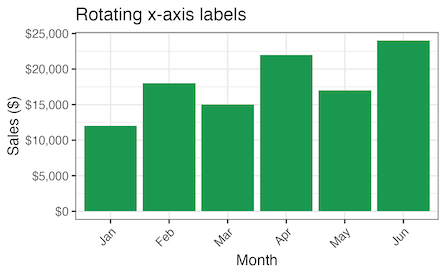
Quick example: currency formatting and rotated x‑labels
library(ggplot2)
library(dplyr)
library(scales)

theme_set(theme_bw(12))
df <- data.frame(month = month.abb[1:6],
                 sales = c(12000, 18000, 15000,
                           22000, 17000, 24000)) |>
  mutate(month = factor(month, levels = month.abb))

df |>
  ggplot(aes(month, sales)) +
  geom_col(fill = "#1A9850") +
  scale_y_continuous(labels = label_dollar()) +
  labs(x = "Month",
       y = "Sales ($)",
       title = "Rotating x-axis labels") +
  theme(axis.text.x = element_text(angle = 45,
                                   hjust = 1))
ggsave("rotate_x_axis_labels_45degree_ggplot2.png")

Related Tutorials
-
Rotate X-Axis Text Labels in ggplot2
Angle x-axis labels to prevent crowding and improve legibility. -
Remove Axis Ticks and Axis Text in ggplot2
Clean up plots by removing ticks and axis text when they’re unnecessary. -
Add an Arrow to Axes in ggplot2
Add arrowheads to axes to show direction or emphasize trends.
Facets
Faceting creates small multiples that reveal patterns across categories, time periods, or segments. It’s one of ggplot2’s superpowers, but the defaults often need refinement: strip labels can be long, panel borders may distract, and ordering can imply the wrong story. Clean faceting improves scannability and comparison.
Common upgrades include wrapping long strip labels, removing heavy borders, customizing facet label text, or enforcing a business‑friendly order (e.g., Jan–Dec instead of alphabetical). Pair facets with consistent scales to keep comparisons fair.
Quick example: tidier facet labels and light theme
library(ggplot2)

p <- ggplot(mpg, aes(displ, hwy)) +
  geom_point(alpha = 0.6) +
  facet_wrap(~ class, ncol=2)

p + labs(title = "Small multiples with faceting") +
  theme(strip.text = element_text(face = "bold"))
ggsave("small_multiples_with_facetting_ggplot2.png",
       width=6, height=8)


Related Tutorials
-
Remove Borders from Facet Panels in ggplot2
Simplify faceted plots by dropping panel borders. -
Remove facet_wrap Strip Labels in ggplot2
Hide facet strip labels when they are redundant or distracting. -
Change Facet Wrap Labels in ggplot2
Edit facet labels for clarity and consistent naming. -
Wrap Long Facet Labels in ggplot2
Break long facet titles into multiple lines for better layout. -
Arrange Months in Correct Order in ggplot2
Ensure month labels display in natural chronological order.
Plot Types & Geoms
Beyond scatter and bars, ggplot2 supports a wide range of geoms to show distributions, uncertainty, and relationships. Boxplots and violins summarize spread; scree plots explain PCA variance; connecting paired points emphasizes before/after relationships. Choosing the right geom clarifies the message and reduces cognitive load.
In practice, you’ll often combine geoms (e.g., half‑violin + boxplot + jittered points) to show both summary and detail. Keep aesthetics consistent across layers and use subtle transparency to manage overplotting.
Quick example: grouped boxplot with reordered categories
library(ggplot2)
library(dplyr)

df <- mtcars |>
  transform(cyl = factor(cyl)) |>
  dplyr::select(cyl, mpg)

ggplot(df, aes(reorder(cyl, mpg, FUN = median), mpg)) +
  geom_boxplot(fill = "#3182BD") +
  labs(x = "Cylinders (ordered by median mpg)", y = "MPG")
Related Tutorials
-
How to Make Grouped Boxplots in ggplot2
Build grouped boxplots to compare distributions across categories. -
Reorder Boxplots by Median or Mean in ggplot2
Arrange boxplots by mean or median to highlight key differences. -
Handle Outliers in Boxplots with ggplot2
Choose methods to display or control outliers in boxplots. -
Create a Half Violin Plot in ggplot2
Combine half violins with boxplots for richer distribution visuals. -
How to Make a Scree Plot in ggplot2
Plot PCA results and visualize explained variance with a scree plot. -
Highlight Specific Groups in ggplot2 Plots
Emphasize categories or groups using color and styling techniques. -
Add Vertical Lines to Density Plots in ggplot2
Annotate density plots with vertical reference lines. -
Connect Paired Points with Lines in ggplot2
Show relationships by linking paired data points with line segments.
Annotations & Labels
Annotations turn charts into explanations. Percentage labels on stacked bars, p‑values on facets, arrows and circles to highlight key points — these small additions guide attention and communicate insights directly on the visual. The goal is to help your audience understand why the pattern matters.
Use annotation layers sparingly and keep text compact. Align labels with the data, and consider color contrast and overlap. For complex layouts, packages like ggrepel help avoid collisions.
Quick example: percentage labels on stacked bars
library(ggplot2)
library(dplyr)

df <- as.data.frame(Titanic) |>
  group_by(Sex, Survived) |>
  summarise(n = sum(Freq), .groups = "drop") |>
  group_by(Sex) |>
  mutate(pct = n / sum(n))

ggplot(df, aes(Sex, pct, fill = Survived)) +
  geom_col(position = "fill") +
  geom_text(aes(label = scales::percent(pct, accuracy = 1)),
            position = position_fill(vjust = 0.5), color = "white") +
  scale_y_continuous(labels = scales::percent) +
  labs(y = "Percent", title = "Survival by Sex (Titanic)")
Related Tutorials
-
Add Percentage Labels to Stacked Bar Plots in ggplot2
Display proportions directly on stacked bars as percentages. -
Dodge Overlapping Text Labels in ggplot2
Prevent overlapping text labels using position and dodging tricks. -
Annotate ggplot2 Plots with Circles
Highlight regions of interest by drawing circle annotations. -
Add P-Values to Faceted Plots in ggplot2
Display statistical test results (p-values) on faceted plots. -
How to Add Arrows to ggplot2 Plots for Emphasis
Use arrows to highlight key elements or trends within the plot.
See also: Matplotlib Guide · Seaborn Guide
Frequently Asked Questions
How do I rotate axis labels in ggplot2 without overlapping?
Overlapping x‑axis labels are common when categories have long names or you have many of them. Rotating labels improves legibility, but angle alone isn’t enough—you should also adjust justification and consider alternatives like horizontal bars or faceting.
library(ggplot2)

# 1) Angle with justification
ggplot(mtcars, aes(x = factor(cyl), y = mpg)) +
  geom_boxplot() +
  theme(axis.text.x = element_text(angle = 45, hjust = 1))

# 2) Horizontal labels via coord_flip()
ggplot(mtcars, aes(x = factor(cyl), y = mpg)) +
  geom_col() + coord_flip()

# 3) Newer guide for rotation (ggplot2 3.3.0+)
ggplot(mtcars, aes(factor(cyl), mpg)) +
  geom_point() +
  scale_x_discrete(guide = guide_axis(angle = 45))
Pitfalls: vertical (90°) labels are harder to read; avoid shrinking fonts until they’re illegible; if labels are truly long, wrap or abbreviate them with stringr::str_wrap(). Best practice: start with 45° + hjust = 1, consider coord_flip() for bars, and facet when categories are too dense for a single panel.
How do I add percentage labels on bars in ggplot2?
There are two common cases: (1) you’re plotting counts, or (2) you already computed percentages. For counts, let ggplot2 compute frequencies and place labels using proportional positioning; for pre‑computed percentages, map labels directly. Keep the y‑axis formatted as percent for consistency and avoid clipping by expanding limits slightly.
library(ggplot2); library(scales); library(dplyr)

# 1) Counts - percentages on stacked bars
ggplot(as.data.frame(Titanic), aes(Sex, Freq, fill = Survived)) +
  geom_col(position = "fill") +
  geom_text(aes(label = percent(..prop.., accuracy = 1)),
            stat = "prop", position = position_fill(vjust = 0.5)) +
  scale_y_continuous(labels = percent)

# 2) Precomputed percentages
df <- tibble::tibble(group = c("A","B","C"), pct = c(0.25, 0.5, 0.25))
ggplot(df, aes(group, pct)) +
  geom_col() +
  geom_text(aes(label = percent(pct)), vjust = -0.2) +
  scale_y_continuous(labels = percent, limits = c(0, 1.1))
Gotchas: don’t compute percentages per bar but then label stacked segments with those — it misleads. Use position_fill() for stacked proportions. For grouped bars, compute group‑level percentages first. Always format the axis and labels with scales::percent for clarity.
How can I reorder categories in a ggplot2 boxplot or bar chart?
Ordering categories by a meaningful statistic makes comparisons clearer. You can reorder with base reorder() inside aes(), or use forcats helpers (fct_reorder, fct_reorder2) for more control. For boxplots, ordering by median is common; for bars, order by the value itself. Always ensure the ordering matches the story you want to tell.
library(ggplot2);
library(forcats);
library(dplyr)

# Boxplots ordered by median using base reorder()
ggplot(mtcars, aes(x = reorder(factor(cyl), mpg, FUN = median), y = mpg)) +
  geom_boxplot() + labs(x = "Cylinders (ordered by median MPG)")

# Bars ordered by value using forcats
df <- tibble::tibble(group = c("A","B","C"), value = c(30, 10, 20))
ggplot(df, aes(x = fct_reorder(group, value), y = value)) +
  geom_col()
Pitfalls: reordering on a filtered subset can yield different orders when you later plot a different subset; if you need consistency across views, reorder on the full dataset first. For line charts, fct_reorder2() orders by the last y value in time, which better reflects end‑state ranking.
How do I add regression lines and confidence intervals by group in ggplot2?
ggplot2 makes trend lines straightforward with geom_smooth(). To draw per‑group regressions, map a grouping aesthetic (e.g., color) and let ggplot2 fit a model per group. Use method = “lm” for linear regression; set se = TRUE/FALSE to show or hide confidence intervals. For non‑linear relationships, use loess or specify a polynomial formula.
library(ggplot2)

# Per-group linear fits with CIs
ggplot(mpg, aes(displ, hwy, color = class)) +
  geom_point(alpha = 0.6) +
  geom_smooth(method = "lm", se = TRUE)

# LOESS smoother without CI
ggplot(mpg, aes(displ, hwy, color = drv)) +
  geom_point() +
  geom_smooth(method = "loess", se = FALSE, span = 0.8)
Best practices: don’t extrapolate beyond observed x; LOESS is O(n²) and slows on large data; overlapping CIs don’t guarantee non‑significance — rely on formal tests if needed. If lines clutter the legend, hide point legend entries or adjust guides for clarity.
Why doesn’t ggplot2 support dual y‑axes, and what are the alternatives?
Dual y‑axes are discouraged because they invite misleading comparisons; differing scales make unrelated series appear correlated. ggplot2 allows a secondary axis only as a transformation of the primary scale via sec_axis(), meaning both axes must be linearly related (e.g., meters↔feet).
library(ggplot2)

# Allowed: secondary axis as a transformation of primary
economics |>
  ggplot(aes(date, psavert)) +
  geom_line() +
  scale_y_continuous(
    name = "Personal savings rate (%)",
    sec.axis = sec_axis(~ . * 1000,
                        name = "Scaled (×1000)")
  )+
  labs(title = "Dual y-axis example with sec.axis")
ggsave("ggplot2_dual_y_axis_example.png")

# Safer alternative: facets
# ggplot(df_long, aes(date, value)) + geom_line() + facet_wrap(~ series, scales = "free_y")
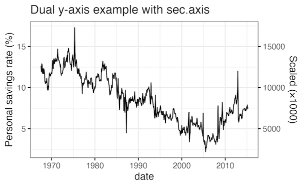
Guidance: only use sec_axis() when the two axes share a meaningful linear transform. Otherwise, prefer facets, normalize series (index to 100), or plot differences/ratios. These designs keep the story honest and easier to read.
Want to use Seaborn in Python?
We also maintain a complete Seaborn guide with 35+ tutorials and recipes.