Learning how to increase legend key size in ggplot2 is essential for creating readable and professional data visualizations. When working with scatter plots containing multiple groups or using transparency (alpha), default legend keys can become too small or difficult to distinguish, making it hard for viewers to match colors between the plot and legend.
In this comprehensive tutorial, you’ll learn how to increase legend key size in ggplot2 using the guides() function with guide_legend() and override.aes parameters. We’ll cover practical scenarios where larger legend keys improve plot readability and user experience.
When Should You Increase Legend Key Size in ggplot2?
You don’t always need to enlarge legend keys, but in the following situations it can make a big difference in readability:
- Scatter plots with many categories, where small default keys blur together
- Plots using transparency (
alpha), which makes legend points faint and hard to see - Presentations and publications, where visual clarity matters more than compactness
- Dashboards and reports, where quick visual scanning is crucial
- Cases with similar colors, where larger keys help distinguish categories
What You’ll Learn
- How to increase legend key size in ggplot2 using
guides()function - Using
guide_legend(override.aes = list(size=6))for custom sizing - Solving legend visibility issues with transparency and alpha settings
- Best practices for ggplot2 legend customization and readability
- Handling multiple group visualizations with enhanced legend clarity
Key ggplot2 Functions for Legend Key Sizing
Essential components covered:
-
Main function:
guides(colour = guide_legend()) -
Size control:
override.aes = list(size=6)parameter -
Color legends: Working with
coloraesthetic mappings - Transparency handling: Maintaining legend clarity with alpha values
Here we will see examples of increasing the point size of the legend in a scatter plot using guides() function in ggplot2.
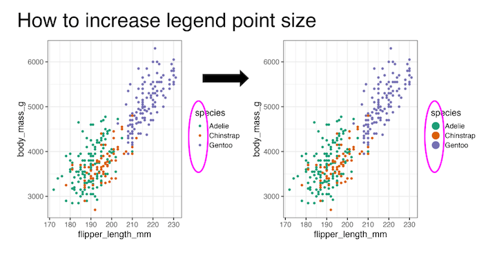
Scatter Plot with Multiple Groups
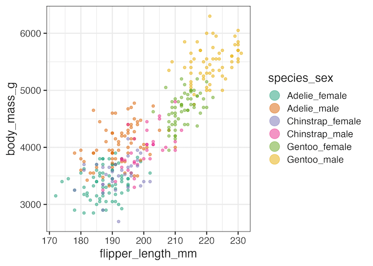
Let’s begin by creating a scatter plot from the Palmer Penguins dataset. We combine species and sex to generate more groups, so the legend quickly becomes busy. By default, the legend keys (colored points) match the plot’s point size:
Data preparation
Le us load the packages needed to make a scatter plot and increase the legend point size.
library(tidyverse)
library(palmerpenguins)
theme_set(theme_bw(16))
We will be using palmer penguin datasets. The legibility of legend point is often an issue when you have more groups, therefor more colored legend keys or points in a scatter plot. To illustrate that we combine two categorical variables to create more groups. In the example below we combine species and sex variable using unite() function.
df <- penguins %>%
  drop_na() %>%
  unite(species_sex, c(species, sex))
The modified penguin data with new combined column looks like this
df %>% head()

## # A tibble: 6 × 7
##   species_sex   island bill_length_mm bill_depth_mm flipper_length_… body_mass_g
##   <chr>         <fct>           <dbl>         <dbl>            <int>       <int>
## 1 Adelie_male   Torge…           39.1          18.7              181        3750
## 2 Adelie_female Torge…           39.5          17.4              186        3800
## 3 Adelie_female Torge…           40.3          18                195        3250
## 4 Adelie_female Torge…           36.7          19.3              193        3450
## 5 Adelie_male   Torge…           39.3          20.6              190        3650
## 6 Adelie_female Torge…           38.9          17.8              181        3625
## # … with 1 more variable: year <int>
Scatter plot with multiple groups colored by legends
When we add color to a plot by variable, ggplot2 helps us making a legend to understand. An important part the legend is the legend key. In a scatter plot, the legend key is the colored circles or points. And by default it will match the size of the plot.
df %>%
  ggplot(aes(flipper_length_mm, body_mass_g, color=species_sex))+
  geom_point()+
  scale_color_brewer(palette="Dark2")
ggsave("ggplot2_scatter_plot_with_color_legend.png")
Here is an example scatter plot with multiple colors and legends.


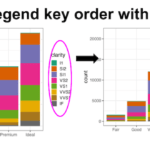
Increasing the Legend Key Size with guides()
The guides() function allows you to customize legends without changing the actual plot. Using guide_legend(override.aes = ...), you can enlarge the legend keys while keeping the plot points the same size. In the example below, we increase legend point size to 6, making it much easier to match legend entries with plot colors:
df %>%
  ggplot(aes(flipper_length_mm, body_mass_g, color=species_sex))+
  geom_point()+
  scale_color_brewer(palette="Dark2")+
  guides(colour = guide_legend(override.aes = list(size=6)))
ggsave("ggplot2_scatter_plot_increase_color_legend_point_size.png")
We have used guide_legend() argument to guides function and increased the size by using override.aes argument. And now the legend keys are easy to see.

Scatter plot of multiple groups with transparency
When you have a lot of data points overeplotting can be an issue and a solution to avoid the overplotting is to increase the transparency of data points in a scatter plot. In ggplot2 we can increase the transparency by using alpha argument and this helps to see overlapping data more clearly.
However, a challenge with this approach is that, setting tranparency using alpha also makes the legend keys or points more transparent and thus more difficult to read the plot.
Here is an example of using alpha to increase the transparency of points on plot also makes the legend key harder to map.
df %>%
  ggplot(aes(flipper_length_mm, body_mass_g, color=species_sex))+
  geom_point(alpha=0.5)+
  scale_color_brewer(palette="Dark2")
ggsave("ggplot2_scatter_plot_with_color_legend_with_alpha.png")

Increase the legend key or point size of legend with guides() Second Example
Increasing the legend key size can alleviate the problem caused by alpha. Note we have increased the size of legend key, but not the legend key label.
df %>%
  ggplot(aes(flipper_length_mm, body_mass_g, color=species_sex))+
  geom_point(alpha=0.5)+
  scale_color_brewer(palette="Dark2")+
  guides(colour = guide_legend(override.aes = list(size=6)))
ggsave("scatter_plot_increase_legend_point_size-guide_legend.png")
Conclusion
Increasing legend key size in ggplot2 is a simple but powerful tweak to improve readability. By using guides() with guide_legend(override.aes = ...), you can adjust legend appearance independently from the plot itself.
This is especially useful in scatter plots with many groups, when using transparency, or when preparing figures for presentations and publications.
Frequently Asked Questions (FAQs)
-
Does changing legend key size affect the plot points?
No. Usingguide_legend(override.aes = ...)only changes how legend symbols appear. The points or shapes in the plot remain the same size. -
How do I increase legend key size for multiple aesthetics?
You can adjust multiple legends at once. For example:
guides(color = guide_legend(override.aes = list(size = 6)), shape = guide_legend(override.aes = list(size = 6))). -
What if transparency (alpha) makes my legend keys hard to see?
You can override alpha separately in the legend:
guides(color = guide_legend(override.aes = list(size = 6, alpha = 1))).
This keeps plot points transparent while legend keys remain fully visible. -
Can I change the shape of legend keys as well as size?
Yes. Override multiple aesthetics insideoverride.aes. For example:
guide_legend(override.aes = list(size = 6, shape = 21)). -
Is there a way to make legends more readable for publications?
Increase symbol size, setalpha = 1in the legend, and use clear contrasting colors. Larger font sizes for legend labels also improve readability in print. -
Why does my legend resize not work?
This can happen if the legend is suppressed byguides(... = "none")orshow.legend = FALSE. Make sure the legend is actually being drawn before customizing its size.
Explore the Complete ggplot2 Guide
35+ tutorials with code: scatterplots, boxplots, themes, annotations, facets, and more—tested and beginner-friendly.
Visit the ggplot2 Hub → No fluff—just code and visuals.