In this tutorial, we will learn how to add colors to axis tick labels in ggplot2. To add colors to axis labels we will use the R package “ggtext: Improved text rendering support for ggplot2” developed by Claus Wilke.
Let us get started by loading the packages needed.
library(tidyverse)
library(palmerpenguins)
library(ggtext)
library(glue)
theme_set(theme_bw(16))
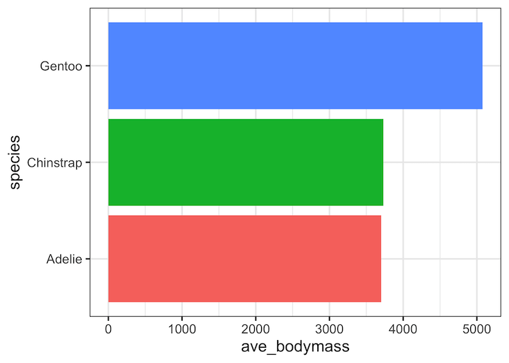
We will use Palmer Penguin data set to make a barplot of mean values of body mass per species.
df <- penguins %>%
  group_by(species) %>%
  summarize(ave_bodymass=mean(body_mass_g, na.rm=TRUE))
df
## # A tibble: 3 × 2
##   species   ave_bodymass
##   <chr>            <dbl>
## 1 Adelie           3701.
## 2 Chinstrap        3733.
## 3 Gentoo           5076.
By default, we get axis text labels in black color. Here is an example of a plot made with default axis tick labels.
df %>%
  ggplot(aes(y=species, x=ave_bodymass, fill = species)) +
  geom_col() +
  theme(legend.position = "none")
  #scale_fill_identity()
ggsave("barplot_default_tick_label_colors.png")

With ggtext, we can manually specify the colors for both filling the bars in the bar plot and axis tick label. In this example, we color the species names in the y-axis tick labels. We will create a new column with color and text containing the markdown code for axis tick labels.
df %>%
  mutate(
  color = c("#009E73", "#D55E00", "#0072B2"),
  name = glue("<i style='color:{color}'>{species}</i>"))
## # A tibble: 3 × 4
##   species   ave_bodymass color   name
##   <chr>            <dbl> <chr>   <glue>
## 1 Adelie           3701. #009E73 <i style='color:#009E73'>Adelie</i>
## 2 Chinstrap        3733. #D55E00 <i style='color:#D55E00'>Chinstrap</i>
## 3 Gentoo           5076. #0072B2 <i style='color:#0072B2'>Gentoo</i>
Next, we will use the newly created variable with markdown code as our y-axis and use element_markdown() function withing theme() element. element_markdown() function is a “direct replacement for element_text(), and it renders text without word wrapping”
df %>%
  mutate(
  color = c("#009E73", "#D55E00", "#0072B2"),
  name = glue("<i style='color:{color}'>{species}</i>")) %>%
  ggplot(aes(ave_bodymass, name, fill = color)) +
  geom_col(alpha = 0.8) +
  scale_fill_identity()+
  theme(
    axis.text.y = element_markdown())+
  labs(y=NULL)
And we get a plot with colored y-axis label ticks. Note the color of axis tick label matches with the bar fill color.

Explore the Complete ggplot2 Guide
35+ tutorials with code: scatterplots, boxplots, themes, annotations, facets, and more—tested and beginner-friendly.
Visit the ggplot2 Hub → No fluff—just code and visuals.