Creating a lollipop plot with ggalt is an excellent way to visualize ranked data with minimal ink usage compared to traditional bar charts. The ggalt package extends ggplot2 functionality with geom_lollipop(), making it easy to create elegant stick-and-circle visualizations that are both space-efficient and visually appealing.
In this comprehensive lollipop plot ggalt tutorial, you’ll learn how to create, customize, and enhance lollipop plots in R using the ggalt extension package. We’ll cover everything from basic syntax to advanced customization options for creating publication-ready visualizations.
What You’ll Learn
- How to create lollipop plot with ggalt using
geom_lollipop() - Making horizontal and vertical lollipop charts with proper orientation
- Adding colors by categorical variables for grouped comparisons
- Customizing point size, colors, and styling options
- Best practices for ggalt lollipop plot design and readability
ggalt, R package developed by @hrbrmstr, has a geom for making lollipop called geom_lollipop(). And we will be using geom_lollipop() to make the lollipo plot and customise a bit.
First, let us load the R packages needed including ggalt. We are use ggalt version 0.4.0 here to make the lollipop plot.
library(tidyverse)
library(gapminder)
library(ggalt)
theme_set(theme_bw(16))
packageVersion("ggalt")
## [1] '0.4.0'
Data preparation for lollipop plot
We will be using a part of gapminder data and make the lollipop plot for the mean life expectancy. values for randomly selected countries from two continents, Africa and Americas.
Let us get the data for making the lollipop chart.
set.seed(2022)
df <- gapminder %>%
  filter(continent %in% c("Africa", "Americas")) %>%
  group_by(country, continent) %>%
  summarize(mean_lifeExp = mean(lifeExp)) %>%
  ungroup() %>%
  slice_sample(n =25)
Our data looks like this with three columns one for country, continent and average life expectancy.
df %>% head()
## # A tibble: 6 × 3
##   country      continent mean_lifeExp
##   <fct>        <fct>            <dbl>
## 1 Namibia      Africa            53.5
## 2 Panama       Americas          67.8
## 3 Venezuela    Americas          66.6
## 4 Tanzania     Africa            47.9
## 5 Botswana     Africa            54.6
## 6 Sierra Leone Africa            36.8
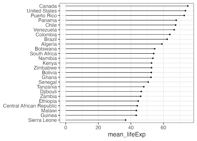
Lollipop plot with geom_lollipop() in ggalt
Now we are ready to make the lollipop plot, a stick with a circle at the end of a stick.
Here we use horizontal=TRUE as argument geom_lollipop() to make the horizontal lollipop chart with country on y axis and mean life expectancy on x axis.
df %>%
  ggplot(aes(y=reorder(country, mean_lifeExp),
             x= mean_lifeExp))+
  geom_lollipop(horizontal=TRUE)+
  labs(y=NULL)
ggsave("lollipop_plot_with_ggalt_geom_lollipop.png")

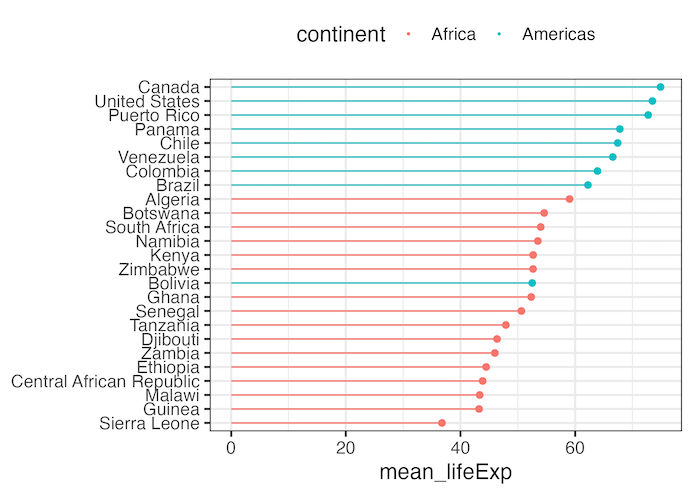
Add colors by a variable to Lollipop plot
We can add color to the lollipop chart based. on the value of another variable using color argument to ggplot2’s aes() function.
df  %>%
  ggplot(aes(y=reorder(country, mean_lifeExp),
             x= mean_lifeExp,
             color=continent))+
  geom_lollipop(horizontal=TRUE)+
  labs(y=NULL)+
  theme(legend.position = "top")
ggsave("add_color_lollipop_plot_with_ggalt_geom_lollipop.png")

Customizing lollipop plot with ggalt
We can also further customize the lollipop plot based on our need. In the example below, we increase the size of circle at the end of stick by using point.size argument to geom_lollipop() function.
df  %>%
  ggplot(aes(y=reorder(country, mean_lifeExp),
             x= mean_lifeExp,
             color=continent))+
  geom_lollipop(point.size=2,
                horizontal=TRUE)+
  labs(y=NULL)+
  theme(legend.position = "top")
ggsave("customizing_lollipop_plot_with_ggalt_geom_lollipop.png")
Explore the Complete ggplot2 Guide
35+ tutorials with code: scatterplots, boxplots, themes, annotations, facets, and more—tested and beginner-friendly.
Visit the ggplot2 Hub → No fluff—just code and visuals.