

Boxplots are one of the most effective ways to summarize data distributions in R, and ggplot2 makes them both powerful and flexible. ggplot2 is the go-to package for making boxplots in R. What’s new is how you can now create them by working with AI tools like ChatGPT. Instead of working alone, now we can… Continue reading 10 ChatGPT Prompts for ggplot2 Boxplots: Complete Guide with Working R Code
Category: ggplot2
AI vs Manual Scatterplots in R: ggplot2 Workflows for the AI Era

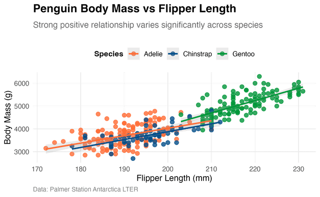
If you’re creating scatterplots in R during 2025, you have likely wrestled with the question: should you let AI write your ggplot2 code, or stick to the tried-and-true manual approach? The answer isn’t as simple as “AI is faster” or “manual is better.” The reality is more nuanced, and the best approach depends on your… Continue reading AI vs Manual Scatterplots in R: ggplot2 Workflows for the AI Era
ggplot2 Boxplot AI Workflows: A Modern Guide


Boxplots in R: Manual, ChatGPT/AI, and Hybrid Approaches in the AI Era If you’re a data analyst or scientist, your workflow in 2025 probably looks a lot different than it did just a few years ago. The buzz around AI coding assistants like GitHub Copilot and large language models like Gemini or ChatGPT isn’t just… Continue reading ggplot2 Boxplot AI Workflows: A Modern Guide
How to make UMAP plot in R

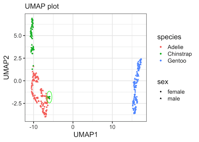
Struggling to visualize and find patterns in high-dimensional data? While PCA and tSNE are common, UMAP has emerged as a powerful, modern technique for dimensionality reduction. This guide will show you not only how to create beautiful UMAP plots in R with ggplot2, but also how to interpret them to uncover meaningful insights in your… Continue reading How to make UMAP plot in R
How To Rotate x-axis Text Labels in ggplot2


Struggling with unreadable, overlapping x-axis labels in your ggplot2 plots? This is a common problem, and this guide provides the definitive solution. Long category names, dates, or numerous data groups often cause x-axis labels to overlap, making plots unreadable and unprofessional. We’ll show you the best and most common way to rotate x-axis labels in… Continue reading How To Rotate x-axis Text Labels in ggplot2