
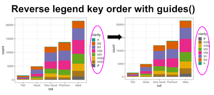
Reversing legend order in ggplot2 is essential for creating intuitive data visualizations where the legend arrangement matches your data hierarchy or presentation needs. By default, ggplot2 displays legend keys in alphabetical order, but often you’ll want to reverse ggplot2 legend order to better align with your data story or visual flow. In this comprehensive ggplot2… Continue reading How to reverse legend key order in ggplot2
Category: Uncategorized
How to Increase Legend Key Size in ggplot2

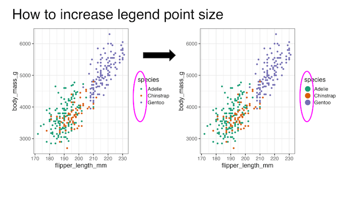
Learning how to increase legend key size in ggplot2 is essential for creating readable and professional data visualizations. When working with scatter plots containing multiple groups or using transparency (alpha), default legend keys can become too small or difficult to distinguish, making it hard for viewers to match colors between the plot and legend. In… Continue reading How to Increase Legend Key Size in ggplot2
Lollipop plot with ggplot extension ggalt

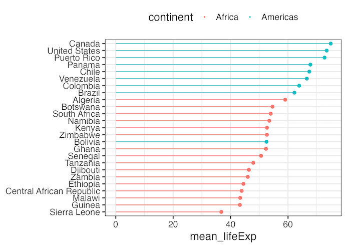
Creating a lollipop plot with ggalt is an excellent way to visualize ranked data with minimal ink usage compared to traditional bar charts. The ggalt package extends ggplot2 functionality with geom_lollipop(), making it easy to create elegant stick-and-circle visualizations that are both space-efficient and visually appealing. In this comprehensive lollipop plot ggalt tutorial, you’ll learn… Continue reading Lollipop plot with ggplot extension ggalt
How to write a function make histograms with ggplot

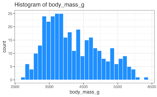
In this tutorial, we will learn how to write a function to make a histograms using ggplot2 in R. Writing a function to create plots is useful, when you make a lot of plots, in this example, a lot of histograms. Thanks to the upcoming 2nd edition of R for Data Science by Hadley Wickham,… Continue reading How to write a function make histograms with ggplot
How to Add Colors to Axis Tick Label in ggplot2


In this tutorial, we will learn how to add colors to axis tick labels in ggplot2. To add colors to axis labels we will use the R package “ggtext: Improved text rendering support for ggplot2” developed by Claus Wilke. Let us get started by loading the packages needed. We will use Palmer Penguin data set… Continue reading How to Add Colors to Axis Tick Label in ggplot2