
In this tutorial, we will learn how to annotate or add colors to multiple groups in a scatter plot made with ggplot2 in R using convex hull shapes. Convex hull is basically a box or polygon connecting the outermost data points for each group in a scatter plot with multiple groups.Adding such convex hulls around each group can nicely highlight the groups in a plot.
We will use palmer penguins dataset to make a scatter plot and add convex hulls around each group. To start, let us load the packages needed.
library(tidyverse)
library(palmerpenguins)
theme_set(theme_bw(16))
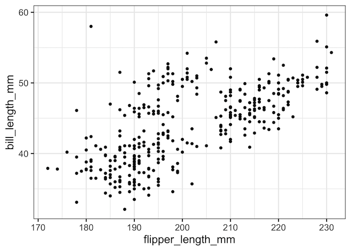
Let us make simple scatter plot with ggplot2 and save it as a variable.
p1 <- penguins %>%
  ggplot(aes(x = flipper_length_mm,
             y = bill_length_mm))+
  geom_point()
p1
Even though we have not highlighted groups in the scatter plot, we can see that scatter plot shows threes groups of data points.
Create Dataset for Convex Hulls
To annotate a plot with convex hull, we need to define the boundaries for convex hull.
Let us subset our original dataset to create a dataset containing the boundaries of the convex hulls for each group. In this example, we use species as grouping variable and chull() function in base R that “computes the subset of points which lie on the convex hull of the set of points specified.”
hull_data <-
  penguins %>%
  drop_na() %>%
  group_by(species) %>%
  slice(chull(flipper_length_mm, bill_length_mm))
Our dataset to make convex hulls look like this. Note that this is just the subset of the original dataset that covers the outline of each group.
hull_data

## # A tibble: 28 × 8
## # Groups:   species [3]
##    species island    bill_length_mm bill_depth_mm flipper_length_mm body_mass_g
##    <fct>   <fct>              <dbl>         <dbl>             <int>       <int>
##  1 Adelie  Dream               35.7          18                 202        3550
##  2 Adelie  Torgersen           34.6          21.1               198        4400
##  3 Adelie  Dream               32.1          15.5               188        3050
##  4 Adelie  Dream               33.1          16.1               178        2900
##  5 Adelie  Biscoe              37.9          18.6               172        3150
##  6 Adelie  Torgersen           40.2          17                 176        3450
##  7 Adelie  Dream               42.2          18.5               180        3550
##  8 Adelie  Biscoe              45.6          20.3               191        4600
##  9 Adelie  Torgersen           46            21.5               194        4200
## 10 Adelie  Torgersen           45.8          18.9               197        4150
## # … with 18 more rows, and 2 more variables: sex <fct>, year <int>
Convex Hull Plot with ggplot2 using geom_polygon()
In ggplot2, we can make convex hull using geom_polygon() geom with the data for convex hulls. We also add color by filling and coloring the convex hulls.
p1+
  geom_polygon(data = hull_data,
               aes(fill = species,
                   colour = species),
               alpha = 0.3,
               show.legend = FALSE)
ggsave("Annotating_ggplot_with_Convex_hull.png")
Now, the ggplot with convex hulls nicely highlights the three groups in the dataset.

Highlighting Groups with Convex Hull and Colors with ggplot2
Notice that the data points in the scatter plot are not colored by group. This is because we did not add color to the original scatter plot we made first. Let us make a scatter plot coloring the points by a variable.
p2 <-penguins %>%
  ggplot(aes(x=flipper_length_mm,y=bill_length_mm, color=species))+
  geom_point()
p2
Now, when we add convex hull as extra layer, we get scatter plot with data points colored by grouping variable.
p2+
  geom_polygon(data = hull_data,
               aes(fill = species,
                   colour = species),
               alpha = 0.3,
               show.legend = FALSE)
ggsave("highlighting_groups_in_ggplot_with_Convex_hull.png")
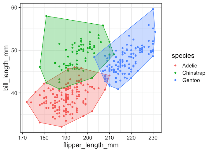
Adding convex hull as a layer to plot is a great way to highlight multiple groups in a dataset. It is often very useful to highlights the structure in a data inferred by PCA. A drawback of the convex hull is that when you multiple groups with outliers, the shapes of convex hulls can be bit confusing and not that useful.
Also, check out other ways to highlight or add annotation in ggplot. For example, we can add circles or ellipses around data points in ggplot2 using ggforce. Here are a few other ways to highlight data points with ggplot2.
Explore the Complete ggplot2 Guide
35+ tutorials with code: scatterplots, boxplots, themes, annotations, facets, and more—tested and beginner-friendly.
Visit the ggplot2 Hub → No fluff—just code and visuals.


