Violinplots are a great alternative to boxplot to visualize distribution of multiple variables. In this turtorial, we will learn about, half violin plot, a variant of violinplot in R with ggplot2. It is literally half of a violinplot, in a meaningful way. We will see examples of how to make half violinplot using ggplot2.
For making violinplot, we can use ggplot2 function geom_violin(). However, for making half violinplot ggplot2 does not have function. We will rely on @drob’s gist containing a function to make half violinplot. Let us first load tidyverse and set the theme for making half violinplots.
library(tidyverse)
theme_set(theme_bw(16))
We have slightly modified (fixed a small typo as suggested by a comment in the gist) the function @drob wrote and have it available at datavizpyr.com’s github account.
source("https://raw.githubusercontent.com/datavizpyr/data/master/half_flat_violinplot.R")
We will use our favorite Penguin dataset to make half violinplots.
p2data <- "https://raw.githubusercontent.com/datavizpyr/data/master/palmer_penguin_species.tsv"
penguins_df <- read_tsv(p2data)
## Parsed with column specification:
## cols(
##   species = col_character(),
##   island = col_character(),
##   culmen_length_mm = col_double(),
##   culmen_depth_mm = col_double(),
##   flipper_length_mm = col_double(),
##   body_mass_g = col_double(),
##   sex = col_character()
## )
Half Violinplot with ggplot2
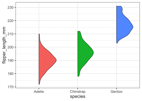
Let us make a half violin plot using the function geom_flat_violin() loaded from the R script by @drob. Here we fill the half violins by species variable
ggplot(penguins_df, aes(species,flipper_length_mm, fill=species)) +
    geom_flat_violin() +
    theme(legend.position="none")
ggsave("half_violin_plots_ggplot_with_fill.png")
And we get a nice half violin plot and you can see that it contains all the information as the regular violin plot.
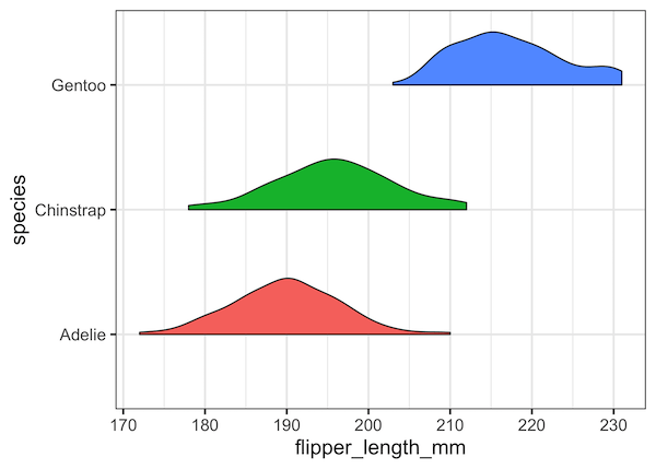
The function geom_flat_violin() acts like regular ggplot2 function. In the example below, we have used coord_flip() to make the half violinplot as horizontal half violin plot().
ggplot(penguins_df, aes(species,flipper_length_mm, fill=species)) +
    geom_flat_violin() +
    coord_flip()+
    theme(legend.position="none")
ggsave("half_violin_plots_ggplot_with_fill_horizontal.png")
Note that this function is a few years old and not friendly with the ggplot2’s new campability to switch axis without coord_flip().
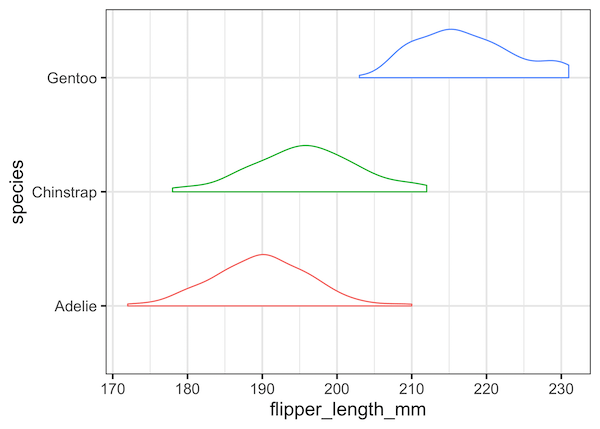
Here is an example of half violin plot without fill color.
ggplot(penguins_df, aes(species,flipper_length_mm, color=species)) +
    geom_flat_violin() +
    coord_flip()+
    theme(legend.position="none")
ggsave("half_violin_plots_ggplot.png")
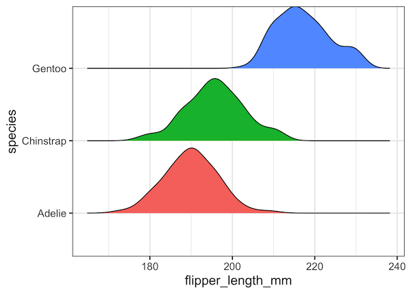
A related type of plot that is similar to horizontal half violin plot is ridgeline plot from ggridges package. Let us make a ridgeline plot with enough spacing between groups using geom_density_ridges() in ggridges package.
library(ggridges)
ggplot(penguins_df, aes(y=species,
                        x=flipper_length_mm,
                        fill=species)) +
    geom_density_ridges(scale=0.9)+
    theme(legend.position="none")
As Claus Wilke states in his Data Visualization book
This is no different from the violin plot, where densities are also shown alongside the grouping variable, without a separate, explicit scale. In both cases, the purpose of the plot is not to show specific density values but instead to allow for easy comparison of density shapes and relative heights across groups.