
In this tutorial, we will learn how to make boxplot using Altair in Python. We will start with making a simple boxplot and show how we can make the boxplot better with useful Altair tips.
Let us load Altair and check its version
import altair as alt
# load pandas
import pandas as pd
alt.__version__
We will use Palmer Penguins dataset to learn the tips to make better boxplots using Altair.
penguins_data="https://raw.githubusercontent.com/datavizpyr/data/master/palmer_penguin_species.tsv"
penguins_df = pd.read_csv(penguins_data, sep="\t")
penguins_df.head()

	species	island	culmen_length_mm	culmen_depth_mm	flipper_length_mm	body_mass_g	sex
0	Adelie	Torgersen	39.1	18.7	181.0	3750.0	MALE
1	Adelie	Torgersen	39.5	17.4	186.0	3800.0	FEMALE
2	Adelie	Torgersen	40.3	18.0	195.0	3250.0	FEMALE
3	Adelie	Torgersen	NaN	NaN	NaN	NaN	NaN
4	Adelie	Torgersen	36.7	19.3	193.0	3450.0	FEMALE
1. Simple Boxplot with Altair
Altair’s mark_boxplot() function allows us to make boxplot in Altair. We start with Altair chart function and specify the data we will be working with. And them use mark_boxplot() function with the x and y-axis variable as argument to encode() function.
alt.Chart(penguins_df).mark_boxplot().encode(
    x='species:O',
    y='culmen_length_mm:Q')
By default we get a tiny plot with boxplot filled in blue color.

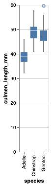
2. Customize the Altair plot size
We can change the size of the Altair plot using properties() function.
alt.Chart(penguins_df).mark_boxplot().encode(
    x='species:O',
    y='culmen_length_mm:Q'
).properties(width=300)
In this example, we specified the width to be 300.

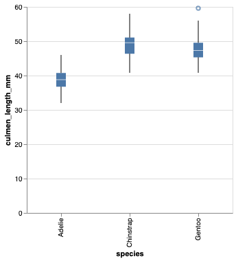
2. Customize box size in boxplot in Altair
Sizes of boxes in the boxplot are smaller and we can control box sizes in Altair using size argument to mark_boxplot() function.
alt.Chart(penguins_df).mark_boxplot(size=50).encode(
    x='species:O',
    y='culmen_length_mm:Q'
).properties(width=300)
Now our boxplots have bigger boxes.
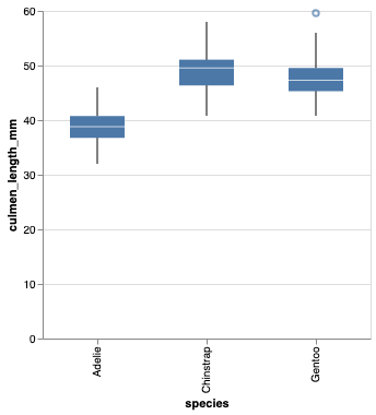
4. Customize axis ranges in boxplot Altair
By default, Altair shows the full range starting from 0 to maximum values of data in both x and y-axis. In this example, we can see that y-axis values start at 0, even though the minimum value of the data is above 20. We can customize the axis range using alt.Scale function as argument to y-axis.
alt.Chart(penguins_df).mark_boxplot(size=50).encode(
    x='species:O',
    y=alt.Y('culmen_length_mm:Q',scale=alt.Scale(zero=False)),
).properties(width=300)
Here we specify zero=False to not show the axis from 0. This makes the plot look much better capturing the variation of data nicely.
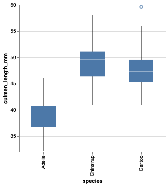
5. Coloring boxplot by a variable
Let us fill the boxplots with colors using a variable in the dataset. To color by variable, we use color argument.
alt.Chart(penguins_df).mark_boxplot(size=50).encode(
    x='species:O',
    y=alt.Y('culmen_length_mm:Q',scale=alt.Scale(zero=False)),
    color=alt.Color('species')
).properties(width=300)


6. Showing outliers data on boxplot
By adjusting extent argument to mark_boxplot() function we can show the outlier data points on boxplot with Altair.
alt.Chart(penguins_df).mark_boxplot(size=50, extent=0.5).encode(
    x='species:O',
    y=alt.Y('culmen_length_mm:Q',scale=alt.Scale(zero=False)),
    color=alt.Color('species')
).properties(width=300)
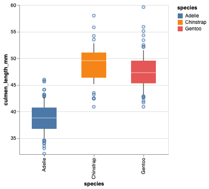
7. Increasing the axis label bigger in Altair
The default axis labels in Altair may be too small and we can increase the axes label using configure_axis() function. And here we specify both label font size and title font size.
alt.Chart(penguins_df).mark_boxplot(size=50, extent=0.5).encode(
    x='species:O',
    y=alt.Y('culmen_length_mm:Q',scale=alt.Scale(zero=False)),
    color=alt.Color('species')
).properties(width=300).configure_axis(
    labelFontSize=16,
    titleFontSize=16
)

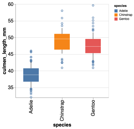
8. Removing legend in Altair boxplot
In the above boxplot, you can see that legend is redundant. We can remove legend in Altair using legend=None argument in alt.Color() function.
alt.Chart(penguins_df).mark_boxplot(size=50, extent=0.5).encode(
    x='species:O',
    y=alt.Y('culmen_length_mm:Q',scale=alt.Scale(zero=False)),
    color=alt.Color('species', legend=None)
).properties(width=300).configure_axis(
    labelFontSize=16,
    titleFontSize=16
)
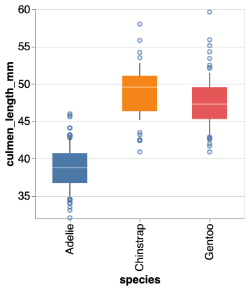
Another useful tips to make the boxplot better is to display the data points in addition to boxplot. However, with the current version of Altair that is not supported natively. A round about hack is to use the strippplot with jitter.


