
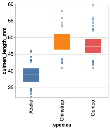
In this post, we will learn how to make boxplot with data points using Altair. Latest version of Altair supports making simple boxplots. However, current version of Altair does not support adding adding jittered data points on top of boxplots. Thanks to Justin Bois from Caltech, we can use his data visualization utility package Altair-catplot,… Continue reading How to Make Boxplot with Jittered Data Points using Altair in Python
Tag: Boxplot
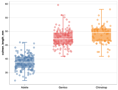
8 Tips to Make Better Boxplots with Altair in Python

In this tutorial, we will learn how to make boxplot using Altair in Python. We will start with making a simple boxplot and show how we can make the boxplot better with useful Altair tips. Let us load Altair and check its version We will use Palmer Penguins dataset to learn the tips to make… Continue reading 8 Tips to Make Better Boxplots with Altair in Python
How to Show and Customize Mean Values in Seaborn Boxplots

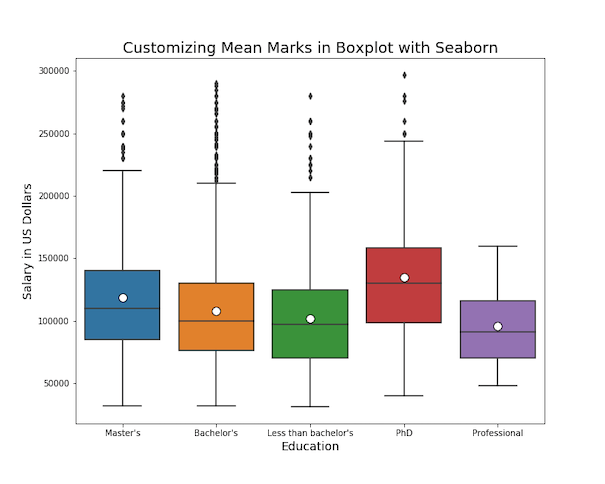
Want to display both median and mean values in your boxplot visualizations? This comprehensive guide shows you exactly how to seaborn boxplot show mean using multiple methods, with ready-to-use Python code examples. Boxplots traditionally show median values, but displaying the mean alongside provides additional statistical insight, especially when dealing with skewed distributions or comparing central… Continue reading How to Show and Customize Mean Values in Seaborn Boxplots
How To Show Mean Value in Boxplots with ggplot2?

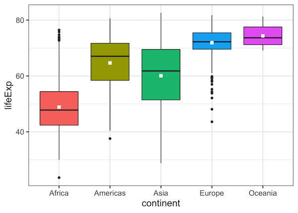
Boxplots are a great way to visualize multiple distributions using summary statistics. Boxplot shows five summary statistics; the minimum, the maximum, the median, and the first and third quartiles of the data. Sometimes, you might want to add other statistical summary values on the boxplot. In this post, we will see how to show mean… Continue reading How To Show Mean Value in Boxplots with ggplot2?
Connect Paired Points on Boxplots with Lines in ggplot2
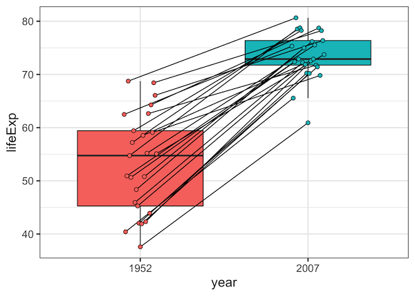
Want to show relationships between paired observations or track changes across groups in your boxplots? This comprehensive guide shows you exactly how to connect points boxplot ggplot2 using lines, with practical examples for before/after studies, paired data, and longitudinal analysis. Standard boxplots are excellent for comparing distributions, but they don’t reveal relationships between individual data… Continue reading Connect Paired Points on Boxplots with Lines in ggplot2