
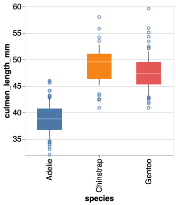
In this post, we will learn how to make boxplot with data points using Altair. Latest version of Altair supports making simple boxplots. However, current version of Altair does not support adding adding jittered data points on top of boxplots. Thanks to Justin Bois from Caltech, we can use his data visualization utility package Altair-catplot,… Continue reading How to Make Boxplot with Jittered Data Points using Altair in Python
Tag: Altair
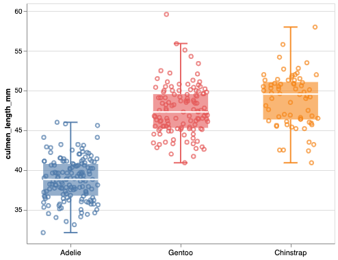
8 Tips to Make Better Boxplots with Altair in Python

In this tutorial, we will learn how to make boxplot using Altair in Python. We will start with making a simple boxplot and show how we can make the boxplot better with useful Altair tips. Let us load Altair and check its version We will use Palmer Penguins dataset to learn the tips to make… Continue reading 8 Tips to Make Better Boxplots with Altair in Python
How To Make Density Plot in Python with Altair?

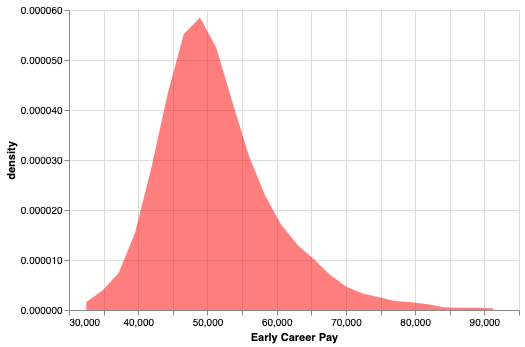
Density plots are like histogram, but displays density instead of counts. In this post, we will see a simple example of making a density plot in Python using Altair. Let us load Pandas and Altair to make density plot. We will use the tuition dataset from TidyTuesday project. Within tuition dataset we will look at… Continue reading How To Make Density Plot in Python with Altair?
How to Make Overlapping Histograms in Python with Altair?

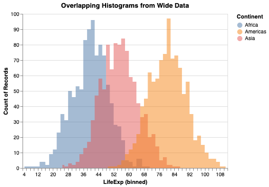
In this post, we will learn how to make multiple overlapping histograms in Python using Altair. Using Altair, we can make overlapping histograms or layers histograms from data that is in wide form and long tidy form. We will see an example of making overlapping histograms from data in tidy form first and then from… Continue reading How to Make Overlapping Histograms in Python with Altair?
How To Highlight a Bar in Bar Chart in Altair?

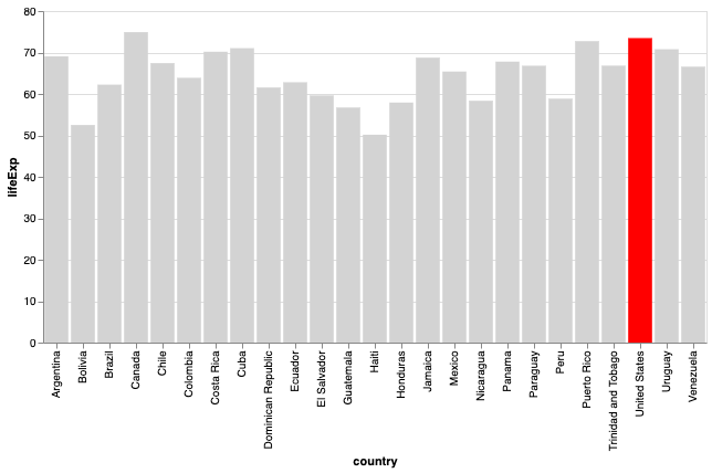
Bar charts are a simple visualization that plots a quantitative variable corresponding to categorical variable as bars. Sometimes we might want to highlight a specific bar in barplot with different color compared to the rest. In this post, we will see examples of * How to Make a simple barplot or barchart with Altair? *… Continue reading How To Highlight a Bar in Bar Chart in Altair?