Density plots are like histogram, but displays density instead of counts. In this post, we will see a simple example of making a density plot in Python using Altair.
Let us load Pandas and Altair to make density plot.
# load pandas
import pandas as pd
# load Altair
import altair as alt
alt.__version__
'4.0.0'
We will use the tuition dataset from TidyTuesday project. Within tuition dataset we will look at salary potential after graduation. We can load the dataset directly from TidyTuesday project’s github page.
data_url='https://raw.githubusercontent.com/rfordatascience/tidytuesday/master/data/2020/2020-03-10/salary_potential.csv'
df = pd.read_csv(data_url)
df.head()
And this is how the salary potential data looks like. It has college, state and early and mid career salary information.
df.iloc[0:5,0:5]
	rank	name	state_name	early_career_pay	mid_career_pay
0	1	Auburn University	Alabama	54400	104500
1	2	University of Alabama in Huntsville	Alabama	57500	103900
2	3	The University of Alabama	Alabama	52300	97400
3	4	Tuskegee University	Alabama	54500	93500
4	5	Samford University	Alabama	48400	90500
In this tutorial, we will focus on univariate density plot and use early career pay to make density plot using Altair.
df=df[["early_career_pay"]]
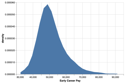
How to Make Simple Density Plot in Altair using transform_density()?
Now we are all set to make density plot. One of the things we need to do is to transform our salary data into density. In Altair, we can do that using transform_density() function by feeding the variable of interest. And then we specify a name for transformed variable and what type of transformation we need using
“as_=[‘Early Career Pay’, ‘density’]”.
alt.Chart(df).transform_density(
    'early_career_pay',
    as_=['Early Career Pay', 'density'],
).mark_area().encode(
    x="Early Career Pay:Q",
    y='density:Q',
)
Then we can go ahead to make density plot using mark_area() function in Altair. By default, we get a nice density plot filled with blue color.
How to Change Color of Density Plot in Altair?
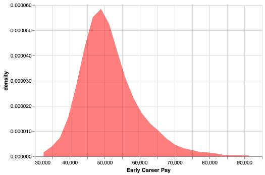
Let us customize the density plot by changing the color to fill with and transparency in Altair. To do that we specify color and opacity inside mark_area() function.
alt.Chart(df).transform_density(
    'early_career_pay',
    as_=['Early Career Pay', 'density'],
).mark_area(
    color='red',opacity=0.3
).encode(
    x="Early Career Pay:Q",
    y='density:Q',
)
Now we get a nice density plot, this time with the color we manually specified.