
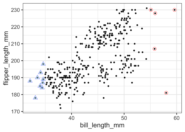
In this tutorial, we will learn how to add circles/triangles around a select data points in a scatter plot made with ggplot2 in R. Adding circles/triangles around data points is yet another way to add annotation to data points to highlight them to attract attention to the region of the plot. Let us load tidyverse… Continue reading How To Add Circles Around Specific Data Points in R
Tag: R
How To Annotate Clusters with Circle/Ellipse by a Variable in R

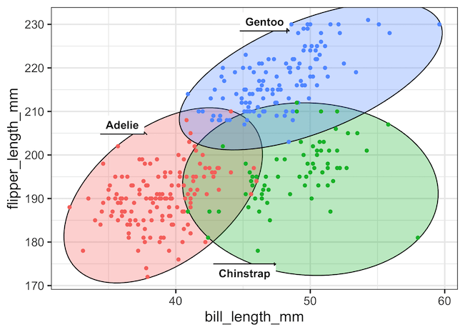
In this tutorial, we will learn how to annotate a plot by circle or ellipse based on a categorical variable in the data. We will use ggforce package’s geom_mark_circle() and geom_mark_ellipse() functions to annotate with circles and ellipse. Unlike geom_circle() function to annotate a plot, geom_mark_* functions automatically computes the circle/ellipse radius to draw around… Continue reading How To Annotate Clusters with Circle/Ellipse by a Variable in R
How To Annotate a Plot with Circle in R

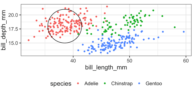
In this tutorial, we will learn how to annotate a plot with circle to highlight a select portion of a plot made with ggplot2 in R. There are a few options to add a circle on top of a plot with ggplot2. In this example, we will annotate a plot with a circle at a… Continue reading How To Annotate a Plot with Circle in R
Visualizing Missing Data with Barplot in R
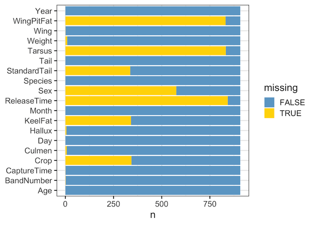
One of the first and most critical steps in any data exploration project is understanding the extent of missing data. Missing values, or NAs, can significantly impact your analysis and modeling results. While there are a few quick ways to visualize missing data, one of the most intuitive is the stacked bar plot. In this… Continue reading Visualizing Missing Data with Barplot in R
How to Add Labels Directly in ggplot2. Hint: Use Secondary Axis Trick
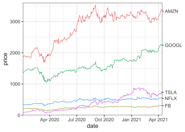
Legends can be of great help to understand a plot. Typically, ggplot2 adds legend by default on right side of the plot based on the variable that we used to color or fill. However, as Cluas Wilke says in his fantastic book on Data Visualization, legends can make the plot difficult to understand as well.… Continue reading How to Add Labels Directly in ggplot2. Hint: Use Secondary Axis Trick