
Legends can be of great help to understand a plot. Typically, ggplot2 adds legend by default on right side of the plot based on the variable that we used to color or fill.
However, as Cluas Wilke says in his fantastic book on Data Visualization, legends can make the plot difficult to understand as well.
Even though legend legibility can be improved by encoding data redundantly, in multiple aesthetics, legends always put an extra mental burden on the reader. In reading a legend, the reader needs to pick up information in one part of the visualization and then transfer it over to a different part. We can typically make our readers’ lives easier if we eliminate the legend altogether.
Eliminating the legend does not mean, however, that we simply not provide one and instead write sentences such as “The yellow dots represent Iris versicolor” in the figure caption. Eliminating the legend means that we design the figure in such a way that it is immediately obvious what the various graphical elements represent, even if no explicit legend is present.
One of the solutions to this problem is “direct labeling”. Basically, with direct labeling. we add suitable text labels or annotations right on the plot itself. This can relieve the readers mental burden of transferring legend information on one side of the plot to the actual plot. Claus Wilke also shared how to directly add the labels using ggplot2 in R. The trick is to use ggplot’2 secondary axis argument “sec.axis”.
In this post, we will make a simple time series plot with few tech companies stock data from January 2020 to April 2021. Let us get started by loading tidyverse.
library(tidyverse)
theme_set(theme_bw(16))
We will load the stock data directly from datavizpyr’s github page.
link2data <- "https://bit.ly/3dqO4V9"
stock_df <- read_tsv(link2data)
Our data looks like this.
head(stock_df)

## # A tibble: 6 x 3
##   company date       price
##   <chr>   <date>     <dbl>
## 1 AMZN    2020-01-02 1898.
## 2 AMZN    2020-01-03 1875.
## 3 AMZN    2020-01-06 1903.
## 4 AMZN    2020-01-07 1907.
## 5 AMZN    2020-01-08 1892.
## 6 AMZN    2020-01-09 1901.
Let us make a simple time series plot with geom_line() to see the change in stock price over time.
stock_df %>%
  ggplot(aes(x=date, y=price, color=company))+
  geom_line()
ggsave("Simple_Time_Series_plot_with_legend_labels_in_wrong_order_ggplot2_R.png")
Since we are adding colors using the variable “company”, ggplot2 has added colors to the line and a legend on the right side. Note that the order of the plot is different from the legend label order and also it is harder to match the colors on legend labels with the plot.

Direct Labelling with sec.axis in ggplot2
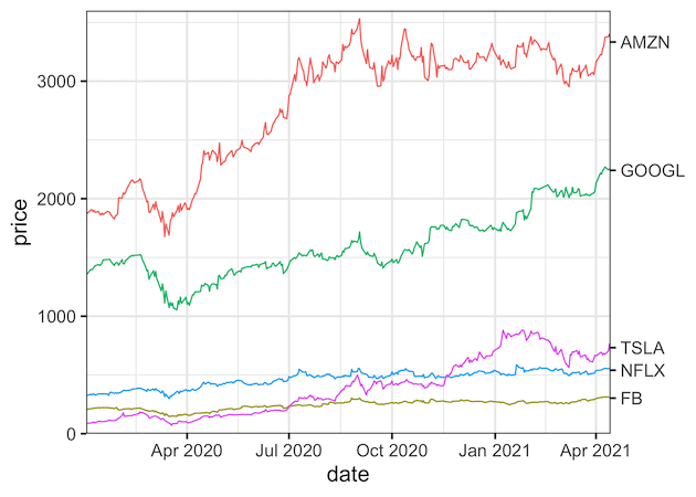
One of the solutions is to directly label the plots. The trick we use here is add secondary axis using “sec.axis” argument and add the company names on the secondary axis. In this case we will be creating secondary axis on y-axis. To add the label at the end of the plot on the secondary axis, we need to know the last stock value for each company.
Here we use groupby() and last() functions to get the last value for each company.
stock_last_df <- stock_df %>%
    group_by(company) %>%
    summarize(
        last = dplyr::last(price)
    )
stock_last_df

## # A tibble: 5 x 2
##   company  last
##   <chr>   <dbl>
## 1 AMZN    3333
## 2 FB       303.
## 3 GOOGL   2242.
## 4 NFLX     540.
## 5 TSLA     732.
With the secondary axis idea to directly label the plot, let us us first make the line plot as before with geom_line(). We add secondary axis using sce.axis as argument to scale_y_continous() function. Here we specify dup_axis() function with specification to add breaks and labels on the secondary y-axis. In addition we also remove any empty white space using expand argument for both the axes.
stock_df %>%
  ggplot(aes(x=date, y=price, color=company))+
  geom_line()+
  scale_x_date(expand = c(0,0))+
  scale_y_continuous(
    limits = c(0, 3600),
    expand = c(0,0),
    sec.axis = dup_axis(
      breaks = stock_last_df$last,
      labels = stock_last_df$company,
      name = NULL
    )
  ) +
  guides(color="none")
ggsave("direct_labeling_with_secondary_axis_ggplot2_R.png")
Check out the ticks on secondary y-axis that we added with “breaks” argument and the company names we added with “labels” argument. We have directly labeled the lines and it is much easier read and interpret the plot.
Explore the Complete ggplot2 Guide
35+ tutorials with code: scatterplots, boxplots, themes, annotations, facets, and more—tested and beginner-friendly.
Visit the ggplot2 Hub → No fluff—just code and visuals.


