
Faceting in ggplot2 is one of the most powerful ways to create small multiples—a series of plots split by a grouping variable. With facet_wrap() and facet_grid(), you can easily compare distributions, trends, or relationships across categories.
New to facets? Start here: How to make a facet plot using facet_wrap().
By default, each facet panel comes with borders and spacing, but for cleaner, publication-ready plots, you may want to adjust or remove them.
Here, we’ll focus on how to customize facet borders and spacing, including removing panel border lines and adjusting/removing spacing between facet panels. These tricks are especially useful when you want a cleaner publication-ready figure.
In this tutorial, we’ll walk through step by step:
- Creating a faceted plot with
facet_wrap() - Removing the default panel borders
- Removing or reducing spacing between panels
- Adding extra customizations
Step 1: Load Data and Packages
We’ll use the palmerpenguins dataset (three penguin species). Let’s load packages and set a clean white background theme. Want more theme ideas? See ggplot2 themes to make your plot look better and how to change ggplot2 theme.
library(tidyverse)
library(palmerpenguins)

# set theme
theme_set(theme_bw(18))

penguins |> head()

## # A tibble: 6 x 8
##   species island bill_length_mm bill_depth_mm flipper_length_… body_mass_g sex
##
## 1 Adelie  Torge…           39.1          18.7              181        3750 male
## 2 Adelie  Torge…           39.5          17.4              186        3800 fema…
## 3 Adelie  Torge…           40.3          18                195        3250 fema…
## 4 Adelie  Torge…           36.7          19.3              193        3450 fema…
## 5 Adelie  Torge…           39.3          20.6              190        3650 male
## 6 Adelie  Torge…           38.9          17.8              181        3625 fema…
## # … with 1 more variable: year
Step 2: Create a Boxplot with facet_wrap()
Now, let’s make a simple boxplot of bill length by sex, and split it into panels for each penguin species using facet_wrap(). For more variations on boxplots, see grouped boxplots with jittered points in ggplot2.
:
penguins |>
  ggplot(aes(x = sex, y = bill_length_mm, color = sex)) +
  geom_boxplot(outlier.shape = NA, width = 0.5) +
  geom_jitter(width = 0.15, alpha = 0.5) +
  facet_wrap(~species) +
  theme(legend.position = "none")
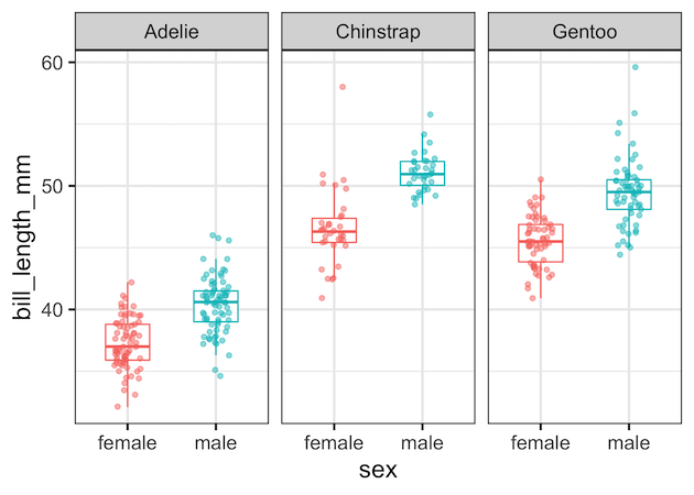
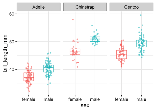
Step 3: Remove Panel Borders
By default, each panel has a grey border. To get rid of it, add panel.border = element_blank() inside theme():
penguins %>%
  ggplot(aes(x = sex, y = bill_length_mm, color = sex)) +
  geom_boxplot(outlier.shape = NA, width = 0.5) +
  geom_jitter(width = 0.15, alpha = 0.5) +
  facet_wrap(~species) +
  theme(legend.position = "none",
        panel.border = element_blank())
Now we get a face plot without any panel borders.
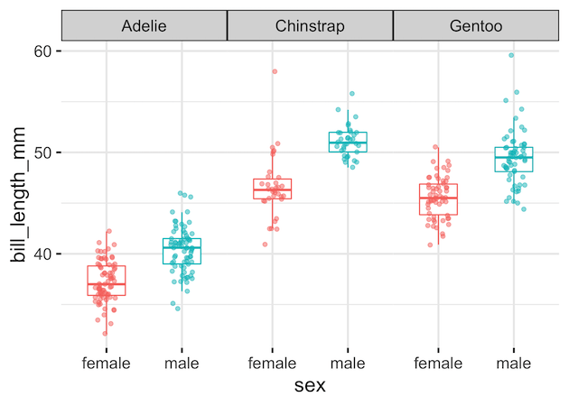
Step 4: Remove or Reduce Spacing Between Panels
If you’d like your panels to sit right next to each other, use panel.spacing.x. Setting it to zero removes the gaps:
penguins %>%
  ggplot(aes(x = sex, y = bill_length_mm, color = sex)) +
  geom_boxplot(outlier.shape = NA, width = 0.5) +
  geom_jitter(width = 0.15, alpha = 0.5) +
  facet_wrap(~species) +
  theme(legend.position = "none",
        panel.border = element_blank(),
        panel.spacing.x = unit(0, "line"))
If you just want smaller gaps, try:
theme(panel.spacing.x = unit(0.5, "lines"))
Other Common Facet Border Tweaks
Once you remove facet panel borders, these related customizations are the ones readers most often need. Each example uses the Palmer Penguins dataset and the same faceted boxplot so it’s easy to compare results.
Setup (shared for the tweaks below)
library(tidyverse)
library(palmerpenguins)
library(grid)  # for unit()

penguins_clean
   drop_na(sex, bill_length_mm)

base_plot
  ggplot(penguins_clean, aes(sex, bill_length_mm, color = sex)) +
  geom_boxplot(outlier.shape = NA, width = 0.55) +
  geom_jitter(width = 0.12, alpha = 0.6, size = 1.7) +
  facet_wrap(~ species)
1) Remove facet strip background (keep bold labels)
After dropping panel borders, the grey strip box can still feel heavy. Removing strip.background keeps the minimalist look and focuses attention on data. Make labels bold for legibility without reintroducing boxes. This combo is a popular “clean” house style for papers, dashboards, and slides.
base_plot +
  theme_bw() +
  theme(
    panel.border = element_blank(),
    strip.background = element_blank(),
    strip.text = element_text(face = "bold")
  )


2) Remove all grid lines (super clean canvas)
Gridlines help read values, but once borders are gone, lots of lines can clutter. Setting panel.grid = element_blank() creates a neutral canvas that emphasizes shapes and differences across facets. Keep axis labels and a few breaks so readers can still anchor estimates without visual noise.
base_plot +
  theme_bw(18) +
  theme(
    panel.border = element_blank(),
    strip.background = element_rect(fill = "grey95", color = "grey60"),
    panel.grid = element_blank()
  )
ggsave("remove_facet_strip_background_ggplot2.png", width=9, height=6)


3) Keep only horizontal grid lines
For vertical comparisons (like boxplot heights), horizontal guides are useful while vertical guides distract. Removing x-direction grids preserves just y-direction references. It’s a widely searched tweak that balances cleanliness with readability—especially effective when you also tighten panel spacing and drop borders.
base_plot +
  theme_bw() +
  theme(
    panel.border = element_blank(),
    panel.grid.major.x = element_blank(),
    panel.grid.minor.x = element_blank()
  )

Step 5: Extra Facet Customizations
These tweaks help you polish faceted charts further:
-
facet_wrap(~species, nrow = 1)→ one-row layout -
theme(strip.background = element_blank())→ remove strip background; see also remove facet_wrap title box -
theme(strip.text = element_text(size = 14, face = "bold"))→ larger, bold strip labels; also try wrap really long facet labels and wrap long strip labels in facet_wrap - Control label placement with move facet strip label to the bottom
- Control panel order with specify the order of panes in facet_wrap (and reverse order in facet)
- Prefer colored boxes? See change facet_wrap box color
For titles, captions, and annotation tips that pair well with facets, see ggplot2 labels & annotations cookbook.
Summary
-
facet_wrap()quickly builds small multiples. - Remove borders with
theme(panel.border = element_blank()). - Control spacing using
panel.spacing.x. - Polish labels and layout with the strip and ordering tips above.
FAQs (Advanced Faceting in ggplot2)
How do I facet by two variables in ggplot2?
Use facet_grid() when you want rows and columns. For example:
facet_grid(species ~ island) creates a matrix of panels where rows are species and columns are islands. This is ideal for comparing categories across two dimensions.
How do I reorder facet panels?
Reorder the factor levels of the faceting variable before plotting. For example:
penguins$species Facets will follow the factor level order you specify.
How do I change the position of facet labels (strip labels)?
Use the strip.position argument. For example, facet_wrap(~species, strip.position = "bottom") moves labels below each panel. In facet_grid(), you can also use switch = "x" or switch = "y" to place labels on alternate sides.
How do I control the number of rows and columns in facet_wrap()?
Use nrow or ncol. For a single row layout, use facet_wrap(~ species, nrow = 1). For two columns, use ncol = 2. This is helpful for fitting figures into narrow or wide layouts without resizing text.
Explore the Complete ggplot2 Guide
35+ tutorials with code: scatterplots, boxplots, themes, annotations, facets, and more—tested and beginner-friendly.
Visit the ggplot2 Hub → No fluff—just code and visuals.


