Stacked barcharts are a variant of barplots, when you have data from multiple groups. In this tutorial, we will see two examples of making stacked barplots using ggplt2 in R. First we will see how to make stacked barplot of two groups with one on top of the other. In the second example we will see an example of how to make stacked barplots of two groups, where the two groups are side by side.
Let us first load tidyverse and set ggplot2 theme for making plots.
library(tidyverse)
theme_set(theme_bw(base_size=16))
For this stacked barplot example, we will use data derived from StackOverflow Survey results from 2019. We have already processed the results to derive a smaller dataset for this example.
The derived data explores the use social media by developers from StackOverflow survey results. Let us load the social media useage summary data from DataVizPyR.com‘s github page.
# social media usage results from StackOverflow 2019 Survey
socialmedia_data_file <- "https://raw.githubusercontent.com/datavizpyr/data/master/SO_data_2019/StackOverflow_Survey_2019_Social_Media_Usage.csv"
socialmedia_usage <- readr::read_csv(socialmedia_data_file)
Our data to make stacked barplots looks like this. In this example, the two groups of interest is Gender.
head(socialmedia_usage)
## # A tibble: 6 x 3
##   SocialMedia              Gender     n
##   <chr>                    <chr>  <dbl>
## 1 Facebook                 Man     1598
## 2 Facebook                 Woman    238
## 3 I don't use social media Man      910
## 4 I don't use social media Woman     41
## 5 Instagram                Man      778
## 6 Instagram                Woman    266
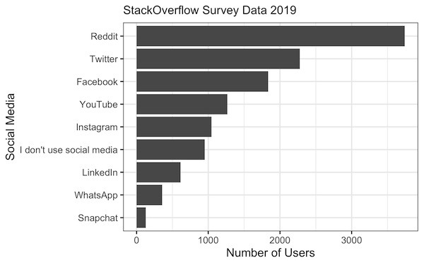
Ordered Horizontal Barplot with coord_flip() and fct_reorder()
Let us first make a simple barplot using ggplot2 in R. We will the type social media on the x-axis and the number of users on y-axis. To make the barplot easier to interpret, we will also reorder the bars in barplot by number of users.
socialmedia_usage %>%
  ggplot(aes(x=forcats::fct_reorder(SocialMedia,n),y=n)) +
  geom_col() +
  coord_flip() +
  labs(x="Social Media", y="Number of Users")
Since the names of social media user groups are longer, we also use coord_flip() to make horizontal barplot with ggplot2.
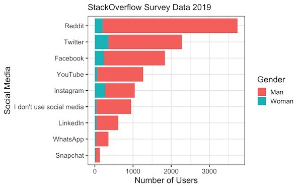
Stacked Barplot
We have the simple barplot we wanted. Now let us make a stacked bar plots to see the user counts grouped by gender.
The only change we need to make to the above code to get a stacked barplot is to add “fill=Gender” within the aesthetics of ggplot() function.
socialmedia_usage %>%
  ggplot(aes(x=forcats::fct_reorder(SocialMedia,n),y=n, fill=Gender)) +
  geom_col() +
  coord_flip() +
  labs(x="Social Media", y="Number of Users")
ggplot2 groups the bars by the values of the grouping variable, in this case Man and Woman. By default, ggplot stacks each group on top of each other with a color for each group.
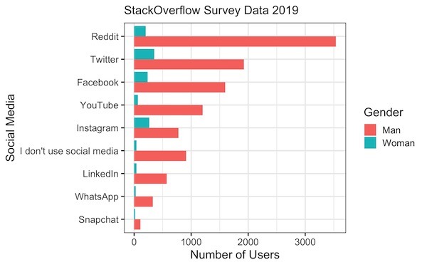
Stacked Barplot Side By Side with position=”dodge”
Barplots stacked vertically are often harder to interpret, as it is harder to make comparison with one main group to another. A better solution is to make the grouped barplots such that bars are located side-by-side.
We have used geom_col() function to make barplots with ggplot2. To make barplots with bars side by side, all we need to do is add `position=”dodge”` within geom_col() function to the above code.
socialmedia_usage %>%
  ggplot(aes(x=forcats::fct_reorder(SocialMedia,n), y=n, fill=Gender)) +
  geom_col(position="dodge") +
  coord_flip() +
  labs(x="Social Media", y="Number of Users")
Now we have stacked barplot or grouped barplots where the bars are side by side. And we can see that that side by side bars are easier make comparison.