Heatmaps are data visualization tool that displays a matrix of data as a matrix of colors. For example, matrix elements with low values will have lighter colors and the elelments with high values will have a darker color.
In earlier post we saw examples of making heatmap using ggplot2 in R. However, we assumed that the data for making heatmap is already given to us in tidy long form.
Often we might want to make heatmap from a matrix. A matrix of data is not in long form preferred by ggplot2.
In this post, we will see an example of making a heatmap using ggplot2, but starting with a matrix of data.
Let us first load tidyverse, a suite of R packages from RStudio.
library(tidyverse)
In this example, to make heatmap from a matrix, we will use simulated data. We will first simulate a matrix containing random numbers, but no signal.
n_row <- 30
n_col <- 10
# a mtrix with random numbers
dat <- matrix(rnorm(n_row*n_col),ncol=n_col)
dim(dat)
Let us set column and row names for the data matrix.
# column and row names
colnames(dat) <- paste0("S",seq(1,n_col))
rownames(dat) <- paste0("f",seq(1,n_row))
Let us add some signal to the random matrix such that there are two groups of samples in the matrix; one set of samples with smaller values on an average and the second group with larger values on an average.
# add signals to matrix
dat[,1:(n_col/2)] <- matrix(rnorm(n_row*n_col/2,mean=50,sd=5),ncol=n_col/2)
dat[,((n_col/2)+1):n_col] <- matrix(rnorm(n_row*n_col/2,mean=70,sd=5),n_col/2)
#colnames(dat) <- paste0("S",c(rep(1,n_col/2),rep(2,n_col/2)))
head(dat)
Now we have our data in matrix form. To use the data with ggplot2, we need to convert to tidy form. We will use the rownames and use tidyr’s pivot_longer() function to convert the matrix to dataframe or tibble in tidy long format.
dat %>%
  as.data.frame() %>%
  rownames_to_column("f_id") %>%
  pivot_longer(-c(f_id), names_to = "samples", values_to = "counts")
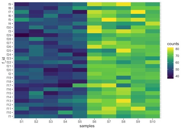
The resulting dataframe contains three columns. Now we can use ggplot2’s functions geom_raster() or geom_tile() to make a heatmap.
dat %>%
  as.data.frame() %>%
  rownames_to_column("f_id") %>%
  pivot_longer(-c(f_id), names_to = "samples", values_to = "counts") %>%
  ggplot(aes(x=samples, y=f_id, fill=counts)) +
  geom_raster() +
  scale_fill_viridis_c()
One of the minor details that one might need to be aware is that the order of the samples in heatmap might get messed up depending on the names of the factors used. In this example, feature ids can get out of order, note S10 is out of order.
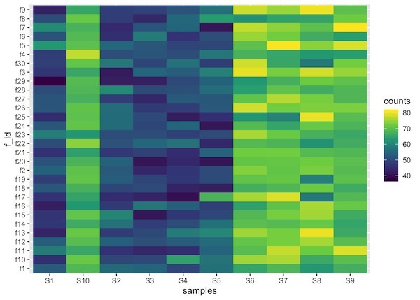
We can fix that by specifying the levels of the factor using forcats’ fct_relevel() function as below.
dat %>%
  as.data.frame() %>%
  rownames_to_column("f_id") %>%
  pivot_longer(-c(f_id), names_to = "samples", values_to = "counts") %>%
  mutate(samples= fct_relevel(samples,colnames(dat))) %>%
  ggplot(aes(x=samples, y=f_id, fill=counts)) +
  geom_raster() +
  scale_fill_viridis_c()