In this tutorial, we will see examples of making barplots and coloring the barplots in a few simple ways. We will see how to color barplots manually by specifying a color of interest and how to color a barplot by another variable in the dataset.
Let us load tidyverse suite of packages and set the theme with base size of the labels.
library(tidyverse)
theme_set(theme_bw(base_size=16))
In this tutorial to color barplots, we will use data set from 2019 Stack Overflow Developer survey. Here we use salary data for 5 educational group with a few more variables including gender and coding experience.
stackoverflow_file <- "https://raw.githubusercontent.com/datavizpyr/data/master/SO_data_2019/StackOverflow_survey_filtered_subsampled_2019.csv"

survey_results <- read_csv(stackoverflow_file)
## Parsed with column specification:
## cols(
##   CompTotal = col_double(),
##   Gender = col_character(),
##   Manager = col_character(),
##   YearsCode = col_character(),
##   Age1stCode = col_character(),
##   YearsCodePro = col_character(),
##   Education = col_character()
## )
In this post we will compare the effect of education on median salary. Let us compute median salary for each educational group.
median_salary <- survey_results %>%
  filter(!is.na(Education))%>%
  group_by(Education) %>%
  summarize(Salary =median(CompTotal))
We have five educational groups with their median salary.
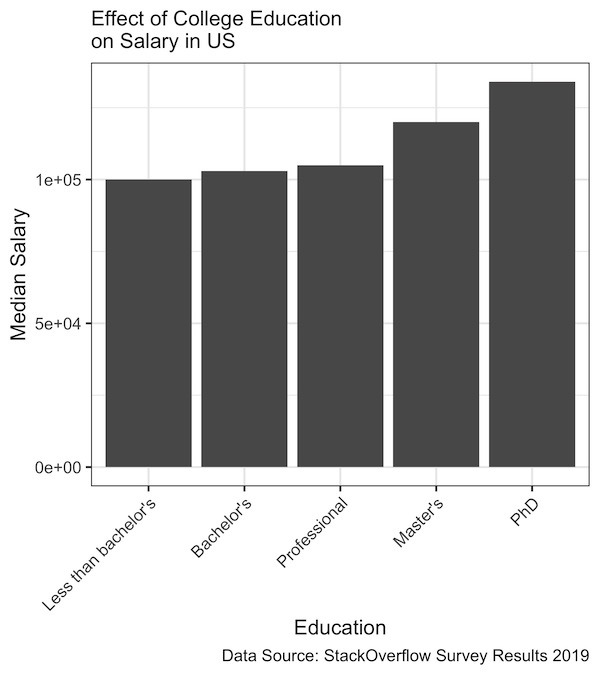
median_salary
## # A tibble: 5 x 2
##   Education            Salary
##   <chr>                 <dbl>
## 1 Bachelor's           103000
## 2 Less than bachelor's 100000
## 3 Master's             120000
## 4 PhD                  134000
## 5 Professional         105000
Let us make a simple barplot with education on x-axis and median salary on y-axis. Let us reorder the bars by median salary and we can see an increase in salary with educational level.
median_salary %>%
  ggplot(aes(x=fct_reorder(Education, Salary), y=Salary)) +
  geom_col()+
  theme(axis.text.x = element_text(angle = 45, hjust = 1))+
  labs(x= "Education",
       y="Median Salary",
       subtitle="Effect of College Education\non Salary in US",
       caption="Data Source: StackOverflow Survey Results 2019")
Since the names of the education groups are longer, we place the x-axis labels at 45 degree to make it easy to read the labels.
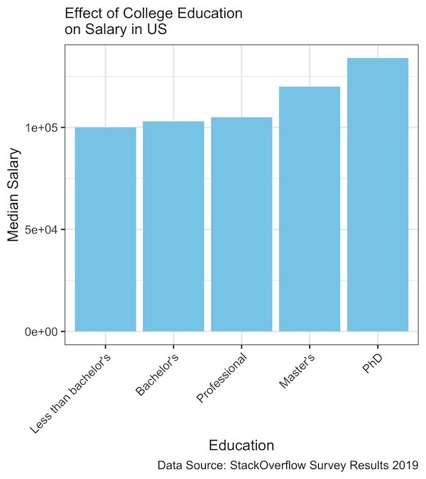
By default, ggplot2 fills the bars in barplot in grey color. To change the fill color, we can manually specify the color of interest as argument to geom_col() function.
median_salary %>%
  ggplot(aes(x=fct_reorder(Education, Salary,), y=Salary)) +
  geom_col(fill="skyblue")+
  theme(axis.text.x = element_text(angle = 45, hjust = 1))+
  labs(x= "Education",
       y="Median Salary",
       subtitle="Effect of College Education\non Salary in US",
       caption="Data Source: StackOverflow Survey Results 2019")
In this example, we are filling the bars with skyblue color using fill=”skyblue”.
Sometime you may want to color the bars of a barplot by a variable. Let us color the barplot by Education level. Since we are filling the bars with color, we specify the fill argument with the variable of interest. In this case we use fill=Education within the aesthetics function of ggplot().
median_salary %>%
  ggplot(aes(x=fct_reorder(Education, Salary), y=Salary,
            fill=Education)) +
  geom_col()+
  theme(axis.text.x = element_text(angle = 45, hjust = 1))+
  labs(x= "Education",
       y="Median Salary",
       subtitle="Effect of College Education\non Salary in US",
       caption="Data Source: StackOverflow Survey Results 2019")
And this will color each bar in different color with a legend connecting the color to variable.