
Want to display exact values or add custom labels to your heatmap cells? This comprehensive guide shows you exactly how to add ggplot2 heatmap text annotation using geom_text(), geom_label(), and advanced formatting techniques for professional data visualizations. Heatmaps are excellent for visualizing data patterns through color intensity, but sometimes you need to show precise values… Continue reading How to add text annotation to heatmap with ggplot2
Category: Heatmaps in R
How To Make Heatmaps in R with ComplexHeatmap?

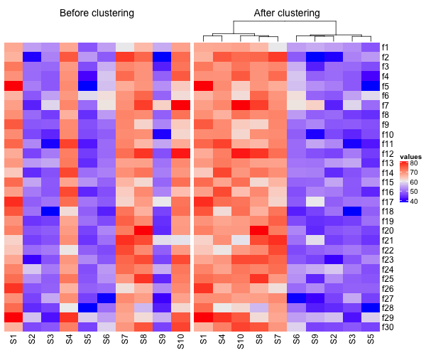
Heatmaps are a great way visualize a numerical dataset in a matrix form. Basically, a heatmap shows the actual data values as colors. When there is a broad trend in data, like change in data over rows or columns of data, a heat map makes it easy to see the broader trend. In this tutorial,… Continue reading How To Make Heatmaps in R with ComplexHeatmap?
How to Make Heatmaps in R with pheatmap?
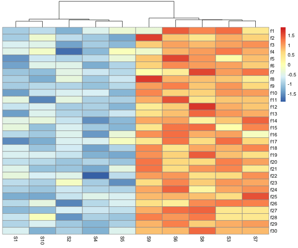
Heatmaps are one of the ways to visualize quantitative data in two dimension. Heatmaps show the actual data as colors and can reveal common patterns easily. In R, there are multiple ways to make heatmap starting from data in matrix form. In this post, we will learn how to make simple heatmaps with using pheatmap… Continue reading How to Make Heatmaps in R with pheatmap?
Heatmap from Matrix using ggplot2 in R

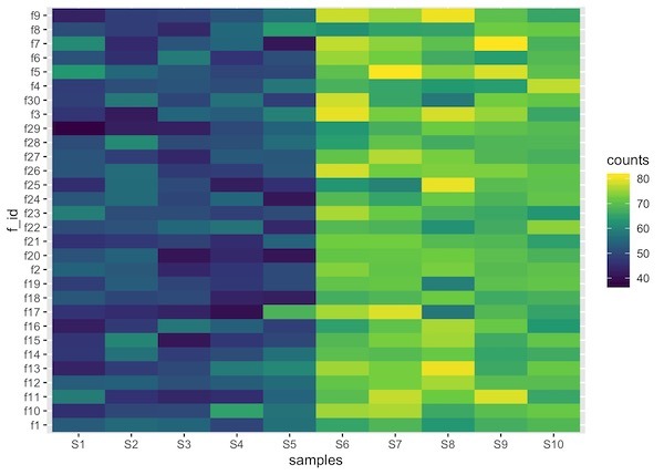
Heatmaps are data visualization tool that displays a matrix of data as a matrix of colors. For example, matrix elements with low values will have lighter colors and the elelments with high values will have a darker color. In earlier post we saw examples of making heatmap using ggplot2 in R. However, we assumed that… Continue reading Heatmap from Matrix using ggplot2 in R
How To Make Simple Heatmaps with ggplot2 in R?
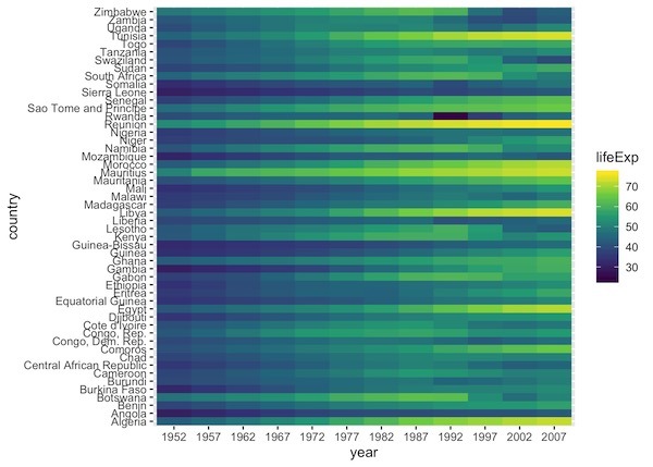
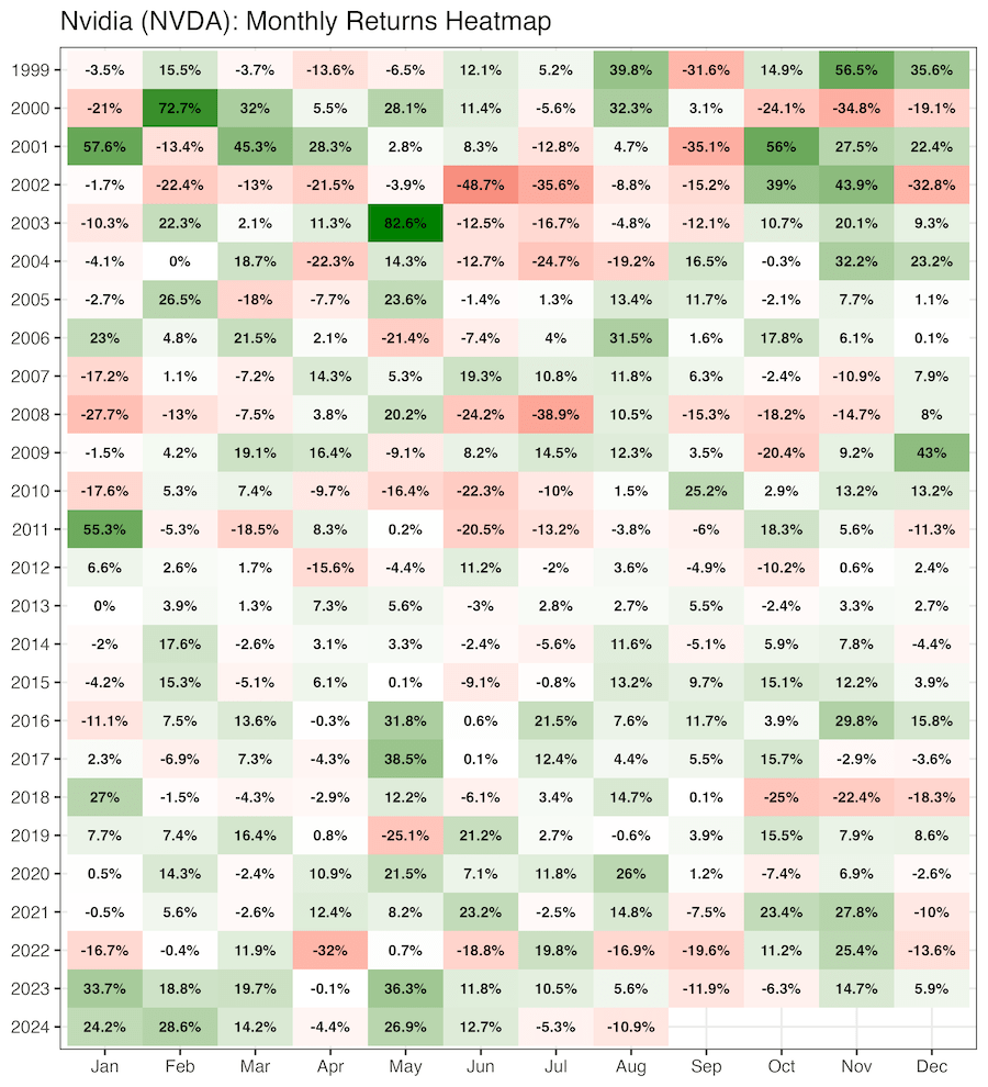
Heatmaps are a powerful way to visualize multi-dimensional data. By representing numerical values as colors within a matrix, heatmaps allow us to spot patterns, clusters, and outliers instantly. For example, you might visualize high values in a dark color and low values in a light color, making data trends immediately apparent to the human eye.… Continue reading How To Make Simple Heatmaps with ggplot2 in R?