
Want to display exact values or add custom labels to your heatmap cells? This comprehensive guide shows you exactly how to add ggplot2 heatmap text annotation using geom_text(), geom_label(), and advanced formatting techniques for professional data visualizations.
Heatmaps are excellent for visualizing data patterns through color intensity, but sometimes you need to show precise values or add explanatory text to specific cells. Adding text annotations transforms basic heatmaps into informative visualizations that communicate both visual patterns and exact numerical details.
In this tutorial, you’ll master add text to heatmap ggplot2 techniques using multiple annotation methods, custom positioning, and styling options. Whether you’re creating correlation matrices, confusion matrices, or performance dashboards, these methods will help you create clear, readable heatmaps with meaningful annotations.
What You’ll Learn:
- ✅ Adding cell values with geom_text() and geom_label()
- ✅ Custom text positioning and alignment
- ✅ Formatting numbers and percentages in annotations
- ✅ Conditional text styling based on cell values
- ✅ Color coordination with heatmap backgrounds
- ✅ Advanced annotation techniques for complex heatmaps
- ✅ Best practices for readable text on colored backgrounds
In ggplot2, we can make simple heatmaps using ggplot2’s geom_raster() and geom_tile(). In this post, we will use geom_text() to add text annotation, i.e. numerical values in the heatmap. We will also see multiple examples of adding color annotation based the numerical values visualized in the heatmap.
library(tidyverse)
library(tidyquant)
theme_set(theme_bw(16))
library(glue)
Let us make a heatmap of monthly returns of Nvidia stock since 1999.
start_date <- as.Date("1980-01-01")
end_date <- Sys.Date()
company_name <- "Nvidia"
stock_ticker <- "NVDA"
print(stock_ticker)
## [1] "NVDA"
We use tidyquant package to get the stock data
stock_df <- tq_get(stock_ticker,
                   from = start_date,
                   to = end_date)

stock_df |> head()

## # A tibble: 6 × 8
##   symbol date         open   high    low  close     volume adjusted
##   <chr>  <date>      <dbl>  <dbl>  <dbl>  <dbl>      <dbl>    <dbl>
## 1 NVDA   1999-01-22 0.0437 0.0488 0.0388 0.0410 2714688000   0.0376
## 2 NVDA   1999-01-25 0.0443 0.0458 0.0410 0.0453  510480000   0.0416
## 3 NVDA   1999-01-26 0.0458 0.0467 0.0411 0.0418  343200000   0.0383
## 4 NVDA   1999-01-27 0.0419 0.0430 0.0396 0.0417  244368000   0.0382
## 5 NVDA   1999-01-28 0.0417 0.0419 0.0413 0.0415  227520000   0.0381
## 6 NVDA   1999-01-29 0.0415 0.0417 0.0396 0.0396  244032000   0.0363
And compute monthly returns of the stock since 1999
monthly_return <- stock_df %>%
    tq_transmute( select     = adjusted,
               mutate_fun = periodReturn,
               period     = "monthly") %>%
    mutate(return= ifelse(monthly.returns > 0, "+ve", "-ve")) %>%
    mutate(year=factor(year(date)) ) %>%
    mutate(month=month(date, label=TRUE))
We have the data ready for making a heatmap.
monthly_return |>
  head()
## # A tibble: 6 × 5
##   date       monthly.returns return year  month
##   <date>               <dbl> <chr>  <fct> <ord>
## 1 1999-01-29         -0.0349 -ve    1999  Jan
## 2 1999-02-26          0.155  +ve    1999  Feb
## 3 1999-03-31         -0.0370 -ve    1999  Mar
## 4 1999-04-30         -0.136  -ve    1999  Apr
## 5 1999-05-28         -0.0651 -ve    1999  May
## 6 1999-06-30          0.121  +ve    1999  Jun
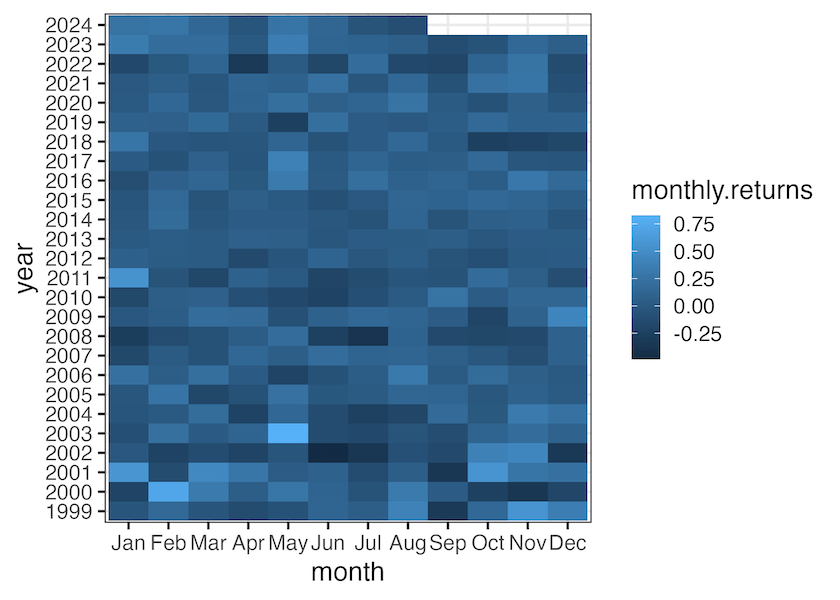
Heatmap with ggplot2’s geom_raster()
We can make a heat map with ggplot2’s geom_raster() function. Here is a heatmap of monthly returns of Nvidia over the years using geom_raster()
monthly_return |>
  ggplot(aes(x=month, y=year, fill=monthly.returns))+
  geom_raster()
ggsave("heatmap_with_geom_raster_ggplot2.png")


Heatmap with ggplot2’s
We can also use geom_tile() fin gggplot2 and make a heatmap. Here is the same heatmap of monthly returns of Nvidia over the years but using geom_tile()
monthly_return |>
  ggplot(aes(x=month, y=year, fill=monthly.returns))+
  geom_tile()
ggsave("heatmap_with_geom_tile_ggplot2.png")
monthly_return |>
  ggplot(aes(x=month, y=year, fill=return))+
  geom_raster()+
  geom_text(aes(label = paste0(round(monthly.returns*100,1), "%")))+
  scale_fill_brewer(palette = "Dark2")
ggsave("heatmap_with_text_color_annotation_ggplot2.png")

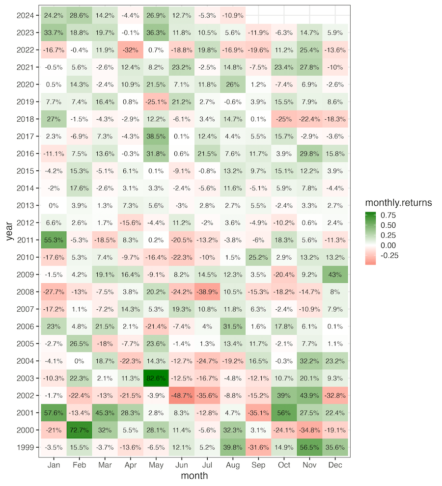
monthly_return |>
  ggplot(aes(x=month, y=year, fill=monthly.returns))+
  geom_raster()+
  geom_text(aes(label = paste0(round(monthly.returns*100,1), "%")))+
  scale_fill_gradient2(midpoint = 0, mid="white", low="#dc322f", high="#008000")
ggsave("text_annotation_to_heatmap_ggplot2.png", width=10, height=11)
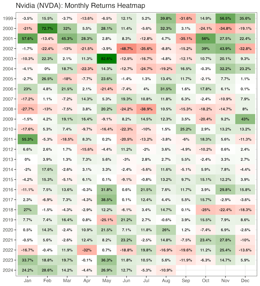
monthly_return |>
  ggplot(aes(x=month, y=fct_rev(year), fill=monthly.returns))+
  geom_raster()+
  geom_text(aes(label = paste0(round(monthly.returns*100,1), "%")),fontface = "bold")+
  scale_fill_gradient2(midpoint = 0, mid="white", low="#dc322f", high="#008000")+
  labs(title=glue("{company_name} ({stock_ticker}): Monthly Returns Heatmap"),
       x=NULL, y=NULL)+
  theme(legend.position = "none")
ggsave("customizing_text_annotation_to_heatmap_ggplot2.png", width=10, height=11)
Explore the Complete ggplot2 Guide
35+ tutorials with code: scatterplots, boxplots, themes, annotations, facets, and more—tested and beginner-friendly.
Visit the ggplot2 Hub → No fluff—just code and visuals.


