In this tutorial, we will learn how to add legends to a plot made with ggplot2 directly on the plot, so that it is much easier to understand the plot. When you make a plot with ggplot, adding legends to explain the plot is of great help to understand a plot. By default, ggplot2 adds legend when use third variable to add color/fill. Often such legends don’t help in certain plots like line plots over a period of time. In this example, we will use ggrepel package to add legends directly on the plot closer to lines in a time series plot.
library(tidyquant)
library(tidyverse)
library(glue)
library(ggrepel)
theme_set(theme_bw(16))
Let us make a line plot of multiple stock companies growth data over time to illustrate the benefit of adding labels/legends at the end of each line.
We will use top semiconductor chip making companies stock price data from the beginning of the year 2024 to now.
stock_tickers <- c("NVDA","AMD","INTC", "AVGO", "QCOM","TSM", "ASML")
company_names <-  c("Nvidia","AMD", "Intel","Broadcom", "Qualcomm","TSM", "ASML")

start_date <- "2024-01-01"
end_date  <- Sys.Date()
Let use use tidyquant’s tq_get() function to get the stock prices.
# get stock prices
stock_df <- stock_tickers |>
    tq_get(from = start_date, end_date=end_date)

stock_df |> head()

# A tibble: 6 × 8
  symbol date        open  high   low close    volume adjusted
  <chr>  <date>     <dbl> <dbl> <dbl> <dbl>     <dbl>    <dbl>
1 NVDA   2024-01-02  49.2  49.3  47.6  48.2 411254000     48.2
2 NVDA   2024-01-03  47.5  48.2  47.3  47.6 320896000     47.6
3 NVDA   2024-01-04  47.8  48.5  47.5  48.0 306535000     48.0
4 NVDA   2024-01-05  48.5  49.5  48.3  49.1 415039000     49.1
5 NVDA   2024-01-08  49.5  52.3  49.5  52.3 642510000     52.2
6 NVDA   2024-01-09  52.4  54.3  51.7  53.1 773100000     53.1
Since each companies stock prices differes and we are only interested in their growth, let us compute the growth of each companie with respect to its price on the first day of 2024.
stock_df <- stock_df |>
  group_by(symbol) |>
  mutate(growth = (adjusted-first(adjusted))/first(adjusted)) |>
  ungroup()
Now we have the data to make time series line plot of all the stocks.
stock_df

# A tibble: 6 × 9
# Groups:   symbol [1]
  symbol date        open  high   low close    volume adjusted   growth
  <chr>  <date>     <dbl> <dbl> <dbl> <dbl>     <dbl>    <dbl>    <dbl>
1 NVDA   2024-01-02  49.2  49.3  47.6  48.2 411254000     48.2  0
2 NVDA   2024-01-03  47.5  48.2  47.3  47.6 320896000     47.6 -0.0124
3 NVDA   2024-01-04  47.8  48.5  47.5  48.0 306535000     48.0 -0.00353
4 NVDA   2024-01-05  48.5  49.5  48.3  49.1 415039000     49.1  0.0193
5 NVDA   2024-01-08  49.5  52.3  49.5  52.3 642510000     52.2  0.0848
6 NVDA   2024-01-09  52.4  54.3  51.7  53.1 773100000     53.1  0.103
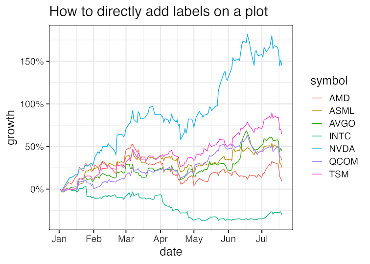
And here is the time series line plot of the semiconductor stock price growth. We can clearly see Nvidia is the winner by miles. However, a bunch of other companies have similar performances and it is harder to map the companies to the line even though we have legend to the plot on right hand side.
tock_df |>
  ggplot(aes(x=date, y=growth, color=symbol))+
  geom_line()+
  scale_y_continuous(
    labels = scales::percent,
    breaks= scales::breaks_pretty(8))+
  scale_x_date(breaks = scales::breaks_pretty(8))+
  labs(title = "How to directly add labels on a plot")
ggsave("how_to_directly_add_label_on_plot_with_ggrepel.png")

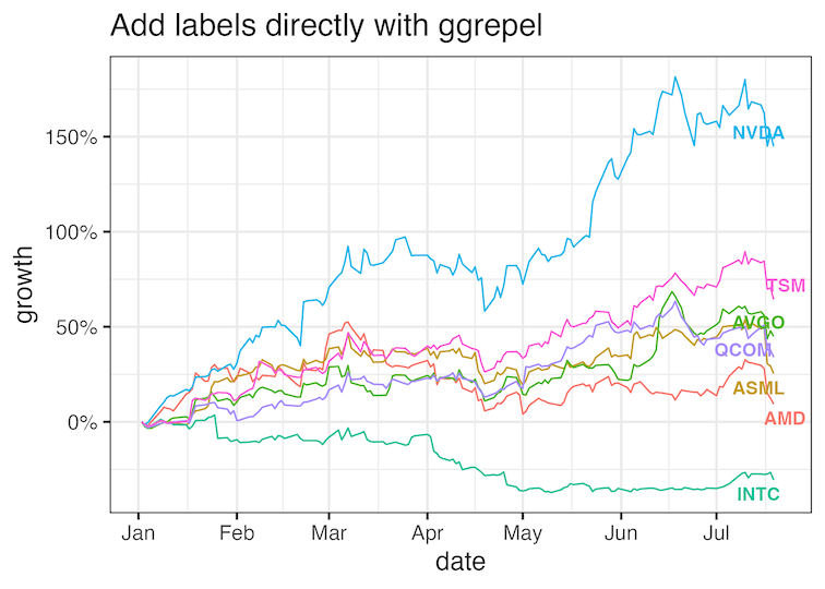
Adding labels directly on the plot
We will use ggrepel’s geom_text_repel() function to directly add the labels on the plot at the end of each line. To do that we need to find where each line ends, i.e. growth value for each company in the last time point in the plot. Let us compute the last value of growth for each stock.
final_value_df <- stock_df %>%
    group_by(symbol) %>%
    summarize(
        last = dplyr::last(growth)
    ) |>
  mutate(date=end_date)
final_value_df

# A tibble: 7 × 3
  symbol    last date
  <chr>    <dbl> <date>
1 AMD     0.0938 2024-07-21
2 ASML    0.254  2024-07-21
3 AVGO    0.450  2024-07-21
4 INTC   -0.305  2024-07-21
5 NVDA    1.45   2024-07-21
6 QCOM    0.340  2024-07-21
7 TSM     0.645  2024-07-21
Now we can add geom_text_repel() as additional layer and place labels at the end of each line in the time series plot.
stock_df |>
  ggplot(aes(x=date, y=growth, color=symbol))+
  geom_line()+
  scale_x_date(breaks = scales::breaks_pretty(8))+
  scale_y_continuous(
    labels = scales::percent,
    breaks= scales::breaks_pretty(8))+
   geom_text_repel(data = final_value_df,
                  size=4,
                  aes(date, last, label = symbol),
                  fontface="bold")+
  guides(color="none")+
  labs(title = "Add labels directly with ggrepel")
ggsave("directly_add_label_on_plot_with_ggrepel.png")
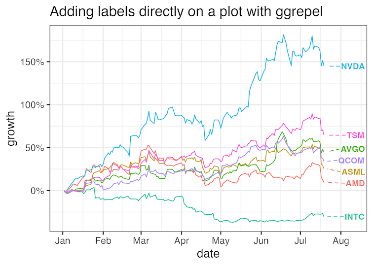
Customizing labels on the plot with ggrepel
We can further customize where exactly the labels should be on the plot using a variety of options available in geom_text_repel() function. Here we add a dotted line connecting the end of line to the label so that the labels don’t overlap.
stock_df |>
  ggplot(aes(x=date, y=growth, color=symbol))+
  geom_line()+
  scale_x_date(breaks = scales::breaks_pretty(8))+
  scale_y_continuous(
    labels = scales::percent,
    breaks= scales::breaks_pretty(8))+
   geom_text_repel(data = final_value_df,
                  size=4,
                  aes(date, last, label = symbol),
                  fontface="bold",
                  force             = 0.5,
                  nudge_x           = 20,
                  direction         = "y",
                  hjust             = -0.5,
                  segment.linetype = 2,
                  segment.size      = 0.5,
                  segment.curvature = 0)+
  guides(color="none")+
  labs(title = "Adding labels directly on a plot with ggrepel")
ggsave("directly_adding_labels_on_ggplot_with_ggrepel.png")
Explore the Complete ggplot2 Guide
35+ tutorials with code: scatterplots, boxplots, themes, annotations, facets, and more—tested and beginner-friendly.
Visit the ggplot2 Hub → No fluff—just code and visuals.


