This tutorial shows you how to add p-value to each facet in ggplot2 when creating multi-panel plots in R. Using a scatter plot example, we’ll perform linear regression analysis for each facet to determine statistical significance. And then we will display the corresponding p-values directly on the plot.
You’ll learn how to annotate each facet with a p-value using two approaches: geom_text() for simple labels and geom_richtext() from ggtext package for styled labels. We’ll also leverage the glue package to create clear, customizable annotations—perfect for the facet plots.
library(tidyverse)
library(palmerpenguins)
library(ggtext)
library(glue)
theme_set(theme_bw(16))
We will use Palmer penguin dataset to make the scatter plot.
penguins |> head()

# A tibble: 6 × 8
  species island    bill_length_mm bill_depth_mm flipper_length_mm body_mass_g
  <fct>   <fct>              <dbl>         <dbl>             <int>       <int>
1 Adelie  Torgersen           39.1          18.7               181        3750
2 Adelie  Torgersen           39.5          17.4               186        3800
3 Adelie  Torgersen           40.3          18                 195        3250
4 Adelie  Torgersen           NA            NA                  NA          NA
5 Adelie  Torgersen           36.7          19.3               193        3450
6 Adelie  Torgersen           39.3          20.6               190        3650
# ℹ 2 more variables: sex <fct>, year <int>
How to annotate multiple plots with p-values
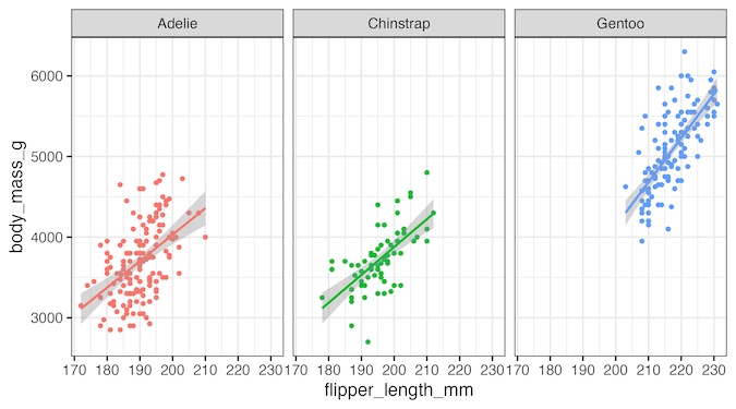
In this post, we will learn how to add p-value to multiple plots made with facet_wrap() in ggplot2. Let us make scatter plots using facet_wrap().
p1 <- penguins |>
  ggplot(aes(flipper_length_mm, body_mass_g, color=species))+
  geom_point()+
  geom_smooth(method = "lm", formula = y ~ x) +
  facet_wrap(~species)+
  theme(legend.position = "none")
p1
ggsave("how_to_annotate_multiple_plots_with_p_value_ggplot2.png",width=9, height=5)

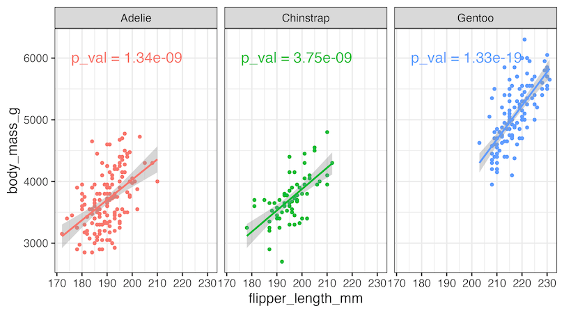
To add p-value as annotation to each facet, let us first perform linear regression analysis using tidyverse framework and save p-value in a data frame. To do this we use broom packages’ tidy() function.
Since we will be adding p-value as annotation to each facet, we need x & y co-ordinates for placing the p-values on the plot. We add the coordinates in the scale of the variables we are plottting.
pval_df <- penguins %>%
  group_by(species) %>%
  summarize(lm_mod = list(lm(body_mass_g~flipper_length_mm) ),
            lm_res = map(lm_mod, broom::tidy)) |>
  unnest(lm_res) |>
  filter(term=="flipper_length_mm") |>
  select(species, p.value) |>
  mutate(
    body_mass_g= rep(6100,3), flipper_length_mm= c(220,220,220),
    label=glue("p_val = {signif(p.value,digits=3)}"))
And this is how our dataframe containing p-value and the coordinates to annotate the plots with p-values look like.
pval_df

# A tibble: 3 × 5
  species    p.value body_mass_g flipper_length_mm label
  <fct>        <dbl>       <dbl>             <dbl> <glue>
1 Adelie    1.34e- 9        6100               220 p_val = 1.34e-09
2 Chinstrap 3.75e- 9        6100               220 p_val = 3.75e-09
3 Gentoo    1.33e-19        6100               220 p_val = 1.33e-19
Annotating each facet with p-value using ggtext’s geom_richtext()
We can now use geom_text() function to add p-value as a label to the plot as shown below.
p1+
  geom_text(
    data = pval_df,
    aes(label = label),
    hjust = 1, vjust = 1,
    size=6
  )

ggsave("annotate_multiple_plots_with_p_value_ggplot2.png", width=9, height=5)
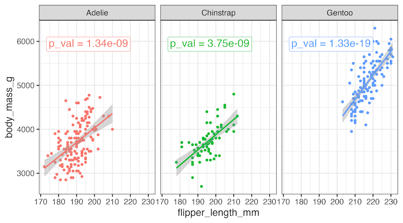
Annotating each facet with p-value using geom_richtext()
ggtext’s geom_richtext() function offers us great customizations for annotating plots. We can add matching colors and a box around p-value to highlight the annotation nicely.
p1+
  geom_richtext(
    data = pval_df,
    aes(
      label = label#,
    ),
    hjust = 1, vjust = 1,
    size=6,
    font="bold"
  )

ggsave("annotate_facet_wrap_plots_with_p_value_ggplot2.png", width=9, height=5)
If you want to annotate a single plot made with ggplot2, check out this post https://datavizpyr.com/annotate-plot-with-p-value-in-ggplot2/
Explore the Complete ggplot2 Guide
35+ tutorials with code: scatterplots, boxplots, themes, annotations, facets, and more—tested and beginner-friendly.
Visit the ggplot2 Hub → No fluff—just code and visuals.