

Goal: This tutorial shows how to control the spacing around the ggplot2 legend—especially when the legend is placed at the bottom—and how to fine-tune multi-row legends. We begin with a reproducible baseline that illustrates the problem, then move through five practical fixes. You’ll learn when to use each parameter (x = NULL, legend.margin, plot.margin, multi-row tuning, and in-panel legends), and how they affect layout. By the end, you’ll have a clean, publication-ready legend layout you can reuse.
Baseline: legend at the bottom (the problem)
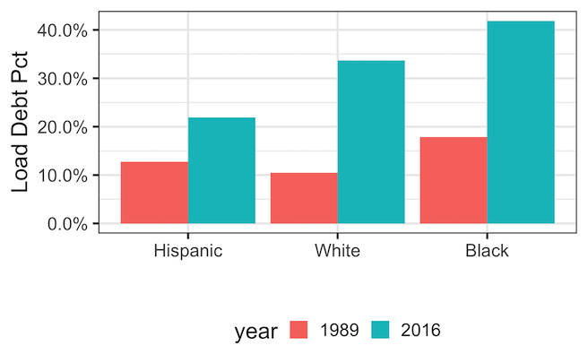
When you move the legend to the bottom using theme(legend.position = "bottom"), ggplot2 may leave excess white space above the legend. This is especially common if you “remove” the x-axis title by setting x = "", which still reserves label space. The baseline example below reproduces the issue so you can see the starting point clearly. We’ll use a small subset of the TidyTuesday student debt dataset and create a simple side-by-side column chart with a bottom legend.
library(tidyverse)
theme_set(theme_bw(20))

student_debt <- readr::read_csv(
  "https://raw.githubusercontent.com/rfordatascience/tidytuesday/master/data/2021/2021-02-09/student_debt.csv")

debt_df <- student_debt |>
  filter(year %in% c(1989, 2016)) |>
  mutate(year = as.character(year))

debt_df |> head()
year race loan_debt loan_debt_pct
2016	White	11108.4100	0.3367511
2016	Black	14224.7700	0.4183588
2016	Hispanic	7493.9990	0.2189689
1989	White	1100.4070	0.1047123
1989	Black	1160.5680	0.1788198
1989	Hispanic	897.5826	0.1272523
6 rows
p_baseline <- debt_df |>
  ggplot(aes(x = forcats::fct_reorder(race, loan_debt_pct),
             y = loan_debt_pct,
             fill = year)) +
  geom_col(position = "dodge") +
  theme(legend.position = "bottom") +
  labs(x = "", y = "Loan Debt %") +  # x = "" still reserves empty label space
  scale_y_continuous(labels = scales::percent,
                     breaks = scales::pretty_breaks(n = 6))

p_baseline
Method 1 — Use x = NULL (avoid reserving label space)
If you don’t need an x-axis title, set x = NULL rather than an empty string. With "", ggplot2 treats the label as present but empty and still reserves space, which pushes the legend farther away. NULL tells ggplot2 not to allocate label space at all. This single change often fixes the most obvious gap, and it’s the cleanest solution when your category names already function as the x-axis description.
p_xnull <- debt_df |>
  ggplot(aes(x = forcats::fct_reorder(race, loan_debt_pct),
             y = loan_debt_pct,
             fill = year)) +
  geom_col(position = "dodge") +
  theme(legend.position = "bottom") +
  labs(x = NULL,
       y = "Loan Debt %",
       title=stringr::str_wrap("Reduce Space Between
                               Bottom Legend and X-axis
                               with x=NULL",
                               width=40)) +  # better than x = ""
  scale_y_continuous(labels = scales::percent,
                     breaks = scales::pretty_breaks(n = 6))

p_xnull
ggsave("reduce_space_between_bottom_legend_and_x_axis_with_xNULL.png")


Method 2 — Pull legend closer with legend.margin
To control the space between the plotting panel and the legend box, adjust legend.margin. A small negative top margin can “pull” the legend upward when it sits below the panel. Start conservatively (e.g., −8 to −12 points) and tweak until it looks balanced. This parameter affects the gap immediately around the legend box, not the spacing between legend rows or the overall outer plot margins.
p_margin <- debt_df |>
  ggplot(aes(x = forcats::fct_reorder(race, loan_debt_pct),
             y = loan_debt_pct,
             fill = year)) +
  geom_col(position = "dodge") +
  labs(x = NULL,
       y = "Loan Debt %",
       title=stringr::str_wrap("Reduce Space Between
                               Bottom Legend and X-axis
                               with legend.margin",
                               width=40)) +
  scale_y_continuous(labels = scales::percent,
                     breaks = scales::pretty_breaks(n = 6)) +
  theme(
    legend.position = "bottom",
    legend.margin   = margin(t = -12)   # try -8, -12, -16 as needed
  )

p_margin
ggsave("pull_legend_closer_to_xaxis_with_legend_margin.png")


Method 3 — Trim outer plot margin with plot.margin
Even with a tight legend margin, generous outer plot margins can make the legend appear far away. Use plot.margin to reduce the bottom outer padding, which shortens the overall canvas. This doesn’t change the panel-to-legend gap itself; rather, it brings the entire plot content closer to surrounding elements in your layout, helpful for multi-plot pages or reports with strict vertical space.
p_plotmarg <- debt_df |>
  ggplot(aes(x = forcats::fct_reorder(race, loan_debt_pct),
             y = loan_debt_pct,
             fill = year)) +
  geom_col(position = "dodge") +
  labs(x = NULL,
       y = "Loan Debt %",
       title=stringr::str_wrap("Reduce Space Between
                               Bottom Legend and X-axis
                               with plot.margin",
                               width=40)) +
  scale_y_continuous(labels = scales::percent,
                     breaks = scales::pretty_breaks(n = 6)) +
  theme(
    legend.position = "bottom",
    legend.margin   = margin(t = -8),
    plot.margin     = margin(t = 10, r = 10, b = 5, l = 10) # tighten bottom
  )

p_plotmarg
ggsave("trim_plot_outer_margin_plot_margin.png")

Method 4: Place the legend **inside** the plot (when appropriate)
If your plot allows it, put the legend **inside the plotting area** to remove external spacing entirely. Add a semi-transparent background for readability.
p_inside <- debt_df |>
  ggplot(aes(x = forcats::fct_reorder(race, loan_debt_pct),
             y = loan_debt_pct,
             fill = year)) +
  geom_col(position = "dodge") +
  labs(x = NULL,
       y = "Loan Debt %",
       title=stringr::str_wrap("Move the legend inside the plot",
                               width=40)) +
  scale_y_continuous(labels = scales::percent,
                     breaks = scales::pretty_breaks(n = 6)) +
  theme(
    legend.position   = c(0.5, 0.05), # centered, near bottom inside panel
    legend.direction  = "horizontal",
    legend.background = element_rect(fill = scales::alpha("white", 0.7), colour = NA),
    plot.margin       = margin(10, 10, 10, 10)
  )

p_inside
ggsave("move_legend_inside_plot_ggplot2.png")

Method 5 — True multi-row legend tuning
For legends with many keys, the bottom legend can wrap to multiple rows. To make row spacing changes visible, first guarantee multiple rows using guide_legend(nrow = …, byrow = TRUE).
Then control row-to-row distance with legend.spacing.y (requires grid::unit()), and the physical height of each key with legend.key.height.
Remember: legend.margin affects the gap between the legend box and the panel, not the spacing between legend rows.
library(tidyverse)
library(grid)   # for unit()

data(diamonds, package = "ggplot2")
# Force a multi-row legend at bottom
p <- diamonds |>
  dplyr::sample_n(2500) |>
  ggplot(aes(carat, price,
             color = color)) +
  geom_point(alpha = 0.5,
             size = 1.2) +
  scale_color_brewer(palette = "Dark2") +
  labs(x = NULL, y = "Price (USD)",
       color = "Color grade",
       title=stringr::str_wrap("Multi-line legend spacing",
                               width=40)) +
  theme(
    legend.position  = "bottom",
    legend.direction = "horizontal"
  ) +
  guides(
    color = guide_legend(nrow = 2, byrow = TRUE)   # <- force two rows
  )

# BEFORE: default spacing
p
ggsave("multi_line_legend_default_spacing.png")


# AFTER A: tighter rows (reduce vertical gap between legend rows)
p + theme(
  legend.spacing.y  = unit(-4, "pt"),  # try -2, -4, -6 for stronger effect
  legend.key.height = unit(10, "pt")   # shrink key height for tighter rows
)
ggsave("reduce_vertical_gap_between_legend_rows.png")

# AFTER B: more outer padding around the whole legend box (not row spacing)
p + theme(
  legend.box = "vertical",
  legend.box.margin = margin(t = 0, r = 0, b = 0, l = 0),
  legend.margin     = margin(t = -15)   # distance between legend and plot
)
ggsave("reduce_distance_between_multi_legend_and_plot.png")

Before/After comparison
Let us visually confirm improvements, by laying out the baseline next to one or more fixes. If you have the patchwork package installed, the code below will render a two-row comparison: baseline vs x = NULL on the first row, and legend/plot margin tweaks on the second row. This side-by-side view helps you choose a combination that balances readability, compactness, and your publication’s spacing constraints.
if (requireNamespace("patchwork", quietly = TRUE)) {
  (p_baseline + p_xnull) / (p_margin + p_plotmarg)
}


Summary: which fix should I use?
Use x = NULL to avoid accidental label space; it’s the simplest and most reliable first step. If the legend still feels detached, adjust legend.margin to close the gap to the panel. When the entire figure needs tightening, reduce plot.margin. For legends that wrap, tune row spacing with legend.spacing.y and legend.key.height. If layout allows, consider an in-panel legend for maximum compactness without compromising readability.
| Method | Use when… | Key code |
|---|---|---|
Use x = NULL
|
You removed the x-axis label with x = "" and see extra space |
labs(x = NULL) |
legend.margin |
Legend sits too far from the panel even with x = NULL
|
theme(legend.margin = margin(t = -8)) |
plot.margin |
Outer plot margins make the figure look padded overall | theme(plot.margin = margin(b = 5)) |
| Multi-row tuning | Your bottom legend wraps to multiple rows |
guide_legend(nrow = 2), legend.spacing.y, legend.key.height
|
| Legend inside plot | Compact layouts or dashboard-style visuals | legend.position = c(0.5, 0.06) |
FAQs
How do I move the legend to the top?
Use theme(legend.position = "top"). If the legend looks too far from the panel, adjust legend.margin. For overall compactness, reduce plot.margin. Remember that moving a long legend to the top may also require adjusting text size or using multiple columns via guide_legend(nrow = ...) to maintain a clean layout.
How do I remove the legend entirely?
Use theme(legend.position = "none") to hide all legends, or selectively suppress specific guides, e.g., guides(fill = "none", color = "none"). Removing the legend makes sense when encodings are self-evident (e.g., labeled facets) or when space is extremely limited. Always verify that the message remains clear for your intended audience.
Why didn’t my multi-row spacing change?
First ensure your legend truly wraps: set guides(... = guide_legend(nrow = 2, byrow = TRUE)). Then adjust legend.spacing.y using grid::unit(), and reduce legend.key.height to make rows physically tighter. Also check that you’re not confusing legend.margin (panel gap) with row spacing. Finally, long labels may require text size tweaks for noticeable results.
What’s the difference between legend.margin and legend.box.margin?
legend.margin controls the space between the legend box and the plotting panel—ideal for closing the “gap” when the legend is at the bottom. legend.box.margin controls the padding around the entire legend block (outside the keys and labels) and is more useful when combining multiple guides or packing legends tightly in multi-row configurations.
Want more layout recipes for publication-ready plots? Explore the ggplot2 tutorial hub for legends, axes, annotations, facets, and themes. Each article includes reproducible code and practical gotchas so you can go from draft to camera-ready quickly.
Explore the Complete ggplot2 Guide
35+ tutorials with code: scatterplots, boxplots, themes, annotations, facets, and more—tested and beginner-friendly.
Visit the ggplot2 Hub → No fluff—just code and visuals.


