This is a quick guide on how to add dollar signs ($) to your axis labels in ggplot2.
We will use the label_dollar() function from the versatile scales package to handle the formatting. This function automatically adds the dollar prefix and inserts commas as thousands separators, making it incredibly simple to display currency on your plots.
In this tutorial, we will learn how to format x or y-axis so that we have dollar symbol in a plot made with ggplot2 in R.
Let us create a dataframe with salary education information for developers using the StackOverflow survey results. We first create two lists; one for education and the second for salary.
education <- c("Bachelor's", "Less than Bachelor's",
               "Master's","PhD","Professional")
salary <- c(110000,105000,126000,144200,95967)
We create a tibble using the two lists with tibble() function.
df <- tibble(Education=education,
             Salary=salary)
df
## # A tibble: 5 x 2
##   Education            Salary
##   <chr>                 <dbl>
## 1 Bachelor's           110000
## 2 Less than Bachelor's 105000
## 3 Master's             126000
## 4 PhD                  144200
## 5 Professional          95967
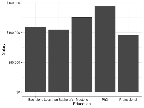
Let us make a simple bar plot with geom_col() in ggplot2.
df %>%
  ggplot(aes(x=Education, y=Salary)) +
  geom_col()
In the barplot, height of bars represent salary for each education category.

Notice the y-axis currently displays salary as plain numbers. We can easily format these labels to appear as dollars, which is more readable for financial data.
The solution is to use the dollar_format() function from the scales package within your scale_y_continuous() layer. Here is how you add it to your ggplot object:
df %>%
  ggplot(aes(x=Education, y=Salary)) +
  geom_col()+
  scale_y_continuous(labels=scales::dollar_format())
Now, we get a bar plot with y-axis formatted with dollars.
Explore the Complete ggplot2 Guide
35+ tutorials with code: scatterplots, boxplots, themes, annotations, facets, and more—tested and beginner-friendly.
Visit the ggplot2 Hub → No fluff—just code and visuals.