
In this post, we will learn how to add mean line to ridgeline plot. We can make ridgeline plot in R with ggridges R package developed Claus Wilke. Ridgeline plot is useful when you have multiple distributions or a distribution that changes in distributions over time or space. The name “ridgeline” comes from the way it looks like, a overlapping mountain range.
Let us load the packages needed for making ridgeline plots. To make ridgeline plot, we need ggridges package in addition to ggplot2. We also load lubridate to parse date variable in the data.
library(tidyverse)
library(ggridges)
library(lubridate)
theme_set(theme_bw(base_size=16))
We will use Broadway data set from TidyTuesday project to make ridgeline plot and then see how to add mean line to the ridgeline plot.
grosses <- readr::read_csv('https://raw.githubusercontent.com/rfordatascience/tidytuesday/master/data/2020/2020-04-28/grosses.csv', guess_max = 40000)
## Parsed with column specification:
## cols(
##   week_ending = col_date(format = ""),
##   week_number = col_double(),
##   weekly_gross_overall = col_double(),
##   show = col_character(),
##   theatre = col_character(),
##   weekly_gross = col_double(),
##   potential_gross = col_double(),
##   avg_ticket_price = col_double(),
##   top_ticket_price = col_double(),
##   seats_sold = col_double(),
##   seats_in_theatre = col_double(),
##   pct_capacity = col_double(),
##   performances = col_double(),
##   previews = col_double()
## )
The Broadway dataset contains data over multiple years. Here we subset the data to a fewer number of years.
df <- grosses %>%
  mutate(Year=factor(year(week_ending))) %>%
  filter(Year %in% seq(1985,2020, by=5))
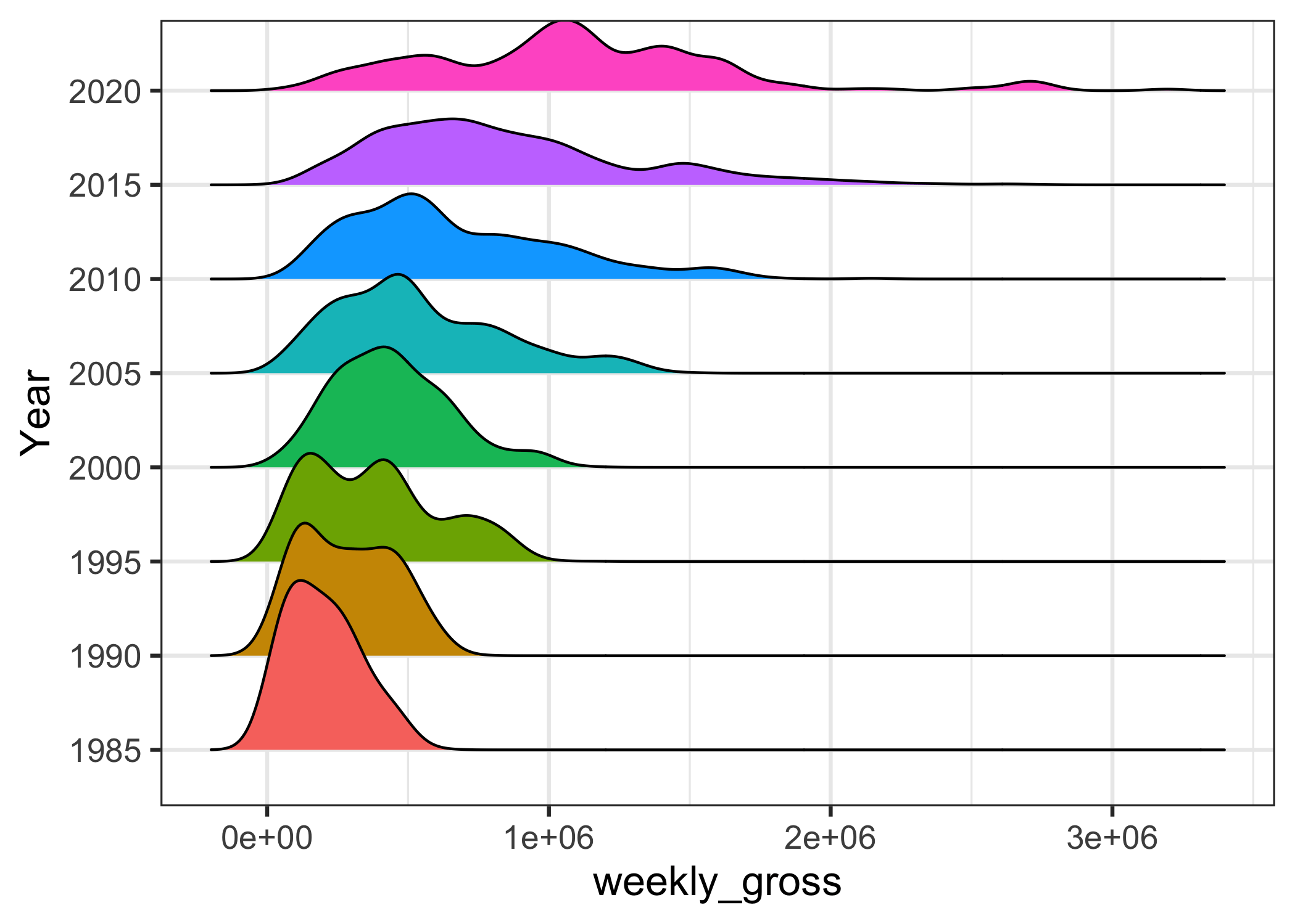
We have data ready to make ridgeline plot. Let us start with making a simple ridgeline plot using geom_density_ridges() function from ggridges package. We will make a ridgeline plot to visualize how weekly gross in broadway shows change over time.
df %>%
  ggplot(aes(y=Year,x=weekly_gross,fill=Year)) +
  geom_density_ridges()+
  theme(legend.position = "none")
We get a nice ridgeline plot filled with colors by “Year” variable.

Adding Vertical line at mean in ridgeline plot
The ridgeline plot with vertical mean line for each group, in this case “year”, would help easily understand the mean trend over years. To add mean line to ridgeline plot with ggridges, we need to use quantile_lines and quantile_fun arguments inside geom_density_ridges() function from ggridges package.
df %>%
  ggplot(aes(y=Year,x=weekly_gross,fill=Year)) +
  geom_density_ridges(quantile_lines=TRUE,
                      quantile_fun=function(x,...)mean(x))+
  theme(legend.position = "none")
Now we get a ridgeline plot with vertical mean lines.

Thanks to @ClausWilke for ggridges package and the nice solution.
Explore the Complete ggplot2 Guide
35+ tutorials with code: scatterplots, boxplots, themes, annotations, facets, and more—tested and beginner-friendly.
Visit the ggplot2 Hub → No fluff—just code and visuals.


