Adding text annotations over a barplot can be useful in quickly conveying the core message of a plot. In this post, we will see example of how to add text labels or text annotations over each bar in barplot. Barplot is great way to visualize numerical values corresponding to categorical variables. The height of the barplot represent the numerical value. With text label we can add the numerical value on top of the barplot for the ease of quick understanding.
Let us load tidyverse suit of packages.
library(tidyverse)
Let us use gapminder data to make barplots. We will download the data directly from github page.
link2data <- "https://raw.githubusercontent.com/cmdlinetips/data/master/gapminder-FiveYearData.csv"
gapminder <- read_csv(link2data)
## Parsed with column specification:
## cols(
##   country = col_character(),
##   year = col_double(),
##   pop = col_double(),
##   continent = col_character(),
##   lifeExp = col_double(),
##   gdpPercap = col_double()
## )
Let us compute mean life expectancy per continent using dplyr’s group_by() and summarize() functions.
life_df <- gapminder %>%
  group_by(continent) %>%
  summarize(ave_lifeExp=mean(lifeExp))
Our data looks like this.
life_df
## # A tibble: 5 x 2
##   continent ave_lifeExp
## * <chr>           <dbl>
## 1 Africa           48.9
## 2 Americas         64.7
## 3 Asia             60.1
## 4 Europe           71.9
## 5 Oceania          74.3
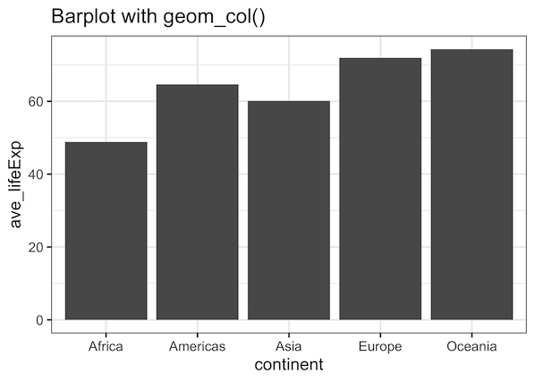
Now we are all set to make some barplots. To begin with, we will make a simple barplot in R using ggplot2. We will use geom_col() function in ggplot2 to make barplot. Here, the height of the bars represent numerical values in the data.
life_df %>%
  ggplot(aes(continent,ave_lifeExp))+
  geom_col() +
  labs(title="Barplot with geom_col()")
ggsave("simple_barplot_with_R_ggplot2.png")

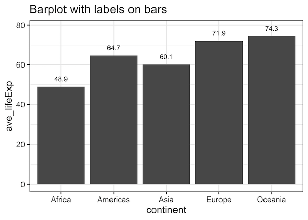
We can labels to bars in barplot using ggplot2’s function geom_text(). We need to provide how we want to annotate the bars using label argument. In our example, label values are average life expectancy values.
options(digits=2)
life_df %>%
  ggplot(aes(continent,ave_lifeExp))+
  geom_col() +
  labs(title="Barplot with labels on bars")+
  geom_text(aes(label = signif(ave_lifeExp, digits = 3)), nudge_y = 4)
We get a nice barplot with average lifeexpectancy values on top of the bar.
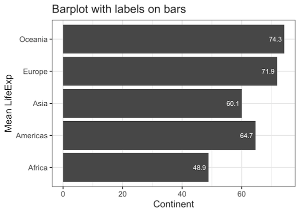
We can easily customize the text labels on the barplot. For example, we can move the labels on y-axis to contain inside the bars using nudge_y argument. We can also specify the color of the labels on barplot with color argument.

life_df %>%
  ggplot(aes(continent,ave_lifeExp))+
  geom_col() +
  coord_flip()+
  labs(title="Barplot with labels on bars",
        x="Continent", y= "Mean LifeExp")+
  geom_text(aes(label = round(ave_lifeExp, 1)), nudge_y= -3, color="white")
In this example, we have also flipped x and y-axis to make horizontal barplots using ggplot2 3.3.0’s feature.