Time Series plots are a great way to see a trend over a period of time. However, if the numerical variable that we are plotting in time series plot fluctuates day to day, it is often better to add a layer moving average to the time series plot.
In this post, we will see examples of making time series plot first and then add 7-day average time series plot. We will use COVID19 dataset from covidtracking.com. We will use Seaborn’s lineplot to make the time series plot and Pandas’ rolling() function to compute 7-day rolling average of new cases per day.
Let us load Pandas and load the COVID19 daily cases in US. Here we specify which variable/column needs to be loaded as date variable using “parse_dates” argument.
import pandas as pd
data_url ="http://covidtracking.com/api/states/daily.csv"
corona= pd.read_csv(data_url, parse_dates=['date'])
corona.head()
Let us make daily cases time series plot for the state of New York. We will filter the COVID data to get the data for NY state.
corona_ny = corona.query("state=='NY'")
corona_ny.head()
We are mainly interested in just two of the variables in the data; date and daily new cases in NY.
corona_ny[['date', 'positiveIncrease']].head()
	date	positiveIncrease
37	2020-05-15	2762.0
93	2020-05-14	2390.0
149	2020-05-13	2176.0
205	2020-05-12	1430.0
261	2020-05-11	1660.0
Simple Time Series Plot with Seaborn’s lineplot()
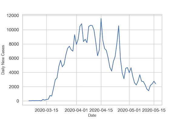
Let us make a simple time series plot between date and daily new cases. We can use Seaborn’s lineplot() function to make the time series plot. In addition to making a simple line plot, we also by customize axis labels and figure size to save the plot as PNG file.
# bigger plot elements suitable for giving talks
sns.set_context("talk")
# set figure size
plt.figure(figsize=(9,6))
# Time series plot with Seaborn lineplot()
sns.lineplot(x="date", y="positiveIncrease",
            data=corona_ny, ci=None)
# axis labels
plt.xlabel("Date", size=14)
plt.ylabel("Daily New Cases", size=14)
# save image as PNG file
plt.savefig("Time_Series_Plot_with_Seaborn.png",
                    format='png',
                    dpi=150)
We get a time series plot from lineplot(). It is easy to see that the number of new cases per day fluctuates a lot. Typically higher during weekdays and lower during weekends.

A better way to visualize is to make a timeseries plot with rolling average or moving average of certain window size. In the example below we make timeseries plot with 7-day rolling average of new cases per day.
For that we need to first compute the rolling average for the new cases per day. Depending on the window size we pick, we will have NAs at the ends.
Computing 7-day rolling average with Pandas rolling()
In Pandas, we can compute rolling average of specific window size using rolling() function followed by mean() function. Here we also perform shift operation to shift the NA values to both ends.
corona_ny['cases_7day_ave'] = corona_ny.positiveIncrease.rolling(7).mean().shift(-3)
Now we have created new variable for 7-day average. Note that because of the shift() function, the first 3 and last 3 values of 7-day average is NaN.
corona_ny[['date', 'positiveIncrease','cases_7day_ave']].head()
date	positiveIncrease	cases_7day_ave
37	2020-05-15	2762.0	NaN
93	2020-05-14	2390.0	NaN
149	2020-05-13	2176.0	NaN
205	2020-05-12	1430.0	2200.857143
261	2020-05-11	1660.0	2200.285714
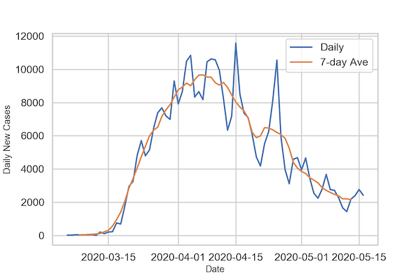
We are now ready to make time series plot with actual new cases per day and its 7-day average. To do that we first make times series plot as before and then use lineplot again with the 7-day average time series plot.
# bigger plot elements suitable for giving talks
sns.set_context("talk")
# set figure size
plt.figure(figsize=(9,6))
# Time series plot with Seaborn lineplot() with label
sns.lineplot(x="date",y="positiveIncrease",
             label="Daily", data=corona_ny,
             ci=None)
# 7-day rolling average Time series plot with Seaborn lineplot() with label
sns.lineplot(x="date",y="cases_7day_ave",
             label="7-day Ave",
             data=corona_ny,
             ci=None)
# set axis labels
plt.xlabel("Date", size=14)
plt.ylabel("Daily New Cases", size=14)
# save image as PNG file
plt.savefig("Time_Series_Plot_with_7day_average_Seaborn.png",
                    format='png',
                    dpi=150)
We can clearly see how the 7-day average case time series has smoothed the variation in case counts.