Barplots are a great way to visualize the relationship between categorical variables and their corresponding quantitative values. However, the default order of categories in Seaborn is often alphabetical, which may not be meaningful. Sorting the bars makes comparisons easier and your visualization clearer.
In this tutorial, we’ll learn how to sort barplots in Seaborn in ascending, descending, and custom orders. We’ll also see how to sort grouped barplots (with hue) and fix common errors.
👉 Want more? Explore the full Seaborn Tutorial Hub with 30+ examples.
Load Packages
Example DataWe’ll use a simple dataset of education levels and average salaries inspired by Stack Overflow developer survey data.
education=["Bachelor's", "Less than Bachelor's","Master's","PhD","Professional"]
salary = [110000,105000,126000,144200,95967]
Let us create Pandas dataframe with the data.
df = pd.DataFrame({"Education":education,
                  "Salary":salary})
df

Education	Salary
0	Bachelor's	110000
1	Less than Bachelor's	105000
2	Master's	126000
3	PhD	144200
4	Professional	95967
Default Seaborn Barplot
In this example, we have the quantitative values corresponding to the bars. Before showing how to sort a barplot, we will first make a simple barplot using Seaborn’s barplot() function.
To make a barplot, we need to specify x and y-axis variables for the barplot as arguments to the Seaborn function. .
sns.barplot(x='Education', y='Salary', data=df)
plt.xlabel("Education", size=15)
plt.ylabel("Salary (USD)", size=15)
plt.title("Default Barplot (Unsorted)", size=18)
plt.tight_layout()
plt.show()
plt.savefig("barplot_Seaborn_Python.png", dpi=100)

Notice the categories are displayed in the alphabetical order, not sorted by value.
Sort Bars in Ascending Order
Seaborn’s barplot() accepts order=, a list (or Series) of categories in the order you want them displayed. The Pandas idiom below generates that order dynamically:
df.sort_values('Salary').Education
What does df.sort_values('Salary').Education mean?
-
df.sort_values('Salary')sorts rows bySalary(ascending by default). -
.Educationselects theEducationcolumn from the sorted DataFrame. - The result is a Series like
['Professional', 'Less than Bachelor\'s', 'Bachelor\'s', 'Master\'s', 'PhD']. - Passing that Series to
order=tells Seaborn to draw bars in this order.
In the order= argument, Seaborn expects a list of categories in the order you want them displayed. That’s why we pass:
This pattern is very flexible: you can sort by any numeric column and extract the categorical column you want for plotting.
Sort Bars in Ascending Order
We use the order argument in sns.barplot() with argument df.sort_values('Salary').Education to sort bars by values.
plt.figure(figsize=(10,6))
# make barplot and sort bars
sns.barplot(x='Education',
            y="Salary",
            data=df,
            order=df.sort_values('Salary').Education)
# set labels
plt.xlabel("Education", size=15)
plt.ylabel("Salary in US Dollars", size=15)
plt.title("Sort Bars in Barplot in Ascending Order", size=18)
plt.tight_layout()
plt.savefig("sort_bars_in_barplot_ascending_order_Seaborn_Python.png", dpi=100)
We have the barplot with ordered bars. By default, sort_values() sorts in ascending order and we get the bars sorted in ascending order.

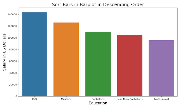
Sort Bars in Descending Order
Now let us see an example of sorting bars in barplot in descending order. We need to specify “ascending = False” inside sort_values() function while using “order” argument.
df.sort_values('Salary', ascending = False).Education
plt.figure(figsize=(10,6))
# make barplot and sort bars in descending order
sns.barplot(x='Education',
            y="Salary",
            data=df,
            order=df.sort_values('Salary',ascending = False).Education)
# set labels
plt.xlabel("Education", size=15)
plt.ylabel("Salary in US Dollars", size=15)
plt.title("Sort Bars in Barplot in Descending Order", size=18)
plt.tight_layout()
plt.savefig("sort_bars_in_barplot_descending_order_Seaborn_Python.png", dpi=100)
Hurray!..Now we get bars sorted in descending order with Seaborn.
Custom Order for Categories
You may want a logical or domain-specific order, for example, by natural education progression levels – from lowest to highest).
custom_order = ["Less than Bachelor's", "Bachelor's", "Master's", "PhD", "Professional"]

plt.figure(figsize=(10,6))
sns.barplot(
    x='Education',
    y='Salary',
    data=df,
    order=custom_order
)
# set labels
plt.xlabel("Education", size=15)
plt.ylabel("Salary in US Dollars", size=15)
plt.title("Sort Bars in Barplot in Descending Order", size=18)
plt.tight_layout()
plt.savefig("Seaborn_barplot_order_custom.png", dpi=100)
plt.title("Seaborn Barplot Custom Order", size=18)
plt.tight_layout()
plt.show()

Seaborn Sort Grouped Barplots (with hue)
Grouped barplots (also called side-by-side barplots) let you compare subcategories within each main category — for example, average salary by education level and gender. In these cases, you still control the main category order with order=, but you may also need to explicitly set the subgroup order with hue_order= so the bars appear consistently (e.g. Female always left, Male always right). Without this, Seaborn will fall back on alphabetical order of the subgroup labels, which can make comparisons harder.
Let us build a tidy dataset: one row per (Education, Gender)
edu = ["Less than Bachelor's", "Bachelor's", "Master's", "PhD", "Professional"]
male   = [102000, 115000, 130000, 150000,  98000]
female = [ 98000, 105000, 122000, 138000,  94000]

df_hue = (
    pd.DataFrame({
        "Education": edu,
        "Male": male,
        "Female": female
    })
    .melt(id_vars="Education", var_name="Gender", value_name="Salary")
)
Choose a sort rule for categories. In the example below, we sort by total salary across genders (descending).
cat_order = (df_hue.groupby("Education")["Salary"]
                    .sum()
                    .sort_values(ascending=False)
                    .index)
In this sorting grouped barplot example, the subgroups (Gender: Male/Female) are in alphabetical order of the subgroup labels. If you want to set subgroup order use hue_order=, so the bars appear consistently (e.g. Female always left, Male always right)
plt.figure(figsize=(10,6))
sns.barplot(
    x="Education", y="Salary", hue="Gender",
    data=df_hue, order=cat_order,
    # hue_order=["Female", "Male"],   # optional explicit subgroup order
    errorbar=None                     # cleaner comparison when pre-aggregated
)
plt.title("Grouped (Hue) Barplot Sorted by Total Salary", size=18)
plt.xticks(rotation=15)
plt.tight_layout()

FAQs
-
How do I sort bars by an aggregate (mean/median) computed from multiple rows?
Pre-aggregate in Pandas, then pass the ordered categories:
agg = df_raw.groupby("Education")["Salary"].median().sort_values()
order = agg.index
sns.barplot(x="Education", y="Salary", data=df_raw, order=order, estimator=np.median) -
How do I show only the Top N categories after sorting?
Slice the sorted index before plotting:
order = df.sort_values("Salary", ascending=False)["Education"]
top_n = order[:5]
sns.barplot(x="Education", y="Salary", data=df, order=top_n) -
What’s the cleanest way to sort a horizontal barplot?
Put the category on the
yaxis and pass the sorted categories toorder:
order = df.sort_values("Salary", ascending=True)["Education"]
sns.barplot(y="Education", x="Salary", data=df, order=order) -
How can I normalize messy category labels before sorting?
Use Pandas string methods once before plotting:
df["Education"] = (df["Education"].str.strip().str.replace(r"\s+"," ",regex=True).str.title()) -
How do I enforce a fixed semantic order across plots?
Convert the column to an ordered Pandas Categorical so Seaborn respects it:
levels = ["Less than Bachelor's","Bachelor's","Master's","PhD","Professional"]
df["Education"] = pd.Categorical(df["Education"], categories=levels, ordered=True) -
How do I keep subgroup (hue) order consistent across multiple charts?
Provide a constant
hue_ordereach time:
hue_order = ["Female","Male"]
sns.barplot(x="Education", y="Salary", hue="Gender", data=df_hue, order=cat_order, hue_order=hue_order)