
PCA aka Principal Component analysis is one of the most commonly used unsupervised learning techniques in Machine Learning. PCA on a high dimensional data can reveal the pattern or structure in the data. Scree plot is one of the diagnostic tools associated with PCA and help us understand the data better.
Scree plot is basically visualizing the variance explained, proportion of variation, by each Principal component from PCA. A dataset with many similar feature will have few have principal components explaining most of the variation in the data.
In this tutorial, we will learn to how to make Scree plot using ggplot2 in R. We will use Palmer Penguins dataset to do PCA and show two ways to create scree plot. At first we will make Scree plot using line plots with Principal components on x-axis and variance explained by each PC as point connected by line. Then we will make Scree plot using barplot with principal components on x-axis and height of the bar representing variance explained.
Principal Component Analysis (PCA) in R
Let us load the packages needed to do PCA in R and make scree plot.
library(tidyverse)
library(palmerpenguins)
theme_set(theme_bw(24))
Our Penguins data look likes with three categorical variables and five numerical variables.
head(penguins)
## # A tibble: 6 x 8
##   species island bill_length_mm bill_depth_mm flipper_length_… body_mass_g sex
##   <fct>   <fct>           <dbl>         <dbl>            <int>       <int> <fct>
## 1 Adelie  Torge…           39.1          18.7              181        3750 male
## 2 Adelie  Torge…           39.5          17.4              186        3800 fema…
## 3 Adelie  Torge…           40.3          18                195        3250 fema…
## 4 Adelie  Torge…           NA            NA                 NA          NA <NA>
## 5 Adelie  Torge…           36.7          19.3              193        3450 fema…
## 6 Adelie  Torge…           39.3          20.6              190        3650 male
## # … with 1 more variable: year <int>
We will need only the numerical variables for doing PCA. So let us select the numerical variables from Penguins data frame.
penguins_data <- penguins %>%
  select(bill_length_mm:year, -sex)
Now we are ready to do PCA analysis. We use prcomp() function in R to do Principal Component analysis. We filter out any rows with missing values and scale the variables before doing PCA with prcomp() function.
pca_obj <- prcomp(drop_na(penguins_data), scale. = TRUE)
Compute Variance Explained by Each PC
Let us look at the contribution or the importance of the principal components using summary() function.
summary(pca_obj)
## Importance of components:
##                          PC1    PC2    PC3     PC4     PC5
## Standard deviation     1.664 0.9967 0.8786 0.60433 0.31512
## Proportion of Variance 0.554 0.1987 0.1544 0.07304 0.01986
## Cumulative Proportion  0.554 0.7527 0.9071 0.98014 1.00000
We will create a dataframe containing the PCs and the variance explained by each PC. We can compute the proportion of variation for each PC using std, i.e standard deviation values from the PCA results.
var_explained_df <- data.frame(PC= paste0("PC",1:5),
                               var_explained=(pca_obj$sdev)^2/sum((pca_obj$sdev)^2))

head(var_explained_df)
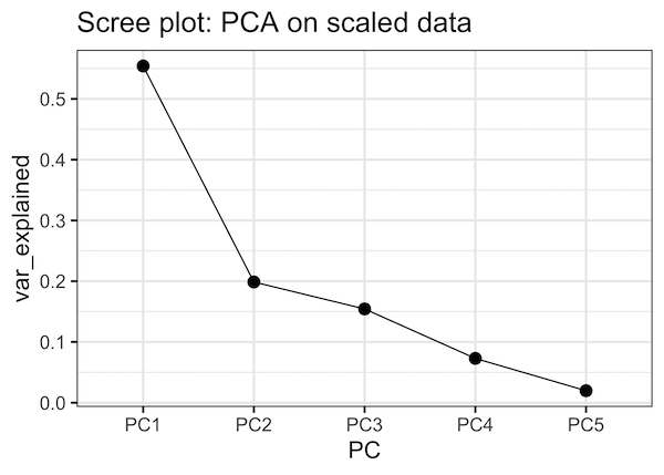
Scree plot with line plot in R
Now, we have the data to make a scree plot. First, we make a scree plot as a line plot using geom_point() and geom_line() as shown below.
var_explained_df %>%
  ggplot(aes(x=PC,y=var_explained, group=1))+
  geom_point(size=4)+
  geom_line()+
  labs(title="Scree plot: PCA on scaled data")
We can see that the first PC explains over 55% of the variation and the second PC explains close to 20% of the variation in the data.
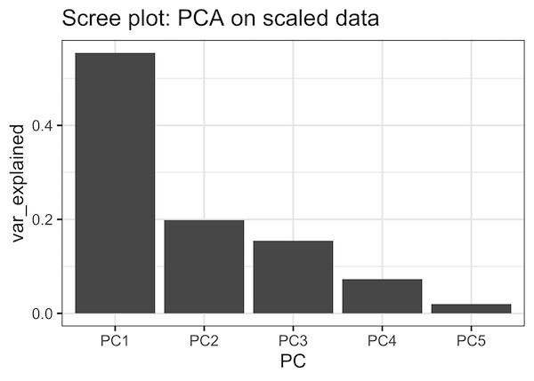
Screeplot with bar plot in R
We can also make Scree plot as barplot with PCs on x-axis and variance explained as the height of the bar.
var_explained_df %>%
  ggplot(aes(x=PC,y=var_explained))+
  geom_col()+
  labs(title="Scree plot: PCA on scaled data")
And we get Scree plot as bar plot. We can see that the first three PCs explains close to 90% of the variation in the data.
Explore the Complete ggplot2 Guide
35+ tutorials with code: scatterplots, boxplots, themes, annotations, facets, and more—tested and beginner-friendly.
Visit the ggplot2 Hub → No fluff—just code and visuals.


