In this post, we will learn how to make Sinaplot in R and show why it is a better way visualize numerical data from multiple categories. In an earlier post, we discussed the benefits of making Violinplot than making a boxplot. This is mainly due to the fact that Boxplot relies only five summary stats from the data and it can be not a good option when the data we have is multi-modal. In such a situation adding density of the data to boxplot aka a Violin plot is a better option.
In this post, we will use the simple illustration from the paper by Hintze and Nelson introducing Violinplot to show why Violinplot+Sinaplot is better than Sinaplot alone and Sinaplot is better than Violinplot alone
Let us load tidyverse and ggforce. ggforce is a R “package aimed at providing missing functionality to ggplot2 through the extension system introduced with ggplot2”
library(tidyverse)
theme_set(theme_bw(16))
We will create data set from three known distributions. The first one is a bimodal distribution constructed from two normals with different means. Second distribution is uniform distribution and the third one is normal distribution.
bimodal <- c(rnorm(100,4),rnorm(100,8))
uniform <- c(runif(200,min=4,max=8))
normal <- c(rnorm(200,6,sd=3))
Boxplot does not reveal the pattern in the data
Let us create a dataframe with three groups of data.
df <- data.frame(bimodal=bimodal,
                 uniform=uniform,
                 normal=normal)
head(df)

##    bimodal  uniform    normal
## 1 4.664331 4.946468  6.574739
## 2 4.153938 4.917738  6.591718
## 3 3.285484 7.184626  5.219606
## 4 3.886365 6.963298 13.033837
## 5 4.168054 4.613306  8.303880
## 6 3.490347 6.343641  9.975178
And convert the data in wide form to long tidy form using pivot_longer() from tidyr package.
f_tidy <- df %>%
  pivot_longer(cols=bimodal:normal,values_to = "obs", names_to = "grp")
Let us make boxplot, which uses five summary statistics from the data. And we can see that all three distributions look the same. Boxplots basically masks the pattern in the data.
df_tidy %>%
  ggplot(aes(x=grp,y=obs, fill=grp))+
  geom_boxplot()+
  theme(legend.position = "none")
ggsave("boxplot_bimodal_normal_uniform_ggplot2.png")
Violinplot is better than Boxplot
One of the solutions is to use Violin plot, which adds density layer to the boxplot it and captures the pattern in the data. In our example, Violinplot captures the bimodal nature of the first group and normal/uniform distribution of other two groups nicely.
df_tidy %>%
  ggplot(aes(x=grp,y=obs, fill=grp))+
  geom_violin()+
  theme(legend.position="none")
ggsave("violinplot_bimodal_normal_uniform_ggplot2.png")
Violinplot with jittered data points is better than Violinplot alone
Violinplot still relies on summary stats and it does not show the actual data behind the plot. It is always good to show the data. Therefore, a better alternative is to add jitted data points to Violin plot.
df_tidy %>%
  ggplot(aes(x=grp,y=obs, fill=grp))+
  geom_violin()+
  geom_jitter(width=0.1,alpha=0.5)+
  theme(legend.position="none")
ggsave("violinplot_with_jittered_data_points_ggplot2.png")
Sinaplot is better than Violinplot
Violin plot with jittered data points show the data and the density pattern. However, the jittered data points can still overlap with each other and can not fully see the data. A solution is Sinaplot. Sinaplot combines the goodness of jittered data points (or strippplot) and the violin plot.
By letting the normalized density of points restrict the jitter along the x-axis the plot displays the same contour as a violin plot, but resemble a simple strip chart for small number of data points. In this way the plot conveys information of both the number of data points, the density distribution, outliers and spread in a very simple, comprehensible and condensed format.
We can make sinaplot with ggforce’s geom_sina() function.
df_tidy %>%
  ggplot(aes(x=grp,y=obs, color=grp))+
  geom_sina()+
  theme(legend.position="none")
ggsave("sinaplot_with_geom_sina_ggforce.png")
Sinaplot with Vioplot is better than Sinaplot alone
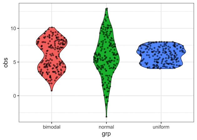
Although sinaplot nices show the data and their density pattern nicely, adding violinplot to it makes it look much better.
df_tidy %>%
  ggplot(aes(x=grp,y=obs, fill=grp))+
  geom_violin()+
  geom_sina(alpha=0.5)+
  theme(legend.position="none")
ggsave("sinaplot_with_violinplot_ggforce.png")
This post was long due, but thanks to the tweet by @strnr that rekindled the interest again.
Explore the Complete ggplot2 Guide
35+ tutorials with code: scatterplots, boxplots, themes, annotations, facets, and more—tested and beginner-friendly.
Visit the ggplot2 Hub → No fluff—just code and visuals.