
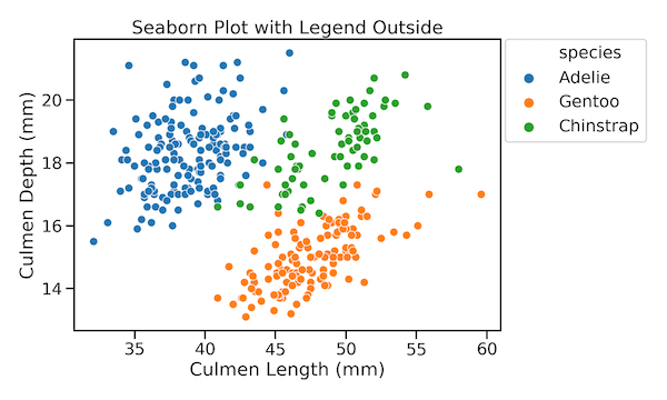
While making plots with legend, like scatterplot, Seaborn has a nice feature that finds a suitable place for legend and puts it automatically inside the plot. This greatly helps in utilizing plotting area efficiently. However, sometimes you might want the legend outside the plot. In this tutorial, we will see an example of how to… Continue reading How To Place Legend Outside the Plot with Seaborn in Python?
How To Place Legend Inside the Plot with ggplot2?

Need to save space or create more polished visualizations? This comprehensive guide shows you exactly how to place ggplot2 legend inside plot using multiple positioning methods, with ready-to-use code examples that work for any chart type. Default legend placement outside the plot area can waste valuable space, especially in publications, dashboards, or presentations where every… Continue reading How To Place Legend Inside the Plot with ggplot2?
How To Make Scatter Plots with Seaborn scatterplot in Python?

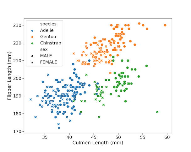
Scatter plots are one of the most powerful ways to visualize the relationship between two quantitative variables. With Python’s Seaborn library, you can easily enhance scatter plots by adding more dimensions using color, shape, and size. In this tutorial, you’ll learn 9 tips to make your Seaborn scatter plots publication-ready. We’ll use the popular Palmer… Continue reading How To Make Scatter Plots with Seaborn scatterplot in Python?
How To Add Labels to Grouped Barplot with Bars Side-By-Side in R?
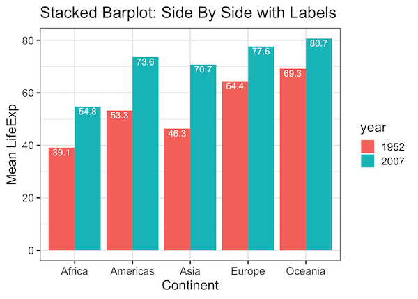
In this post we will learn how to add labels to bars on barplot that is stacked side-by-side. We will start with making side-by-side grouped barplot and work our way through adding annotation on top of each bar of the stacked barplot. Adding annotation to grouped barplot with side-by-side bars is similar to annotating bars… Continue reading How To Add Labels to Grouped Barplot with Bars Side-By-Side in R?
How To Connect Paired Points with Lines in Scatterplot in ggplot2?

Scatter plots are a great way to visualize the trend between two quantitative variables. Sometimes, you may have paired quantitative variables and would like to see the how the pairs are related. For example you may have two quantitative variables corresponding to two different time points and would like to connect the paired data points… Continue reading How To Connect Paired Points with Lines in Scatterplot in ggplot2?