
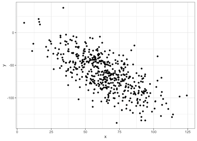
ggplot2 offers 8 themes for making plots using ggplot2. By default, ggplot2 uses the grey theme. Here, we will examples of how to change the plot theme from the default grey ggplot2 theme. Let us first make a simple scatter plot with default grey ggplot theme Let us create data frame with two variables to… Continue reading How To Change ggplot2 theme?
Scatter Plot with Transparent Points Using ggplot2 in R
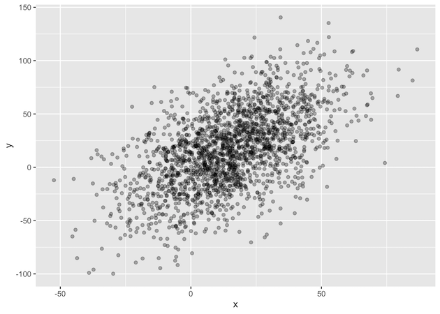
While scatter plots are ideal for visualizing the relationship between two quantitative variables, their effectiveness diminishes with large datasets due to overplotting. This issue occurs when numerous data points are plotted on top of each other, hiding the true density of the data. To solve this, we can make the points transparent. In this tutorial,… Continue reading Scatter Plot with Transparent Points Using ggplot2 in R
Simple Scatter Plot in R with ggplot2

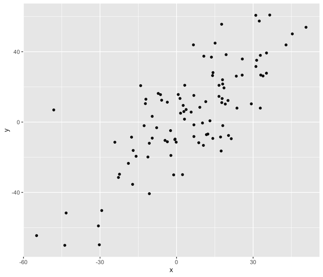
Scatter plot is a great data visualization tool to visualize relationship between two quantitative variables. We will see an example to make a simple scatter plot in R with ggplot2. Let us first load the ggplot2 package. Let us create a data set and store it in a data frame. Let us use the above… Continue reading Simple Scatter Plot in R with ggplot2