While scatter plots are ideal for visualizing the relationship between two quantitative variables, their effectiveness diminishes with large datasets due to overplotting. This issue occurs when numerous data points are plotted on top of each other, hiding the true density of the data. To solve this, we can make the points transparent. In this tutorial, we’ll use the alpha argument in ggplot2 to control the transparency and create a more insightful plot.
library(ggplot2)Let us make a data frame with two quantitative variables. We generate these variables using random numbers from normal/gaussian distribution.
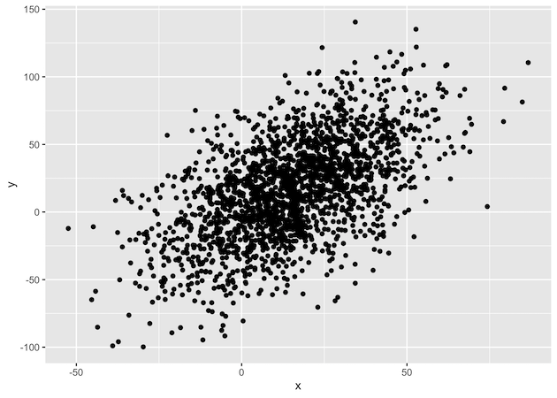
set.seed(42)
x <- rnorm(2000, mean=15, sd=20)
y <- x+ rnorm(2000, mean=2, sd=30)
df <- data.frame(x=x, y=y)
Let us make a simple scatter plot to illustrate the problem of overplotting
df %>%
  ggplot(aes(x=x, y=y)) + geom_point()
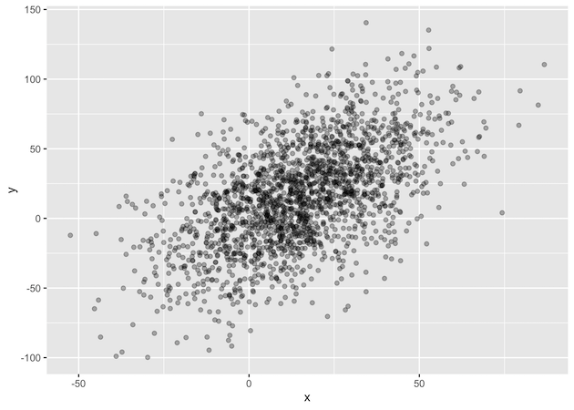
df %>%
 ggplot(aes(x=x,y=y)) + geom_point(alpha=0.3)
Explore the Complete ggplot2 Guide
35+ tutorials with code: scatterplots, boxplots, themes, annotations, facets, and more—tested and beginner-friendly.
Visit the ggplot2 Hub → No fluff—just code and visuals.