
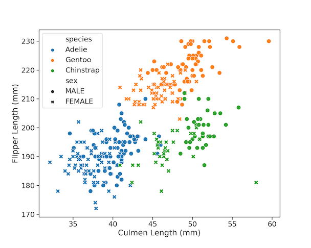
Scatter plots are one of the most powerful ways to visualize the relationship between two quantitative variables. With Python’s Seaborn library, you can easily enhance scatter plots by adding more dimensions using color, shape, and size. In this tutorial, you’ll learn 9 tips to make your Seaborn scatter plots publication-ready. We’ll use the popular Palmer… Continue reading How To Make Scatter Plots with Seaborn scatterplot in Python?
Tag: Scatter Plot
How To Connect Paired Points with Lines in Scatterplot in ggplot2?


Scatter plots are a great way to visualize the trend between two quantitative variables. Sometimes, you may have paired quantitative variables and would like to see the how the pairs are related. For example you may have two quantitative variables corresponding to two different time points and would like to connect the paired data points… Continue reading How To Connect Paired Points with Lines in Scatterplot in ggplot2?
How To Color Scatter Plot by Variable in R with ggplot2?

In this post we will learn how to color scatter plots using another variable in the dataset in R with ggplot2. Scatter plots are extremely useful identify any trend between two quantitative variables. However, often you have additional variable in a data set and you might be interested in understanding its relationship. One way to… Continue reading How To Color Scatter Plot by Variable in R with ggplot2?
Simple Scatter Plot in R with ggplot2

Scatter plot is a great data visualization tool to visualize relationship between two quantitative variables. We will see an example to make a simple scatter plot in R with ggplot2. Let us first load the ggplot2 package. Let us create a data set and store it in a data frame. Let us use the above… Continue reading Simple Scatter Plot in R with ggplot2