
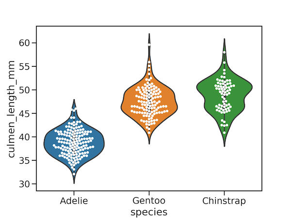
Violinplots are combination of boxplot and density plots. In this tutorial we will learn how to make Violinplots with Seaborn in Python and also show actual data points with violin plot. 👉 Want more? Explore the full Seaborn Tutorial Hub with 35+ examples, code recipes, and best practices. We will use Penguin data set to… Continue reading How To Make Violinpot with data points in Seaborn?
Tag: Python
How To Add Regression Line Per Group with Seaborn in Python?

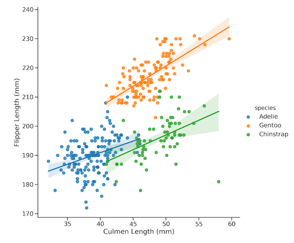
In this tutorial, we will learn how to add regression line per group to a scatter plot with Seaborn in Python. Seaborn has multiple functions to make scatter plots between two quantitative variables. For example, we can use lmplot(), regplot(), and scatterplot() functions to make scatter plot with Seaborn. However, they differ in their ability… Continue reading How To Add Regression Line Per Group with Seaborn in Python?
How To Make Bubble Plot with Seaborn Scatterplot in Python?

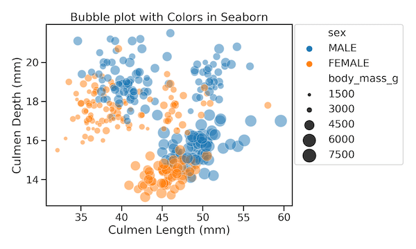
Bubble plots are scatter plots with bubbles (color filled circles) instead of data points. Bubbles have different sizes based on another variable in the data. Also bubbles can be of different color based on another variable in the dataset. Let us load the libraries needed. 👉 Want more? Explore the full Seaborn Tutorial Hub with… Continue reading How To Make Bubble Plot with Seaborn Scatterplot in Python?
How To Place Legend Outside the Plot with Seaborn in Python?
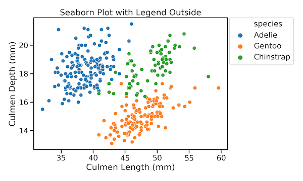
While making plots with legend, like scatterplot, Seaborn has a nice feature that finds a suitable place for legend and puts it automatically inside the plot. This greatly helps in utilizing plotting area efficiently. However, sometimes you might want the legend outside the plot. In this tutorial, we will see an example of how to… Continue reading How To Place Legend Outside the Plot with Seaborn in Python?
How To Make Scatter Plots with Seaborn scatterplot in Python?

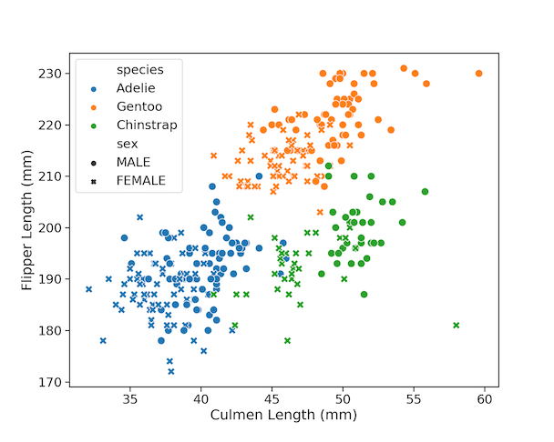
Scatter plots are one of the most powerful ways to visualize the relationship between two quantitative variables. With Python’s Seaborn library, you can easily enhance scatter plots by adding more dimensions using color, shape, and size. In this tutorial, you’ll learn 9 tips to make your Seaborn scatter plots publication-ready. We’ll use the popular Palmer… Continue reading How To Make Scatter Plots with Seaborn scatterplot in Python?