In this tutorial, we will learn how to add regression line per group to a scatter plot with Seaborn in Python. Seaborn has multiple functions to make scatter plots between two quantitative variables. For example, we can use lmplot(), regplot(), and scatterplot() functions to make scatter plot with Seaborn. However, they differ in their ability to add regression line to the scatter plot.
We will start with two ways in Seaborn to add simple regression line to a scatter plot. We will use lmplot() function and regplot() function to add a single regression line. When you have data set with third categorical variable, adding regression line per group can be meaningful. We will use lmplot() function to add regression line per group in a scatterplot.
Let us load the libraries we need to make the plots.
import matplotlib.pyplot as plt
import pandas as pd
import seaborn as sns
We will use the penguins data set to make scatter plot and add regression lines to it.
penguins_data="https://raw.githubusercontent.com/datavizpyr/data/master/palmer_penguin_species.tsv"
penguins_df = pd.read_csv(penguins_data, sep="\t")
penguins_df.head()
species	island	culmen_length_mm	culmen_depth_mm	flipper_length_mm	body_mass_g	sex
0	Adelie	Torgersen	39.1	18.7	181.0	3750.0	MALE
1	Adelie	Torgersen	39.5	17.4	186.0	3800.0	FEMALE
2	Adelie	Torgersen	40.3	18.0	195.0	3250.0	FEMALE
3	Adelie	Torgersen	NaN	NaN	NaN	NaN	NaN
4	Adelie	Torgersen	36.7	19.3	193.0	3450.0	FEMALE
How To Add Regression Line to Scatter plot in Seaborn?
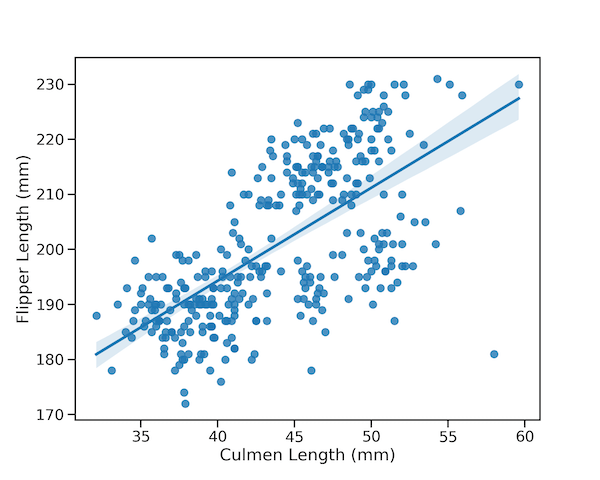
Let us first see an example using Seaborn’s lmplot() function to make a scatter plot with a single regression line. lmplot() adds regression line with confidence interval band to the scatterplot by default.
# add regression line with lmplot()
sns.lmplot(x="culmen_length_mm",
           y="flipper_length_mm",
           data=penguins_df,
           height=10)
plt.xlabel("Culmen Length (mm)")
plt.ylabel("Flipper Length (mm)")
plt.savefig("How_To_Add_Regression_Line_in_Seaborn_with_lmplot.png",
                    format='png',dpi=150)

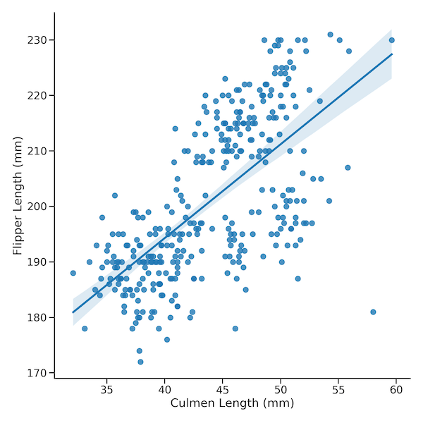
Regression Line to Scatter plot in Seaborn with regplot()
We can also make scatter plot with a single regression line to using regplot() function in Seaborn. By default, regplot() function also adds a confidence interval band to the regression line.
# add regression line with regplot()
plt.figure(figsize=(10,8))
sns.regplot(x="culmen_length_mm",
           y="flipper_length_mm",
           data=penguins_df)
plt.xlabel("Culmen Length (mm)")
plt.ylabel("Flipper Length (mm)")
plt.savefig("How_To_Add_Regression_Line_in_Seaborn_with_regplot.png",
                    format='png',dpi=150)

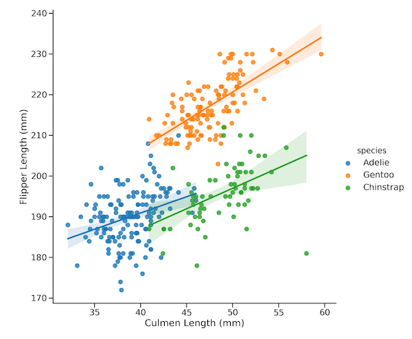
How To Add Regression Line Per Group in a Scatter plot in Seaborn?
Simple scatter plot show relationship between two quantitative variables. Often, you may have a third variable, that is categorical in nature, and may interested in asking how does the third variable change the relationship between the two quantitative variables.
Although regplot() can handle adding regression line to the whole data, it can not handle regression line per group. We can use lmplot() in Seaborn to add regression line for each value of the third categorical variable. Seaborn’s doc says that “lmplot() combines regplot() with FacetGrid to provide an easy interface to show a linear regression on “faceted” plots that allow you to explore interactions with up to three additional categorical variables”
The way to add regression per group with lmplot() is to simply add the “hue” argument with the cartegorical variable name. In this example, we add regression lines for three groups of species in the penguin data.
# add regression line per group Seaborn
sns.lmplot(x="culmen_length_mm",
           y="flipper_length_mm",
           hue="species",
           data=penguins_df,
           height=10)
plt.xlabel("Culmen Length (mm)")
plt.ylabel("Flipper Length (mm)")
plt.savefig("How_To_Add_Regression_Line_per_group_Seaborn.png",
                    format='png',dpi=150)
How To Remove CI band to Regression Lines on a Scatter plot in Seaborn?
By default, lmplot() with hue adds confidence interval band to the regression lines. We can turn off the CI band and have just the regression line using the argument ci=None.
# add regression line per group Seaborn
sns.lmplot(x="culmen_length_mm",
           y="flipper_length_mm",
           hue="species",
           ci=None,
           data=penguins_df,
           height=10)
plt.xlabel("Culmen Length (mm)")
plt.ylabel("Flipper Length (mm)")
plt.savefig("How_To_Add_Regression_Line_per_group_without_CI_Seaborn.png",
                    format='png',dpi=150)