Bubble plots are scatter plots with bubbles (color filled circles) instead of data points. Bubbles have different sizes based on another variable in the data. Also bubbles can be of different color based on another variable in the dataset.
Let us load the libraries needed.
👉 Want more? Explore the full Seaborn Tutorial Hub with 35+ examples, code recipes, and best practices.
import matplotlib.pyplot as plt
import pandas as pd
import seaborn as sns
We will use the fantastic new Penguins data, that is great for data visualization and learning Machine Learning and Data Science. We will load the penguins data from github page.
penguins_data="https://raw.githubusercontent.com/datavizpyr/data/master/palmer_penguin_species.tsv"
Let us load the simplified Penguins data as a Pandas dataframe.
penguins_df = pd.read_csv(penguins_data, sep="\t")
penguins_df.head()
species	island	culmen_length_mm	culmen_depth_mm	flipper_length_mm	body_mass_g	sex
0	Adelie	Torgersen	39.1	18.7	181.0	3750.0	MALE
1	Adelie	Torgersen	39.5	17.4	186.0	3800.0	FEMALE
2	Adelie	Torgersen	40.3	18.0	195.0	3250.0	FEMALE
3	Adelie	Torgersen	NaN	NaN	NaN	NaN	NaN
4	Adelie	Torgersen	36.7	19.3	193.0	3450.0	FEMALE
Scatterplot with Seaborn
As mentioned before, bubble is a special type of scatterplot with bubbles instead of simple data points in scatter plot. Let us first make a simple scatter plot using Seaborn’s scaatterplot() function.
sns.set_context("talk", font_scale=1.1)
plt.figure(figsize=(8,6))
sns.scatterplot(x="culmen_length_mm",
                y="culmen_depth_mm",
                data=penguins_df)
plt.xlabel("Culmen Length (mm)")
plt.ylabel("Culmen Depth (mm)")
plt.savefig("Seaborn_scatterplot.png",
                    format='png',dpi=150)
Bubble plot with Seaborn scatterplot()
To make bubble plot in Seaborn, we can use scatterplot() function in Seaborn with a variable specifying “size” argument in addition to x and y-axis variables for scatter plot.
In this bubble plot example, we have size=”body_mass_g”. And this would create a bubble plot with different bubble sizes based on the body size variable.
sns.set_context("talk", font_scale=1.1)
plt.figure(figsize=(10,6))
sns.scatterplot(x="culmen_length_mm",
                y="culmen_depth_mm",
                size="body_mass_g",
                data=penguins_df)
# Put the legend out of the figure
plt.legend(bbox_to_anchor=(1.01, 1),borderaxespad=0)
# Put the legend out of the figure
#plt.legend(bbox_to_anchor=(1.01, 0.54),  borderaxespad=0.)
plt.xlabel("Culmen Length (mm)")
plt.ylabel("Culmen Depth (mm)")
plt.tight_layout()
plt.savefig("Bubble_plot_Seaborn_scatterplot.png",
                    format='png',dpi=150)
Note that now we have a simple bubble plot made with Seaborn scatterplot function. Note that the size of the points vary with the size variable.
For the ease of visibility of data points we also place the legend outside the plotting area.
Bubble plot with specific size ranges Seaborn scatterplot()
We can customize the bubble plot made with Seaborn easily. One of the things that we notice from the bubble plot above is that the bubble size range seems to be small. It will be great if we could vary the smallest and largest bubble sizes.
With the argument “sizes” in Seaborn’s scatterplot() function, we can specify ranges for the bubble sizes. In this bubble plot example below, we used sizes=(20,500)
sns.set_context("talk", font_scale=1.1)
plt.figure(figsize=(10,6))
sns.scatterplot(x="culmen_length_mm",
                y="culmen_depth_mm",
                size="body_mass_g",
                sizes=(20,500),
                alpha=0.5,
                data=penguins_df)
# Put the legend out of the figure
plt.legend(bbox_to_anchor=(1.01, 1),borderaxespad=0)
# Put the legend out of the figure
#plt.legend(bbox_to_anchor=(1.01, 0.54),  borderaxespad=0.)
plt.xlabel("Culmen Length (mm)")
plt.ylabel("Culmen Depth (mm)")
plt.title("Bubble plot in Seaborn")
plt.tight_layout()
plt.savefig("Bubble_plot_size_range_Seaborn_scatterplot.png",
                    format='png',dpi=150)
Now our bubble plot looks much better with smallest bubble corresponding to smallest body mass and the biggest bubble corresponds to the largest body mass.
Bubble plot with colors by variable Seaborn scatterplot()
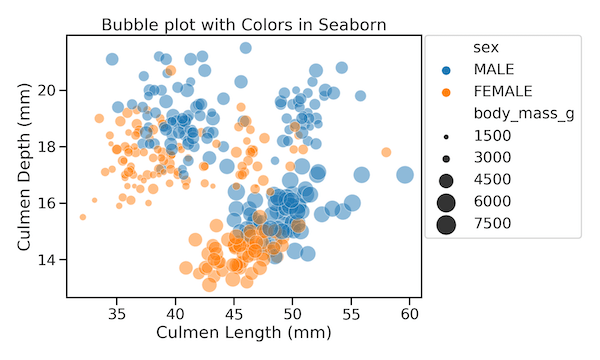
When you have more variables in the data, we can color the bubbles by the fourth variable. To color the bubble plot by a variable, we specify “hue” argument.
sns.set_context("talk", font_scale=1.1)
plt.figure(figsize=(10,6))
sns.scatterplot(x="culmen_length_mm",
                y="culmen_depth_mm",
                size="body_mass_g",
                sizes=(20,500),
                alpha=0.5,
                hue="sex",
                data=penguins_df)
# Put the legend out of the figure
plt.legend(bbox_to_anchor=(1.01, 1),borderaxespad=0)
# Put the legend out of the figure
#plt.legend(bbox_to_anchor=(1.01, 0.54),  borderaxespad=0.)
plt.xlabel("Culmen Length (mm)")
plt.ylabel("Culmen Depth (mm)")
plt.title("Bubble plot with Colors in Seaborn")
plt.tight_layout()

plt.savefig("Bubble_plot_Seaborn_color_by_variable_Seaborn_scatterplot.png",
                    format='png',dpi=150)
In this example we color bubbles by sex and we can easily see the body mass relationship with sex with the bubble plot with colors.
