
Creating professional-looking data visualizations in R starts with choosing the right ggplot2 theme. While ggplot2’s default gray theme works for basic plots, selecting the right theme can transform your visualizations from amateur to publication-ready.
In this comprehensive guide, you’ll discover 10+ ggplot2 themes that will make your R plots look professional and polished with literally no additional work from your end.
We’ll cover built-in themes, popular theme packages, and show you how to customize themes for your specific needs.
Whether you’re preparing plots for academic publications, business presentations, or data science portfolios, mastering ggplot2 themes is essential for creating impactful visualizations.
We will first load tidyverse, the suite of R packages.
library(tidyverse)
We will use the Palmer penguins data to illustrate the 6 themes from ggplot2. Let us load the data directly from github page.
path2data <- "https://raw.githubusercontent.com/cmdlinetips/data/master/palmer_penguins.csv"
penguins<- readr::read_csv(path2data)
## Parsed with column specification:
## cols(
##   species = col_character(),
##   island = col_character(),
##   bill_length_mm = col_double(),
##   bill_depth_mm = col_double(),
##   flipper_length_mm = col_double(),
##   body_mass_g = col_double(),
##   sex = col_character()
## )
Let us make a simple barplot using ggplot2 with Penguin data showing the number of penguins per each species. We will first make a simple barplot and save the plot as ggplot2 object.
p <- penguins |>
  count(species) |>
  ggplot(aes(x=species,y=n))+
  geom_col(width=0.5) +
  labs(x="Penguin Species", y="Count")
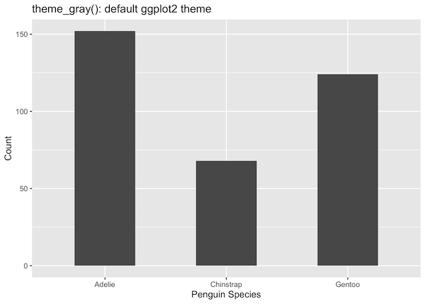
1. theme_gray() – The Default Theme
theme_gray() (also called theme_grey()) is ggplot2’s default theme. While it’s perfectly functional for exploratory data analysis, it may not be ideal for final presentations or publications.
Key characteristics:
- Light gray background with white grid lines
- Black text and axis lines
- Moderate contrast suitable for screen viewing
If you don’t specify any theme, you will get ggplot2 made with theme_grey() or theme_gray(). Here the background color will be grey and may not be efficient if you are actually printing the plot.
p +
  labs(title="theme_gray(): default ggplot2 theme")

When to use theme_gray():
- Quick exploratory data analysis
- Internal reports where aesthetics aren’t critical
- When you prefer the classic ggplot2 look
When to avoid theme_gray():
- Printed materials (wastes ink and reduces readability)
- Professional presentations
- Academic publications
- Web dashboards with white backgrounds
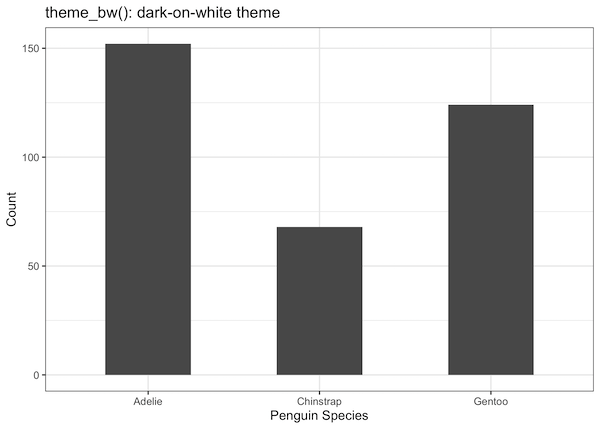
2. theme_bw() – Black and White Theme
theme_bw() provides excellent contrast with a clean white background, making it perfect for publications and professional documents. This theme is widely accepted in academic journals and business reports.
Key characteristics:
- White background with gray grid lines
- Black border around the plot area
- High contrast for excellent readability
- Print-friendly design
p +
  theme_bw()+
  labs(title="theme_bw(): dark-on-white theme")
Pro tip: The base_size parameter controls the overall size of text elements. Use base_size = 16 for presentations and base_size = 12 for publications.
theme_bw() with base_size=16
AN additional advantage of choosing a theme is that it enables to change the size of labels, lines and rectange sizes of the plot easily. This helps greatly with making the plot easy to read/see.
In this example, we increase the base_size to 16 from the default 11 by providing it as argument to theme_bw().
p +
  theme_bw(base_size = 16)+
  labs(title="theme_bw(): dark-on-white theme")
Now the plot is more legible over all.

Perfect for:
- Academic papers and journal submissions
- Black and white printing
- Formal business reports
- High-contrast requirements
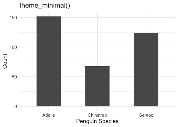
3. theme_minimal() – Clean and Modern
theme_minimal() offers a clean, contemporary look that’s become increasingly popular in data visualization. It removes unnecessary visual clutter while maintaining readability.
Key characteristics:
- No background fill or border
- Subtle gray grid lines
- Modern, minimalist aesthetic
- Excellent for digital presentations
p +
  theme_minimal(16)+
  labs(title="theme_minimal()")
Best practices with theme_minimal():
- Use sufficient color contrast since there’s no background
- Consider adding subtle borders for grouped data
- Works excellently with colorful data visualizations
Ideal use cases:
- Business presentations and slides
- Web dashboards and applications
- Modern reports and infographics
- Social media graphics
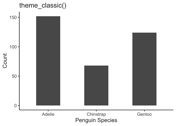
4. theme_classic() – Traditional Academic Style
theme_classic() provides a traditional statistical plot appearance with clean axis lines and no grid background. This theme is widely accepted in scientific publications.
Key characteristics:
- White background with no grid lines
- Black axis lines at bottom and left only
- Traditional statistical plot appearance
- Clean, distraction-free design
p +
  theme_classic(16)+
  labs(title="theme_classic()")
Why scientists love theme_classic():
- Focuses attention on the data, not the design
- Follows traditional statistical plotting conventions
- Accepted by most academic journals
- Clean appearance for figure panels
Perfect for:
- Scientific papers and research publications
- Statistical analysis reports
- Academic presentations
- Traditional data analysis contexts
5. theme_light() – Subtle Gray Theme
theme_light() strikes a balance between the stark contrast of theme_bw() and the minimalism of theme_minimal(). It features light gray borders and subtle styling.
Key characteristics:
- White background with light gray borders
- Subtle gray grid lines
- Softer appearance than theme_bw()
- Good compromise between minimal and bordered themes
p +
  theme_light(16)+
  labs(title="theme_light()")

When to choose theme_light():
- When theme_minimal() feels too stark
- For plots that benefit from subtle framing
- Professional documents that need clean but defined boundaries
- Multi-panel figures where separation is helpful
6. theme_dark() – Modern Dark Background
theme_dark() provides a modern dark aesthetic that’s popular in contemporary data visualization, especially for digital dashboards and presentations.
Key characteristics:
- Dark gray background
- Light-colored text and grid lines
- Modern, high-tech appearance
- Reduced eye strain in low-light environments
# Dark theme works well with bright colors
dark_plot <- penguins %>%
  drop_na() %>%
  ggplot(aes(x = flipper_length_mm, y = body_mass_g, color = species)) +
  geom_point(size = 2, alpha = 0.8) +
  theme_dark(base_size = 14) +
  scale_color_brewer(type = "qual", palette = "Set2") +
  labs(x = "Flipper Length (mm)",
       y = "Body Mass (g)",
       color = "Species",
       title = "theme_dark(): Modern Dark Aesthetic")
====

dark_plot


Color considerations for dark themes:
- Use bright, saturated colors that pop against dark backgrounds
- Avoid dark colors (navy, dark red) that blend with the background
- Consider accessibility – ensure sufficient contrast
- Digital dashboards and monitoring systems
- Late-night presentations
- Modern, tech-focused contexts
- Applications with dark UI themes
- No background, borders, or grid lines
- No axis lines or tick marks
- Complete focus on the data visualization itself
- Maximum customization flexibility
Best suited for:
7. theme_void() – Completely Blank Canvas
theme_void() removes all background elements, axes, and grid lines, creating a completely blank canvas. This theme is perfect for highly customized visualizations and artistic plots.
Key characteristics:
# theme_void() works great for maps, network plots, and artistic visualizations
# Here's an example with a simple pie chart visualization that doesn't need axes
void_plot <- penguins |>
  count(species) |>
  ggplot(aes(x = "", y = n, fill = species)) +
  geom_col(width = 1) +
  coord_polar(theta = "y") +  # Create pie chart
  theme_void(base_size = 14) +
  labs(fill = "Species",
       title = "theme_void(): Complete Blank Canvas") +
  theme(plot.title = element_text(hjust = 0.5, size = 16, face = "bold"))

void_plot

8. theme_linedraw() – Precise Line-Based Design
theme_linedraw(), a part of ggplot2 themes, provides a theme that uses only black lines of various widths on white backgrounds. This theme is particularly useful when you want precise, technical-looking plots with strong line emphasis.
Key characteristics:
- White background with black lines only
- No gray elements – purely black and white
- Strong emphasis on line weights and borders
- Technical, blueprint-like appearance
- Crisp, high-contrast design
# Create a multi-series line plot
line_data <- penguins |>
  drop_na() |>
  group_by(species, year) |>
  summarise(avg_mass = mean(body_mass_g), .groups = "drop")

line_data |> head()
linedraw_plot <- line_data |>
  ggplot(aes(x = year, y = avg_mass, color = species)) +
  geom_line(size = 1.5) +
  geom_point(size = 3) +
  theme_linedraw(base_size = 14) +
  labs(x = "Year",
       y = "Average Body Mass (g)",
       color = "Species",
       title = "theme_linedraw(): Precise Line-Based Design",
       subtitle = "Clean lines and strong contrast for technical presentations") +
  scale_x_continuous(breaks = c(2007, 2008, 2009))
linedraw_plot
ggsave("ggplot2_theme_linedraw_example.png")

When theme_linedraw() excels:
- Technical drawings and engineering plots
- When you need maximum contrast without gray elements
- Plots that will be converted to vector graphics
- Situations where line weight is important
- Black and white printing with emphasis on borders
Best practices with theme_linedraw():
- Use distinct colors since the theme provides no gray differentiation
- Works excellently with geometric shapes and technical plots
- Consider line weights carefully as they’re emphasized in this theme
- Great for plots that need to look precise and technical
Comparison with similar themes:
- vs theme_bw(): theme_linedraw() has no gray elements, only pure black lines
- vs theme_classic(): theme_linedraw() includes panel borders and stronger line emphasis
- vs theme_minimal(): theme_linedraw() has borders and more structural elements
Perfect for:
- Engineering and technical documentation
- Architectural and design presentations
- High-contrast requirements
- Vector graphics and scalable illustrations
- Plots emphasizing geometric precision
Check out here to learn more about the original themes of ggplot2..
Let us consider a few examples from great external ggplot2 theme packages.
9. theme_ipsum() – A Focus on Typography
The theme_ipsum() theme from the hrbrthemes package provides a clean, precise, and pristine aesthetic with a strong emphasis on modern typography. It is designed to make plots clear and readable for reports and publications.
Key characteristics:
- Clean, minimalist appearance with a light gray background
- Emphasis on high-quality, legible fonts (defaults to Arial Narrow)
- Subtle grid lines that don’t distract from the data
- Thoughtful spacing and margins for a polished look
library(hrbrthemes)
psum_plot <- penguins |>
  ggplot(aes(x = flipper_length_mm, y = body_mass_g, color = species)) +
  geom_point(size = 2, alpha = 0.8) +
  scale_color_ipsum() + # Use the theme's companion color scale
  labs(x = "Flipper Length (mm)",
       y = "Body Mass (g)",
       color = "Species",
       title = "theme_ipsum(): Typography-Focused Theme",
       subtitle = "From the 'hrbrthemes' package") +
  theme_ipsum(base_size = 14, plot_title_size = 20)
psum_plot
ggsave("ggplot2_theme_ipsum_hrbrthemes.png")
p>Font considerations for ipsum themes:
- The theme is built around specific fonts; installing them (e.g., Arial Narrow) ensures the intended appearance.
- The
hrbrthemespackage includes functions to help import the required fonts. - The base font size and family can be easily adjusted for different outputs.
Best suited for:
- Academic papers and corporate reports
- Data storytelling where clarity and readability are paramount
- Integrating plots into documents with modern typography
- Creating plots that look professional and polished with minimal effort
10. theme_economist() – Distinctive Publication Style from ggthemes
theme_economist() masterfully emulates the clean, recognizable, and professional aesthetic of the world-renowned magazine, The Economist. It’s an excellent choice for adding a touch of authority and unique style to a plot.
Key characteristics:
- Light gray overall background with a signature light blue plotting panel.
- White, subtle grid lines.
- Axis lines are present only on the left and bottom.
- Uses a specific font (Officina Sans) if installed, giving it a unique character.
library(ggthemes)
# Economist theme provides a polished, magazine-quality look
economist_plot <- penguins |>
  ggplot(aes(x = flipper_length_mm, y = body_mass_g, color = species)) +
  geom_point(size = 2, alpha = 0.8) +
  theme_economist(base_size = 14) +
  scale_color_economist() +
  labs(x = "Flipper Length (mm)",
       y = "Body Mass (g)",
       color = "Species",
       title = "theme_economist(): Publication-Ready Style",
       caption = "Source: Palmer Penguins")
economist_plot
ggsave("ggplot_theme_economist_ggthemes.png")

11. theme_tufte() – Minimalist Edward Tufte Style
theme_tufte() comes from the ggthemes package and implements the design principles of Edward Tufte, emphasizing maximum data-ink ratio and minimal chart junk. This theme removes all non-essential elements to focus purely on the data.
Key characteristics:
- Extremely minimal design with no background or grid lines
- Uses range frames instead of full axes
- Maximum data-to-ink ratio philosophy
- Clean typography and spacing
- Inspired by Edward Tufte’s “The Visual Display of Quantitative Information”
tufte_plot <- penguins |>
  drop_na() |>
  ggplot(aes(x = bill_length_mm, y = bill_depth_mm)) +
  geom_point(aes(color = species), size = 2, alpha = 0.8) +
  theme_tufte(base_size = 14) +
  labs(x = "Bill Length (mm)",
       y = "Bill Depth (mm)",
       color = "Species",
       title = "theme_tufte(): Maximum Data-Ink Ratio",
       subtitle = "Following Edward Tufte's minimalist design principles")

tufte_plot
ggsave("ggthemes_theme_tufte_example.png")

Edward Tufte’s design principles reflected:
- Data-ink ratio: Every ink mark represents data
- Chart junk elimination: No unnecessary decorative elements
- Range frames: Axis lines only span the data range
- Minimal typography: Clean, unobtrusive text
When to use theme_tufte():
- Academic presentations focused on data clarity
- Statistical analysis where the data should speak for itself
- Minimal design aesthetic requirements
- When following information design best practices
- Reports where simplicity and clarity are paramount
Best practices with theme_tufte():
- Use sparingly with color – let the data patterns stand out
- Consider adding
geom_rangeframe()for authentic Tufte style - Remove unnecessary legends when data is self-explanatory
- Focus on meaningful data relationships rather than decorative elements
Potential drawbacks:
- May be too minimal for some audiences expecting traditional charts
- Requires ggthemes package installation
- Range frames might confuse viewers unfamiliar with Tufte’s style
- Very sparse appearance may seem unfinished to some
Explore the Complete ggplot2 Guide
35+ tutorials with code: scatterplots, boxplots, themes, annotations, facets, and more—tested and beginner-friendly.
Visit the ggplot2 Hub → No fluff—just code and visuals.


