

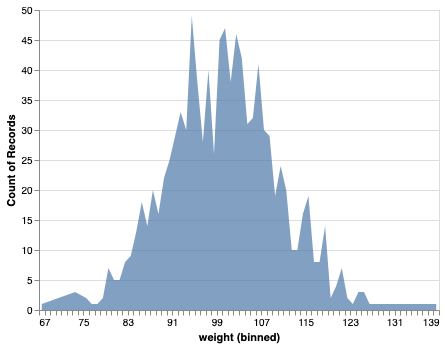
Why Sorting and Customizing Bar Plots Matters? Most bar charts need two upgrades to be useful: (1) put the categories in a meaningful order (ascending/descending), and (2) add polish (value labels, colors, readable axes, or horizontal layout for long names). This tutorial shows how to do all of that—starting with sorting—and then layering on practical… Continue reading Matplotlib Bar Plot in Python: Sort (Asc/Desc), Add Labels, Colors, Currency Axis & Horizontal Bars
Area Chart with Altair in Python

In this post, we will see how to make simple area chart with Altair in Python. Area chart displays a quantitative variable like a line plot or density plot but coloring the area under the curve. In Altair, we can make area chart with mark_area() function. Let us first load Altair and the needed packages.… Continue reading Area Chart with Altair in Python
Multiple Density Plots and Coloring by Variable with ggplot2


In this tutorial, we will learn how to make multiple density plots in R using ggplot2. Making multiple density plot is useful, when you have quantitative variable and a categorical variable with multiple levels. First, we will start with making multiple overlapping density plots and then see 4 ways to customize the density plot and… Continue reading Multiple Density Plots and Coloring by Variable with ggplot2
How To Make Bubble Plot in Python with Matplotlib?

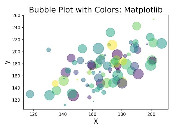
In this post, we will learn how to make bubbleplots using Matplotlib in Python. Bubble plot is a scatterplot, but with size of the data point on the scatter plot is coded by another variable. Basically, if the third variable is larger you get a bigger circle filled with a color i.e. bigger bubble and… Continue reading How To Make Bubble Plot in Python with Matplotlib?
How To Make Grouped Barplots in Python with Seaborn?

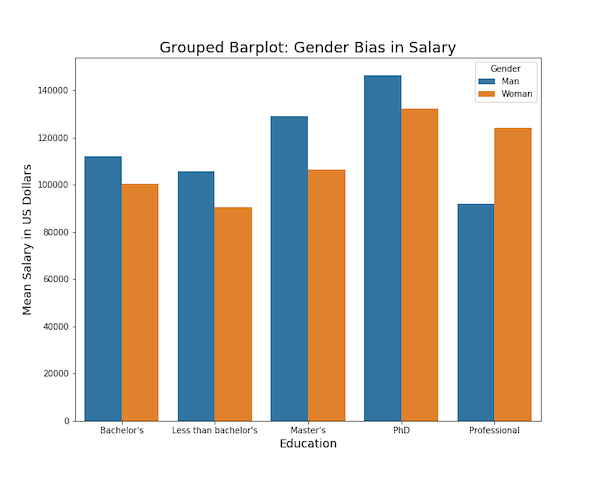
In this tutorial, we will see examples of how to make grouped barplots using Seaborn in Python. Barcharts are great when you have two variables one is numerical and the other is a categorical variable. A barplot can reveal the relationship between them. A Grouped barplot is useful when you have an additional categorical variable.… Continue reading How To Make Grouped Barplots in Python with Seaborn?