In this post, we will learn how to make lollipop plots in using R. Lollipop plots or lollipop charts kid of related to barplots or scatter plot when one of the variables is categorical variable.
We will use NYC flights data from nycflights13 R package. Let us load tidyverse and nycflights13 packages.
library(tidyverse)
library(nycflights13)
theme_set(theme_bw(base_size=16))
Data for making lollipop plot
We will use the flights data from nycflights13.
flights %>% colnames()

##  [1] "year"   "month"   "day"   "dep_time"
##  [5] "sched_dep_time" "dep_delay"  "arr_time"   "sched_arr_time"
##  [9] "arr_delay"  "carrier"    "flight"     "tailnum"
## [13] "origin"    "dest"     "air_time"    "distance"
## [17] "hour"   "minute"   "time_hour"
Let us use flights data frame and compute mean arrival delay per flight carrier. We first group_by(carrier) and use summarize function to get the mean values of the arrival delay.
flights_delay <- flights %>%
  group_by(carrier) %>%
  summarize(avg_arr_delay = mean(arr_delay, na.rm=TRUE))
This gives us a much smaller dataframe with carrier and its average arrival delay. And we will use the data to make lollipop plots in R using ggplot2.
## # A tibble: 16 x 2
##    carrier avg_arr_delay
##    <chr>           <dbl>
##  1 9E              7.38
##  2 AA              0.364
##  3 AS             -9.93
##  4 B6              9.46
##  5 DL              1.64
Lollipop Plot and its Relation to Barplot and Scatterplot
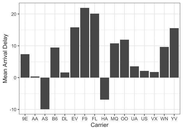
Lollipop plot is closely related to a barplot and it is a great replacement for a simple barplot. Lollipop plot and barplot convey the same information, but lollipop uses much less ink-space than a barplot. Let us quickly make a bar plot with flights_delay data frame
flights_delay %>%
  ggplot(aes(x=carrier,y=avg_arr_delay)) +
  geom_col()+
  labs(y= "Mean Arrival Delay", x="Carrier")
In the barplot, we have carrier on x-axis and mean arrival delay as the height of the bar.
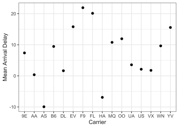
We can see that a bar is used to represent a quantitative value. A much sparse way to represent the bar is to use scatter plot and simply plot a dot for each quantitative value and categorical value.
Here is the scatter plot version of the above barplot.
flights_delay %>%
  ggplot(aes(x=carrier,y=avg_arr_delay)) +
  geom_point(size = 3, colour = "black") +
  labs(y= "Mean Arrival Delay", x="Carrier")
We can immediately see that, the scatter plot below has the same information as the barplot. However, it is not that easy to make sense out of it.
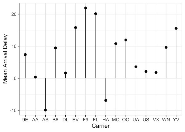
Basic Lollipop Plot in R
A lollipop chart strikes a nice balance on keeping it simple and making it easy to understand. A lollipop plot simply replaces the bar with a line/stick and a circle on top of the line.
In R, we can make lollipop plot using geom_point() and geom_segment() functions from ggplot2. geom_segment() function adds the vertical line for each category on x-axis. And geom_point() function adds the circle on top of the line in lollipop plot.
Within geom_segment() we need to specify the range of x and y -axis to make the line.
flights_delay %>%
  ggplot(aes(x=carrier,y=avg_arr_delay)) +
  geom_point(size = 3, colour = "black") +
  geom_segment( aes(x=carrier, xend=carrier, y=0, yend=avg_arr_delay))+
  labs(y= "Mean Arrival Delay", x="Carrier")
Here is our first attempt at the basic lollipop plot in R and it looks great.
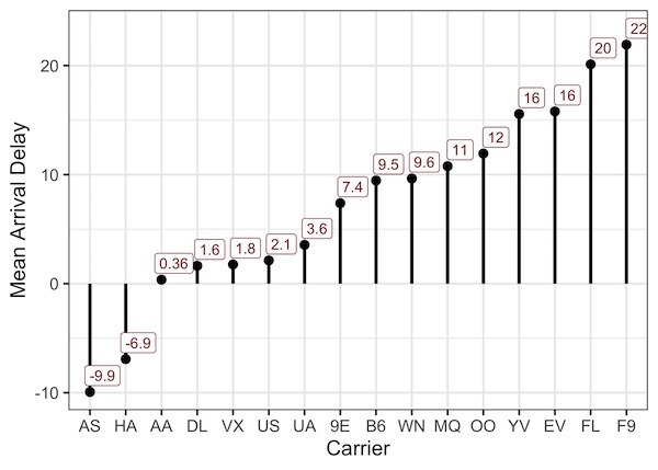
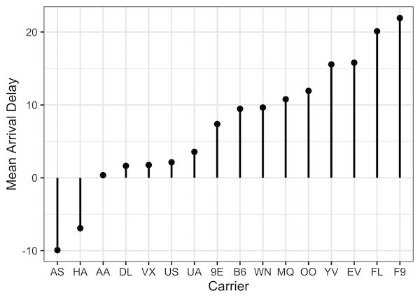
How to Reorder Lollipop Plot in R?
We can customize the lollipop plot further. For example, we can re-order the lollipop plot by its height i.e.avg_arr_delay using base R’s reorder() function.
flights_delay %>%
  ggplot(aes(x=reorder(carrier,avg_arr_delay),y=avg_arr_delay)) +
  geom_point(size = 3, colour = "black", aes(color=)) +
  geom_segment(aes(xend = carrier, yend = 0), size = 1.2)+
  labs(y= "Mean Arrival Delay", x="Carrier")
Now we get reordered lollipop plot.
How to Add Annotation To Lollipop Plot in R?
We can add more customization to the lollipop plot. Here, we add text annotation i.e. the mean arrival delay on top of the lollipop. We use geom_label() function to add the annotation.
flights_delay %>%
  ggplot(aes(x=reorder(carrier,avg_arr_delay),y=avg_arr_delay)) +
  geom_point(size = 3, colour = "black", aes(color=)) +
  geom_segment(aes(xend = carrier, yend = 0), size = 1.2)+
  geom_label(aes(carrier, avg_arr_delay+1.5, label = signif(avg_arr_delay,2)), colour = "darkred", nudge_x = 0.35, size = 4)+
  labs(y= "Mean Arrival Delay", x="Carrier")