In this tutorial, we will learn how to make multiple density plots in R using ggplot2. Making multiple density plot is useful, when you have quantitative variable and a categorical variable with multiple levels. First, we will start with making multiple overlapping density plots and then see 4 ways to customize the density plot and make it look better.
Load Packages and Datasets
Let us load tidyverse and also set the default theme to theme_bw() with base size for axis labels.
library(tidyverse)
theme_set(theme_bw(base_size=16))
We will make density plots using 2019 Stack Overflow survey data. The results from the 2019 survey is processed already and is available at datavizpyr.com‘s github page.
stackoverflow_file <- "https://raw.githubusercontent.com/datavizpyr/data/master/SO_data_2019/StackOverflow_survey_filtered_subsampled_2019.csv"
# read file
survey_results <- read_csv(stackoverflow_file)
To make density plots, we will mainly use distribution of salary and the manager category with two levels: individual contributors and managers in US to make multiple density plots with ggplot2.
## # A tibble: 5 x 4
##   CompTotal Gender Manager YearsCode
##       <dbl> <chr>  <chr>   <chr>
## 1    180000 Man    IC      25
## 2     55000 Man    IC      5
## 3     77000 Man    IC      6
## 4     67017 Man    IC      4
## 5     90000 Man    IC      6
How to Make Multiple Density Plots with ggplot2
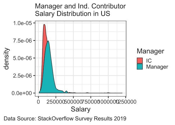
Let us first make a simple multiple-density plot in R with ggplot2. We learned earlier that we can make density plots in ggplot using geom_density() function. To make multiple density plot we need to specify the categorical variable as second variable. In this example, we specify the categorical variable with “fill” argument within aes() function inside ggplot(). And then we add geom_density() function as before.
survey_results%>%
  ggplot(aes(x=CompTotal, fill=Manager)) +
  geom_density()+
  labs(x= "Salary",
       subtitle="Manager and Ind. Contributor\nSalary Distribution in US",
       caption="Data Source: StackOverflow Survey Results 2019")

ggsave("simple_density_plot_with_ggplot2_R.jpg")
We get a multiple density plot in ggplot filled with two colors corresponding to two level/values for the second categorical variable. If our categorical variable has five levels, then ggplot2 would make multiple density plot with five densities.
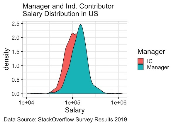
Multiple Density Plots with log scale
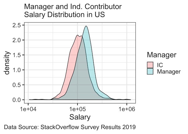
We can see that the our density plot is skewed due to individuals with higher salaries. We can correct that skewness by making the plot in log scale. In ggplot2, we can transform x-axis values to log scale using scale_x_log10() function.
survey_results%>%
  ggplot(aes(x=CompTotal, fill=Manager)) +
  geom_density()+
  scale_x_log10()+
  labs(x= "Salary",
       subtitle="Manager and Ind. Contributor\nSalary Distribution in US",
       caption="Data Source: StackOverflow Survey Results 2019")
#ggsave("density_plot_scale_x_log10_with_ggplot2_R.jpg")
Now our multiple density plot looks much better with log scale on x-axis.
Multiple Density Plots with tranparency
Another problem we see with our density plot is that fill color makes it difficult to see both the distributions. We can solve this issue by adding transparency to the density plots. We can change the transparency using alpha argument.
survey_results%>%
  ggplot(aes(x=CompTotal, fill=Manager)) +
  geom_density(alpha=0.3)+
  scale_x_log10()+
  labs(x= "Salary",
       subtitle="Manager and Ind. Contributor\nSalary Distribution in US",
       caption="Data Source: StackOverflow Survey Results 2019")
#ggsave("density_plot_scale_x_log10_with_ggplot2_R.jpg")
In this example, we set the transparency level with alpha=0.3 inside geom_density() function. Now we can see the distribution of salaries for both the groups we have.
Color Density line in Multiple Density Plots by a Variable
Note that the outline around the density plot is black in color. We can color the outline of density plot with the same colors as the fill argument, using another argument “color” inside aes() function as shown below. Here we color the line by a variable in the data frame.
survey_results%>%
  ggplot(aes(x=CompTotal, color=Manager, fill=Manager)) +
  geom_density(alpha=0.3,size=1)+
  scale_x_log10()+
  labs(x= "Salary",
       subtitle="Manager and Ind. Contributor\nSalary Distribution in US",
       caption="Data Source: StackOverflow Survey Results 2019")
We have also increased the thickness of outline using size argument to geom_density()

Having both fill and color arguments colors the outline and fills the density plot. If you don’t want to fill the density plot, we can simply not use the fill argument.
In the example below we color the density plot outline but do not fill it color.
survey_results%>%
  ggplot(aes(x=CompTotal, color=Manager)) +
  geom_density(alpha=0.3,size=1)+
  scale_x_log10()+
  labs(x= "Salary",
       subtitle="Manager and Ind. Contributor\nSalary Distribution in US",
       caption="Data Source: StackOverflow Survey Results 2019")


Explore the Complete ggplot2 Guide
35+ tutorials with code: scatterplots, boxplots, themes, annotations, facets, and more—tested and beginner-friendly.
Visit the ggplot2 Hub → No fluff—just code and visuals.