

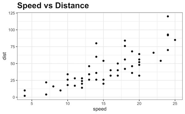
In this tutorial, we will learn how to make multiple density plots in R using ggplot2. Making multiple density plot is useful, when you have quantitative variable and a categorical variable with multiple levels. First, we will start with making multiple overlapping density plots and then see 4 ways to customize the density plot and… Continue reading Multiple Density Plots and Coloring by Variable with ggplot2
Category: R
How To Make Title Bold in ggplot2?

Want to make your plot titles stand out and look more professional? This comprehensive guide shows you exactly how to make title bold ggplot2 using multiple styling methods, with ready-to-use code examples. 📚 Complete ggplot2 guide — 35+ tutorials with code, themes, labels, and more. Browse hub → Plot titles are crucial for communicating your… Continue reading How To Make Title Bold in ggplot2?
Remove Axis Text & Ticks in ggplot2 (R) — Quick Examples

Sometimes when making a plot in R, you may want a cleaner chart without axis labels or tick marks. In ggplot2, both axis text (the labels) and axis ticks (the small tick marks) can be removed or customized. In this tutorial, you’ll learn how to remove axis text and ticks in ggplot2 for the x-axis… Continue reading Remove Axis Text & Ticks in ggplot2 (R) — Quick Examples
How To Make Lollipop Plot in R with ggplot2?
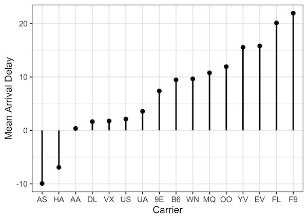
In this post, we will learn how to make lollipop plots in using R. Lollipop plots or lollipop charts kid of related to barplots or scatter plot when one of the variables is categorical variable. We will use NYC flights data from nycflights13 R package. Let us load tidyverse and nycflights13 packages. Data for making… Continue reading How To Make Lollipop Plot in R with ggplot2?
Reorder Boxplots in R (ggplot2): 4 Easy Examples

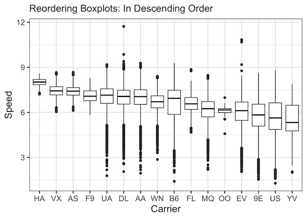
Why Reorder Boxplots in ggplot2? By default, ggplot2 arranges categorical variables alphabetically. Reordering boxplots by a numeric summary (mean or median) helps highlight patterns—like which airlines fly fastest on average. This makes your visualization more interpretable and presentation-ready. In this post, we will learn how to re-order boxplots in R with ggplot2. We will make… Continue reading Reorder Boxplots in R (ggplot2): 4 Easy Examples