
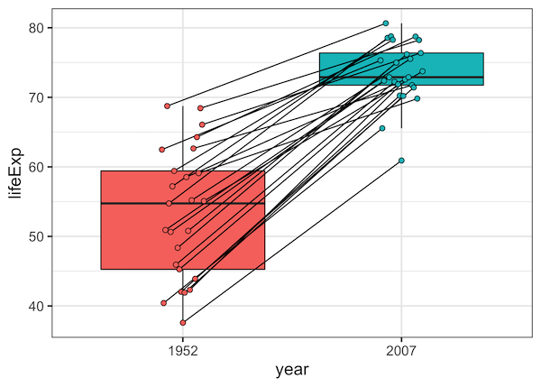
Want to show relationships between paired observations or track changes across groups in your boxplots? This comprehensive guide shows you exactly how to connect points boxplot ggplot2 using lines, with practical examples for before/after studies, paired data, and longitudinal analysis. Standard boxplots are excellent for comparing distributions, but they don’t reveal relationships between individual data… Continue reading Connect Paired Points on Boxplots with Lines in ggplot2
Category: R
How to Make ECDF Plot with ggplot2 in R?

ECDF plot, a short for Empirical Cumulative Distribution Function Plot, is a great way to visualize one or more distributions. ECDF plot is a great alternative for histograms, as it does not suffer from the need of tuning parameter (bin size in histogram is a tuning parameter) and it can show the full range of… Continue reading How to Make ECDF Plot with ggplot2 in R?
ggpointdensity plot: A ggplot extension combining scatter plot with density plot

Scatterplots are great for visualizing relationship between two quantitative variables. However, it suffers from overplotting when the number of data points is large. Another solution is plot the density instead of actjual points. However, sometimes you might want to see the datapoints. ggpointdensity is a ggplot2 extension that solves the problem by combining scatterplot with… Continue reading ggpointdensity plot: A ggplot extension combining scatter plot with density plot
How To Add Mean Line to Ridgeline Plot in R with ggridges?

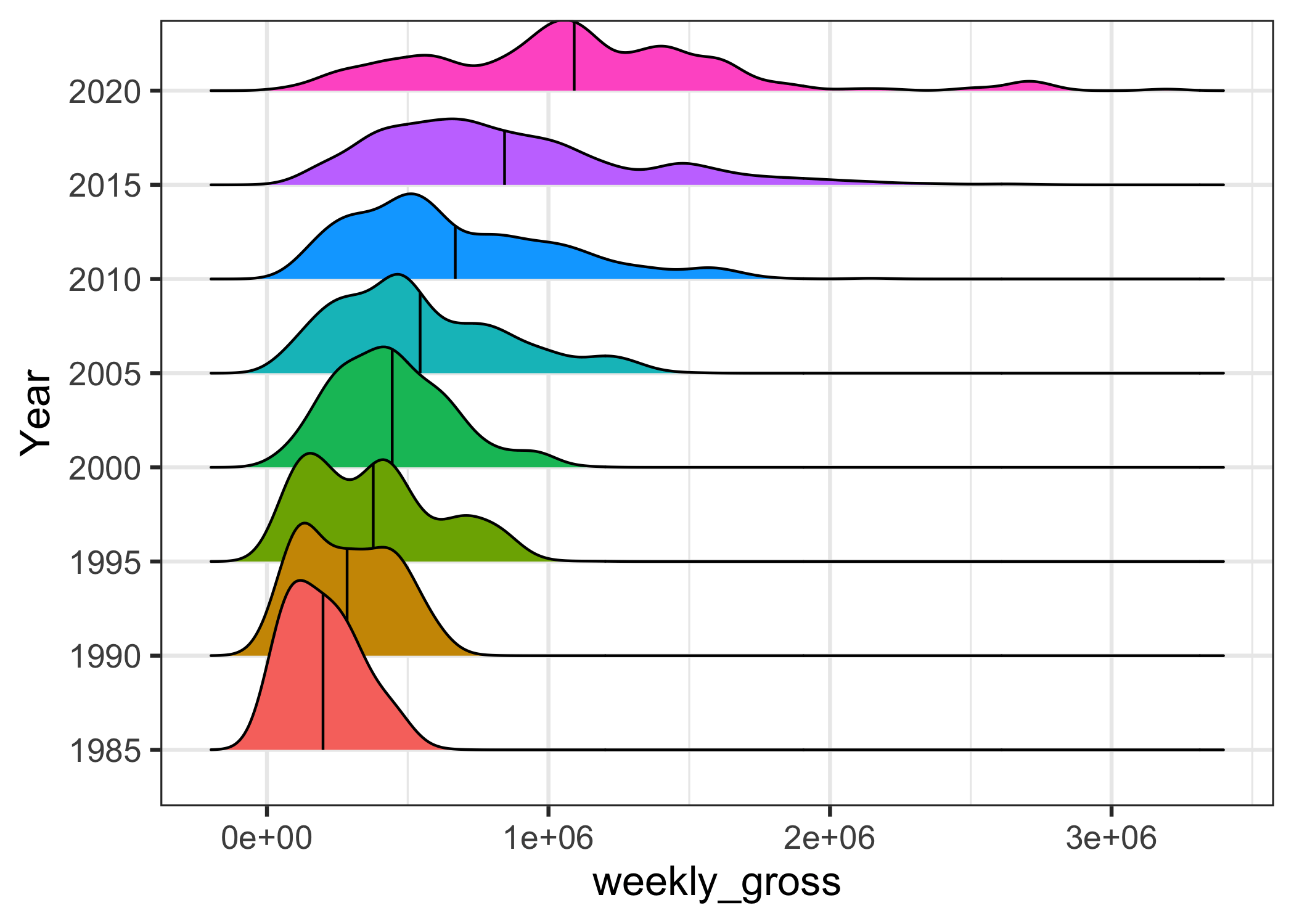
In this post, we will learn how to add mean line to ridgeline plot. We can make ridgeline plot in R with ggridges R package developed Claus Wilke. Ridgeline plot is useful when you have multiple distributions or a distribution that changes in distributions over time or space. The name “ridgeline” comes from the way… Continue reading How To Add Mean Line to Ridgeline Plot in R with ggridges?
How to Add Labels Over Each Bar in Barplot in R?
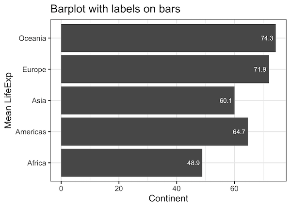
Adding text annotations over a barplot can be useful in quickly conveying the core message of a plot. In this post, we will see example of how to add text labels or text annotations over each bar in barplot. Barplot is great way to visualize numerical values corresponding to categorical variables. The height of the… Continue reading How to Add Labels Over Each Bar in Barplot in R?