
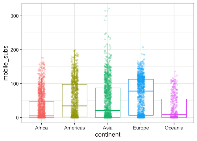
Making a boxplot with data points on top of the boxplot is a great way to show distributions of multiple groups. A big advantage is that one can see the raw data and the summary stats of distributions using boxplot with data points. ggplot2 in R makes it easy to make boxplots and add data… Continue reading A mistake to Avoid while making boxplot with datapoints in ggplot2
Category: ggplot2
How to Make Boxplot with a Line Connecting Mean Values in R?
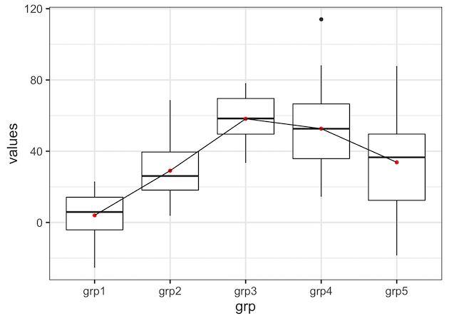
In this post, we will learn how to draw a line connecting the mean (or median) values in a boxplot in R using ggplot2. Connecting mean or median values in each group i.e. each box in boxplot can help easily see the pattern across different groups. The basic idea in making a boxplot with a… Continue reading How to Make Boxplot with a Line Connecting Mean Values in R?
How to Add Labels to Select Points with ggrepel?
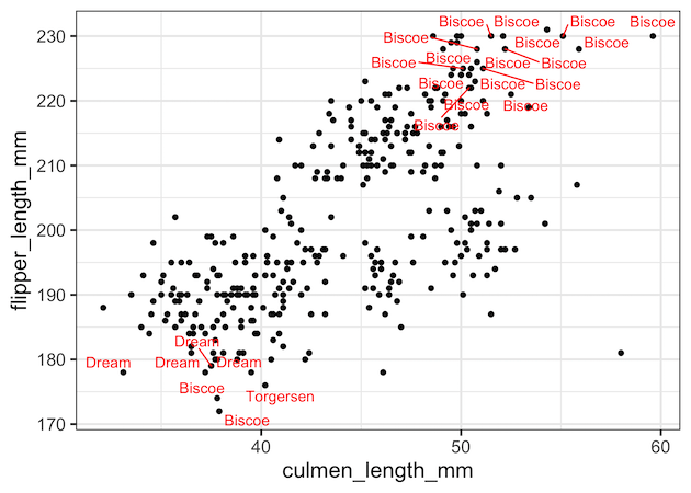
In this post, we will see how to add labels or annotations to select data points such that the labels don’t overlap with each other. We will use the R package ggrepel together with ggplot to add labels without overlaps. More specifically we will use geom_text_repel() function from ggrepel to add annotations to data points.… Continue reading How to Add Labels to Select Points with ggrepel?
How To Make Scree Plot in R with ggplot2

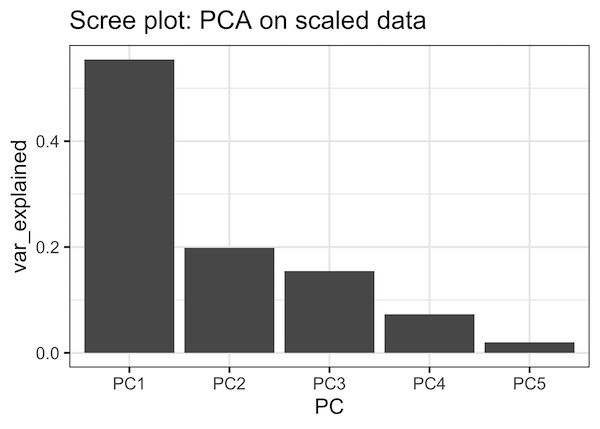
PCA aka Principal Component analysis is one of the most commonly used unsupervised learning techniques in Machine Learning. PCA on a high dimensional data can reveal the pattern or structure in the data. Scree plot is one of the diagnostic tools associated with PCA and help us understand the data better. Scree plot is basically… Continue reading How To Make Scree Plot in R with ggplot2
Rain Cloud Plots using Half Violin Plot with jittered data points in R


Raincloud plot is another interesting use of Violinplots. Rain cloud plot is basically a combination of horizontal half violin plots with jittered data points. We will see step-by-step examples of how to make raincloud plot in this tutorial in R with ggplot2. Since there is no special function available for half violinplot in ggplot2, we… Continue reading Rain Cloud Plots using Half Violin Plot with jittered data points in R