
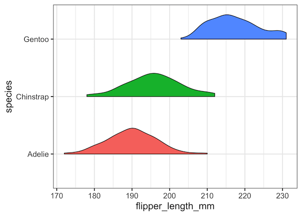
Violinplots are a great alternative to boxplot to visualize distribution of multiple variables. In this turtorial, we will learn about, half violin plot, a variant of violinplot in R with ggplot2. It is literally half of a violinplot, in a meaningful way. We will see examples of how to make half violinplot using ggplot2. For… Continue reading How To Make Half Violinplot with ggplot2 in R?
Category: ggplot2
How To Remove facet_wrap Title Box in ggplot2?

In this tutorial, we will see how to remove box surrounding title of each facets made with facet_wrap() function in ggplot2. Let us load tidyverse and set ggplot2 theme_bw() with base size 16. Let us use Palmer penguin dataset to make plots with facets using facet_wrap() in ggplot2. We ill use the palmerpenguins package to… Continue reading How To Remove facet_wrap Title Box in ggplot2?
How To Change facet_wrap() Box Color in ggplot2?

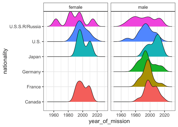
Facetting is a great way to show relationship between more than two variables. When you have three variables, with faceting one can splot a single plot into smaller plots with subset of data corresponding to the third variable. In ggplot2, we can easily make facetted plot using facet_wrap() function. When you use facet_wrap() in ggplot2,… Continue reading How To Change facet_wrap() Box Color in ggplot2?
How To Zoom in on a Plot in R?

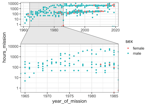
While making data visualization, often you might want show a bigger level picture and then zoom in on part of the plot. In this tutorial, we will see an example of how to zoom in on a part of plot made with ggplot2 in R. The package, ggforce, made by fantastic Thomas Lin Pedersen, can… Continue reading How To Zoom in on a Plot in R?
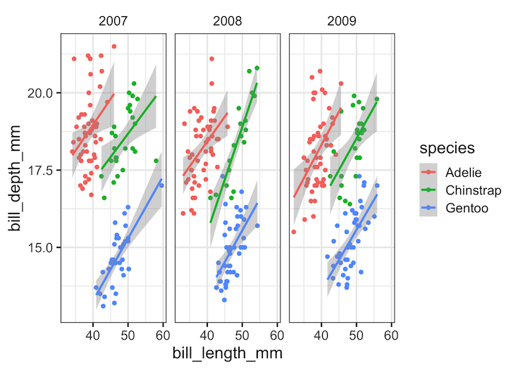
How To Add Regression Line per Group to Scatterplot in ggplot2?
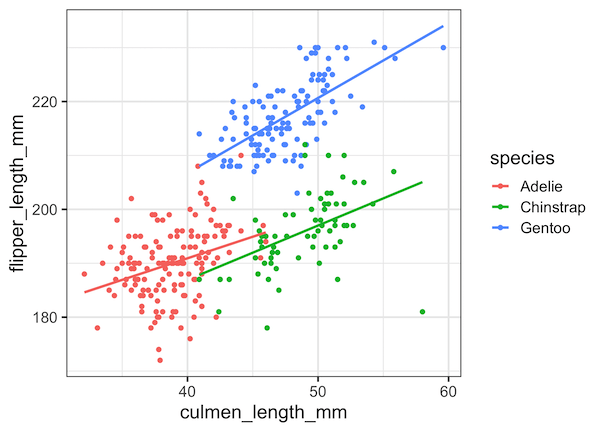
In this tutorial, we will learn how to add regression lines per group to scatterplot in R using ggplot2. In ggplot2, we can add regression lines using geom_smooth() function as additional layer to an existing ggplot2. We will first start with adding a single regression to the whole data first to a scatter plot. And… Continue reading How To Add Regression Line per Group to Scatterplot in ggplot2?