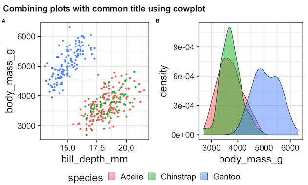
Combining or joining multiple plots made with ggplot2 into a single plot is often very useful in telling a story with data. Now we have multiple options in R, including patchwork, gridExtra, and cowplot to join multiple plots made by ggplot2. In this post, we will see how to use R package cowplot made by… Continue reading How To Join Multiple ggplot2 Plots with cowplot?
Category: ggplot2
How To Make Dumbbell Plot in R with ggplot2?
Dumbbell plots or connected dot plots are a great way to visualize change in something over time for multiple groups. Dumbbell plots are a great alternative to grouped barchart as dumbbell plot uses much less ink on the paper and is much simpler to understand. We can use ggplot2 extension packages to make a dumbbell… Continue reading How To Make Dumbbell Plot in R with ggplot2?
How To Get the Default Color Codes of ggplot2?
ggplot2 adds colors to its plot automatically. Sometimes you might want to get the list of colors (color codes) that ggplot2 uses. In this post, we will learn how to get the color codes that ggplot2 uses by default in a plot. We will use scales package in tidyverse to get the colors for different… Continue reading How To Get the Default Color Codes of ggplot2?
How To Manually Specify Colors for Barplot in ggplot2?
One of the great things about making plots with ggplot2 is that it offers a number of ways to add colors to the plots. We can use ggplot2’s default options for adding colors to plots. However, sometimes one might want to manually specify colors to a plot. There are a few ways to manually specify… Continue reading How To Manually Specify Colors for Barplot in ggplot2?
How To Make Scatterplot with Marginal Histograms in R?
In this post, we will learn how to make a scatterplot with marginal histograms in R. We will use ggExtra, one of the ggplot2 extension packages to make scatterplot with marginal histogram. First, we will add simple marginal histograms to a scatterplot made with ggplot2. Next, we we will show how to color the histogram… Continue reading How To Make Scatterplot with Marginal Histograms in R?
