

Violin plots are a way visualize numerical variables from one or more groups. Violin plots are similar to box plots. A boxplot shows a numerical distribution using five summary level statistics. Violin plots have the density information of the numerical variables in addition to the five summary statistics. In this post we will learn how… Continue reading How To Make Violin Plots with ggplot2 in R?
Author: datavizpyr
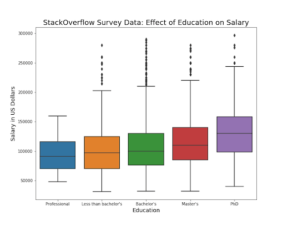
How To Use Seaborn Color Palette to Color Boxplot

Adding right set of colors to plot can reveal a pattern that is not seen before. Seaborn Color Palettes makes it really easy to add group of suitable colors to your data visualization. In this post, we will learn how to use Seaborn Color Palettes to color a boxplot made with Seaborn. Although we illustrate… Continue reading How To Use Seaborn Color Palette to Color Boxplot
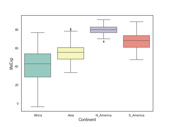
How To Manually Order Boxplot in Seaborn?

In this post we will learn how to manually sort boxes in boxplot when using Seaborn’s boxplot function in Python. Earlier we saw how to order a boxplot in Python by another variable, for example we ordered boxplot by mean/median using Seaborn. Sometimes, you may already know what order the boxes should be and want… Continue reading How To Manually Order Boxplot in Seaborn?
How To Highlight a Bar in Barplot in R?

Sometimes while making a barplot, you might like to highlight a single bar in different color when compared to other bars. In this post, we will learn how to highlight a bar in barplot using ggplot2 in R. A Barplot displays counts or some quantitative variable corresponding to multiple categories as bars. Let us load… Continue reading How To Highlight a Bar in Barplot in R?
How To Make Barplots with Error bars in ggplot2?

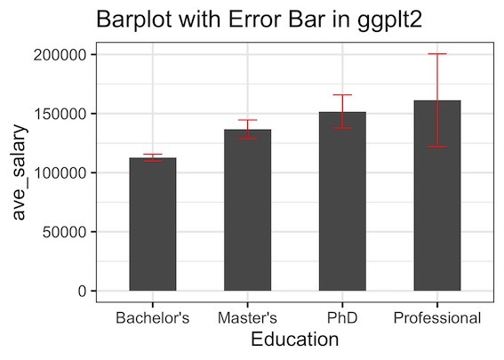
In this post, we will learn how to make a barplot with error bar using ggplot2 in R. Barplot alone is useful to display counts for multiple categories. However, often there may be uncertainty around the count values and we could represent as error bar on the barplot. Let us load tidyverse packages. We will… Continue reading How To Make Barplots with Error bars in ggplot2?