Violin plots are a way visualize numerical variables from one or more groups. Violin plots are similar to box plots. A boxplot shows a numerical distribution using five summary level statistics. Violin plots have the density information of the numerical variables in addition to the five summary statistics.
In this post we will learn how to make violin plots in R using ggplot2. We will start with simple violin plot with a simulated data first and then use this week data from tidytuesday projects from R for Data Science Online community.
Let us first load tidyverse.
library(tidyverse)
We will simulate some data to make simple violin plot using ggplot2.
set.seed(42)
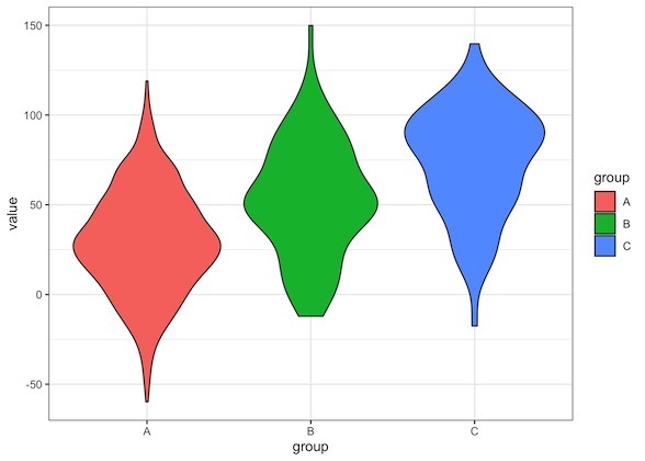
data <- tibble(
group=c( rep("A",500), rep("B",100), rep("C",70)),
value=c(rnorm(500, 30, 30), rnorm(100, 53, 30), rnorm(70, 73, 30)))
The data contains two columns, one corresponding to three groups and numerical values for each of them.
data %>% head()

## # A tibble: 6 x 2
##   group value
##   <chr> <dbl>
## 1 A      71.1
## 2 A      13.1
## 3 A      40.9
## 4 A      49.0
## 5 A      42.1
## 6 A      26.8
We can make Violin plots with ggplot2 using geom_violin() function. In ggplot2, as its doc explains, Violin Plot
is a blend of geom_boxplot() and geom_density(): a violin plot is a mirrored density plot displayed in the same way as a boxplot.
After passing the data to ggplot() function with mapping information, we add geom_violin() function to make simple violin plot. In this violin plot, we have also colored by using fill argument inside the aes() function with mapping variables.
data %>%
  ggplot(aes(x=group, y=value, fill=group)) +
  geom_violin()
A quick look at the violin plot shows that is is very similar to boxplot with additional density information makes the box look like a violin. For example, we have fewer data points at the thin part of violin plot and a lot more data points when the violin plot is thicker/wider.

Now that we have learned how to make violin plot using simulated data set, let us try our hands at a real dataset and make violin plot. here, we will not only make violin plot, but also customize the violin plot to make it look better.
We will use the data set from tidytuesday project. The tidytuesday data set will be using to make simple violin plots and improve is from Week 8 2020 and it is on “Food Consumption and CO2 Emissions”.
The dataset comes from nu3 and was contributed by Kasia Kulma. Kasia has put together a great guide on webscraping along with data cleaning and organization! Make sure to check out her blog post
Let us load the food consumption and CO2 emission data from tidytuesday website.
food_consumption <- read_csv('https://raw.githubusercontent.com/rfordatascience/tidytuesday/master/data/2020/2020-02-18/food_consumption.csv')
This dataset contains food consumption and CO2 emission for countries
head(food_consumption)

## # A tibble: 6 x 4
##   country   food_category consumption co2_emmission
##   <chr>     <chr>               <dbl>         <dbl>
## 1 Argentina Pork                10.5          37.2
## 2 Argentina Poultry             38.7          41.5
## 3 Argentina Beef                55.5        1712
## 4 Argentina Lamb & Goat          1.56         54.6
## 5 Argentina Fish                 4.36          6.96
## 6 Argentina Eggs                11.4          10.5
Let us make violin plot between food category and CO2 emission and fill the violin plot with colors based on the value of food category.
food_consumption %>%
  ggplot(aes(x=food_category, y=co2_emmission, fill=food_category)) +
  geom_violin()
Our first attempt at making Violin plot looks a great disaster. There is nothing “violin” about the plot, right?
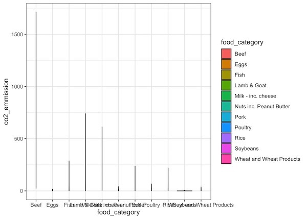
We can see that CO2 emission values on the y-axis is pretty spread out with possibly most of the values are smaller. Let us try plotting the CO2 emission values on log scale. We can easily do that by adding scale_y_log10() to our ggplot2 code for violin plot.
food_consumption %>%
  ggplot(aes(x=food_category, y=co2_emmission, fill=food_category)) +
  geom_violin()+
  scale_y_log10()
Now our Violin plot on log scale looks much better than our first attempt. Since we have colored the violins by food category, we also get a legend for it.
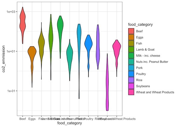
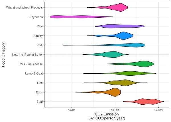
Although our Violin plot on second try was huge improvement, there is still a lot of things that could be fixed. The first is our x-axis tick labels corresponding to foo categories are overlapping with each other and not readable. And our legend is not adding any new information. So we can fix these two issues with removing the legend and making the violin plot horizontal so that the tick labels are easily readable.
food_consumption %>%
  ggplot(aes(x=food_category, y=co2_emmission, fill=food_category)) +
  geom_violin()+
  scale_y_log10() +
  coord_flip()+
  theme(legend.position = "none")+
  labs(x="Food Category",y="CO2 Emission\n(Kg CO2/person/year)")
ggsave("horizontal_violin_plots_ggplot2_R.jpeg")
Here we flipped the x and y-axis with coord_flip() function to make the violin plot horizontal. And we used them(legend.position=”none”) to remove the legend.
Our Horizontal Violin plot looks much better and we can read the x-tick labels (now on y-axis) easily. And we can see that CO2 consumption is lowest for Soy beans and highest for beef.
Our third try at Violin plot is definitely a huge improvement over the previous attempts. We could easily see the top and bottom CO2 emission food categories easily. However, for others in between the top and bottom categories it is not that easy. We can solve the problem by ordering the Violin plot by mean CO2 emission values.
food_consumption %>%
  ggplot(aes(x=fct_reorder(food_category,co2_emmission),
             y=co2_emmission, fill=food_category)) +
  geom_violin()+
  scale_y_log10() +
  coord_flip()+
  theme(legend.position = "none")+
  labs(x="Food Category", y="CO2 Emission\n(Kg CO2/person/year)")
ggsave("horizontal_violin_plots_ordered_ggplot2_R.jpeg")
We have ordered the Violin plot using fct_reorder() function available in forcats R package. We can also use base R reorder() function to re-order the Violin plot. Now we have a nice looking horizontal Violin plot ordered by CO2 emission values.