

Creating professional-looking data visualizations in R starts with choosing the right ggplot2 theme. While ggplot2’s default gray theme works for basic plots, selecting the right theme can transform your visualizations from amateur to publication-ready. In this comprehensive guide, you’ll discover 10+ ggplot2 themes that will make your R plots look professional and polished with literally… Continue reading Best ggplot2 Themes to Make Your R Plots Look Professional (2025 Guide)
Tag: R
How To Add Labels to Grouped Barplot with Bars Side-By-Side in R?

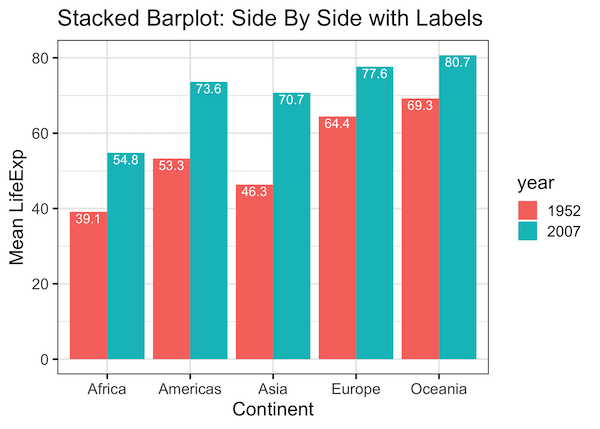
In this post we will learn how to add labels to bars on barplot that is stacked side-by-side. We will start with making side-by-side grouped barplot and work our way through adding annotation on top of each bar of the stacked barplot. Adding annotation to grouped barplot with side-by-side bars is similar to annotating bars… Continue reading How To Add Labels to Grouped Barplot with Bars Side-By-Side in R?
How To Adjust Legend Position in ggplot2?
Legends are useful to add additional variables to a data visualization. By default, when we make a plot with legend using ggplot2, it places the legend on outside the plot on the right side. In this post, we will learn how to change or adjust the legend position in ggplot2. We will use ggplot2’s theme()… Continue reading How To Adjust Legend Position in ggplot2?
How To Show Mean Value in Boxplots with ggplot2?
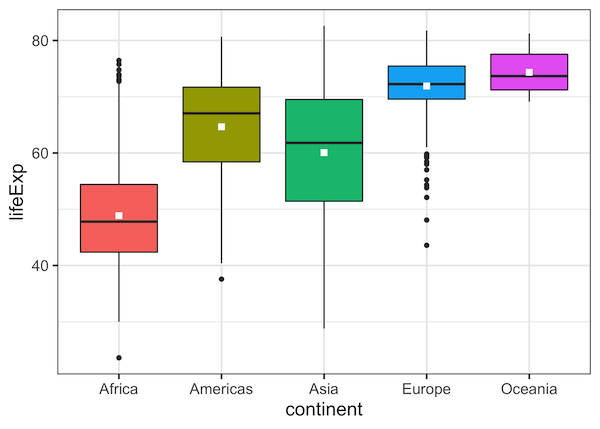
Boxplots are a great way to visualize multiple distributions using summary statistics. Boxplot shows five summary statistics; the minimum, the maximum, the median, and the first and third quartiles of the data. Sometimes, you might want to add other statistical summary values on the boxplot. In this post, we will see how to show mean… Continue reading How To Show Mean Value in Boxplots with ggplot2?
Connect Paired Points on Boxplots with Lines in ggplot2
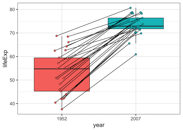
Want to show relationships between paired observations or track changes across groups in your boxplots? This comprehensive guide shows you exactly how to connect points boxplot ggplot2 using lines, with practical examples for before/after studies, paired data, and longitudinal analysis. Standard boxplots are excellent for comparing distributions, but they don’t reveal relationships between individual data… Continue reading Connect Paired Points on Boxplots with Lines in ggplot2