
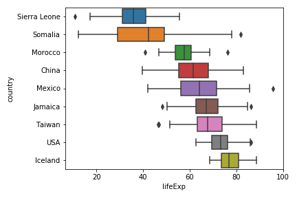
Horizontal boxplots cane be very useful, when you have categories with longer names. In general, Boxplots are great visualization tool for looking at multiple distributions at the same time, However, when the description of each distribution on x-axis is bit longer, it may become really difficult to understand the boxplot. One of the solutions is… Continue reading Horizontal Boxplots with Seaborn in Python
Simple Scatter Plot with Matplotlib in Python
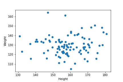
Matplotlib is one of the most popular plotting libraries in Python. As the name kind of hints, Matplotlib is bases on MATLAB style interface offers powerful functions to make versatile plots with Python. In this post, we will see examples of simple scatter plot with Matplotlib’s module pyplot. Let us first load the libraries needed.… Continue reading Simple Scatter Plot with Matplotlib in Python
Scatter Plot with Regression Line using Altair in Python

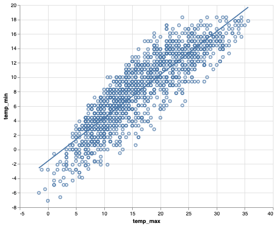
Adding regression line to scatter plot is a great way to understand the relationship between two numeric variables. In this post, we will see an example of using Altair to make a scatter plot with regression line using real world dataset. Let us load the packages we need. We will load Altair package and load… Continue reading Scatter Plot with Regression Line using Altair in Python
How To Make Histogram with Median Line using Altair in Python?

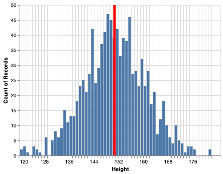
In this post we will learn how to make a histogram with a median line using Altair in Python. This is also a great example illustrating the power of Altair’s grammar of graphics. Let us load the packages needed to make histogram with a median or mean line using Altair. Let us generate data to… Continue reading How To Make Histogram with Median Line using Altair in Python?
How To Change Axis Label, Set Title and Subtitle in ggplot2

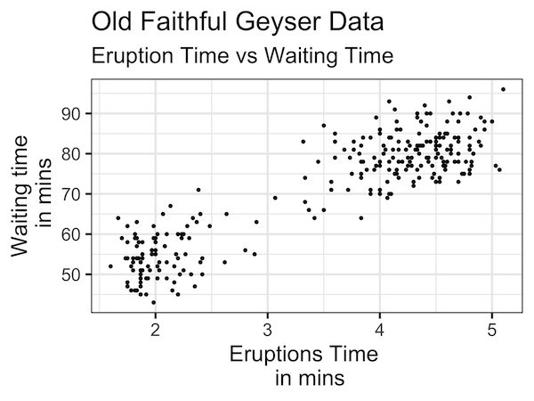
One of the key ingredients of a good plot is providing enough information on the plot to help convey the message in the plot. In this post we will examples of how to change x-axis and y-axis labels in a plot made with ggplot2 in R. And then we will see how to change axis… Continue reading How To Change Axis Label, Set Title and Subtitle in ggplot2